As the Design Director, I provided comprehensive design direction and leadership, including brand strategy, art direction and design, and UX/UI design. Additionally, my role involved leading and managing the design effort across a diverse team of internal and external team members across key areas, including website development, video production, marketing collateral materials, presentation decks, social media, trade show marketing, photography, and content creation.


Background
In 2021, There was a merger between Honeywell Quantum Solutions (HQS) and Cambridge Quantum (CQ).
Two major companies in the quantum computing field they combined their hardware and software solutions to form a new company called Quantinuum.
Two major companies in the quantum computing field they combined their hardware and software solutions to form a new company called Quantinuum.
Honeywell Quantum Solutions (HQS) and Cambridge Quantum (CQ) merged in 2021. Two leading businesses in the quantum computing sector joined their hardware and software solutions to establish Quantinuum.
Challenge
Challenge
Our challenge was to effectively position and launch Quantinuum which included:
- Visual identity
- Brand strategy and messaging
- Foundational launch website
- Launch video
- Social media launch
- Orchestrate employee launch across US, UK, and Japan
- Brand strategy and messaging
- Foundational launch website
- Launch video
- Social media launch
- Orchestrate employee launch across US, UK, and Japan
Strategy
Our approach comprised of two stages: to focus on the initial launch phase while ensuring that all marketing collateral and plans remained scalable for future use. To achieve this, we adopted a strategic and iterative process that included conducting stakeholder interviews, develop audience personas and customer journeys, and establish a comprehensive digital media plan.
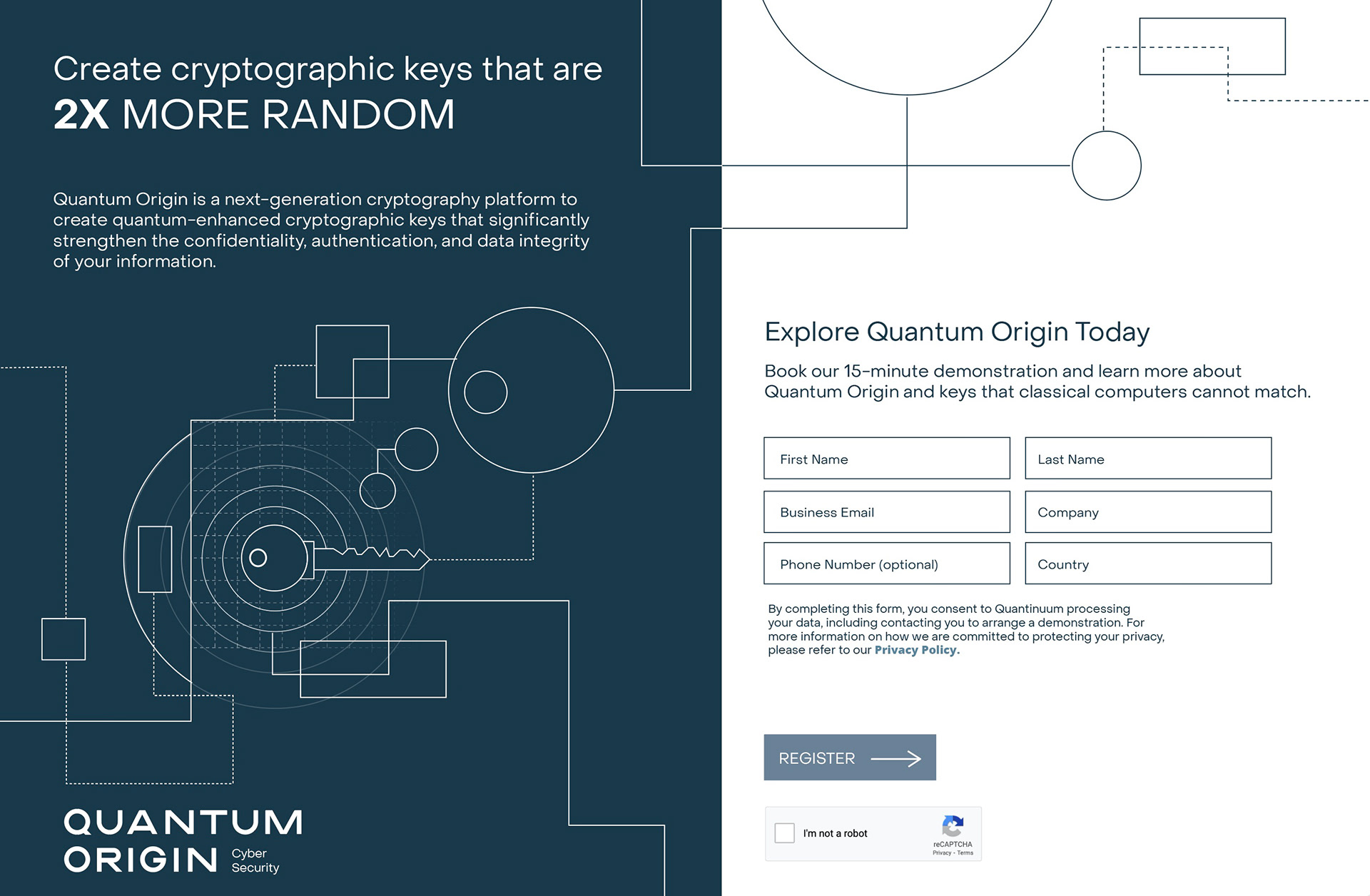
The launch website was used to present Quantinuum, showcase their software and hardware solutions and create a scalable foundation for the comprehensive website - Quantinuum 1.0.
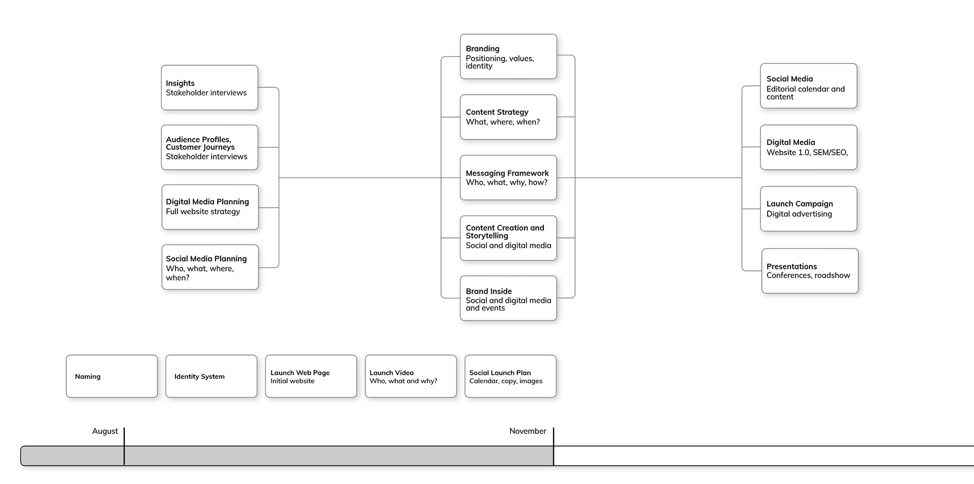
Overall framework for approach to the project.
Initial focus is on the brand identity and the employee launch.
"Science is a continuum of discovery"
During the initial information gathering phase with the Quantinuum team and executive leadership, our focus was on understanding the company's values, offerings, and target markets. The "continuum of discovery" statement was a critical foundation that gave us clarity to build the brand on.
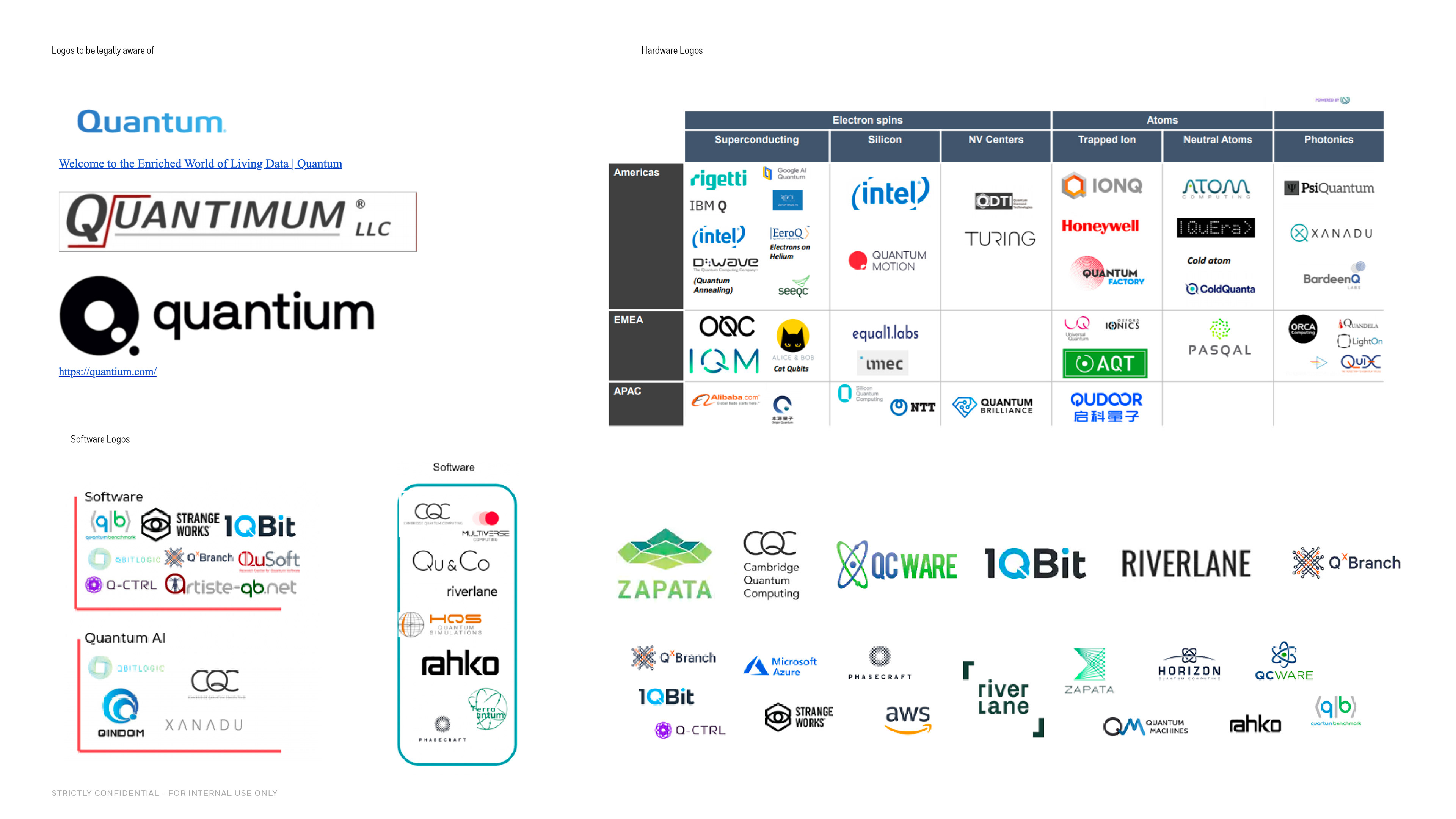
Landscape view of industry logos
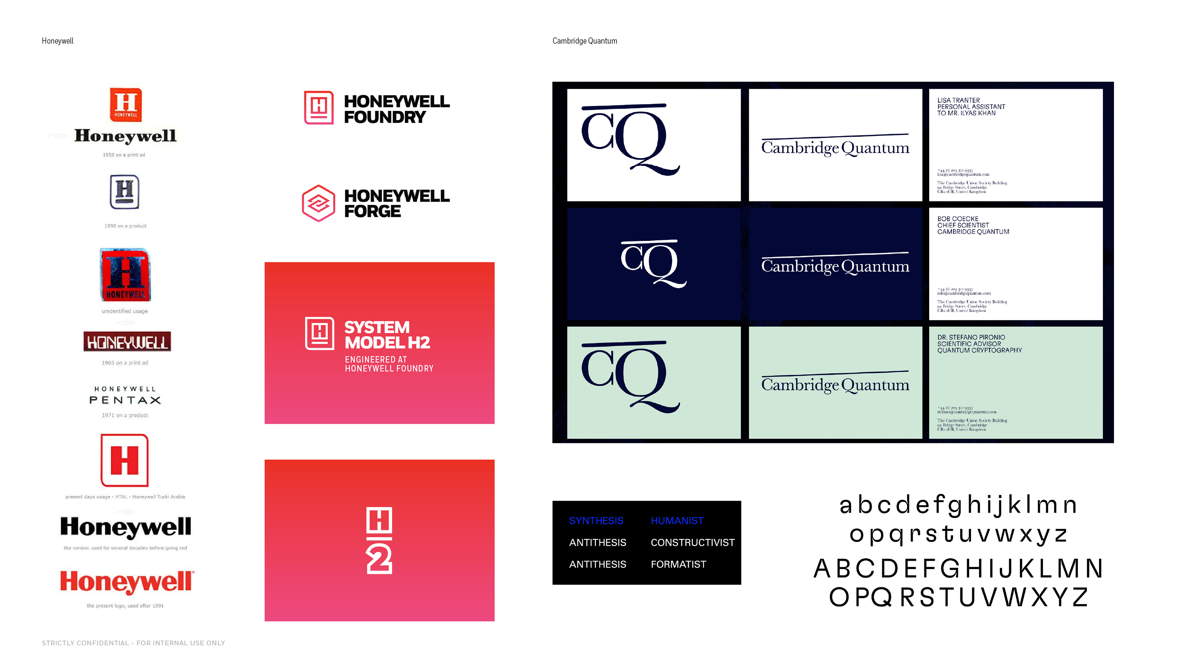
Honeywell and Cambridge logos
Audit of existing industry logos for quantum computing and hardware enterprises, including a review of the client's existing systems.
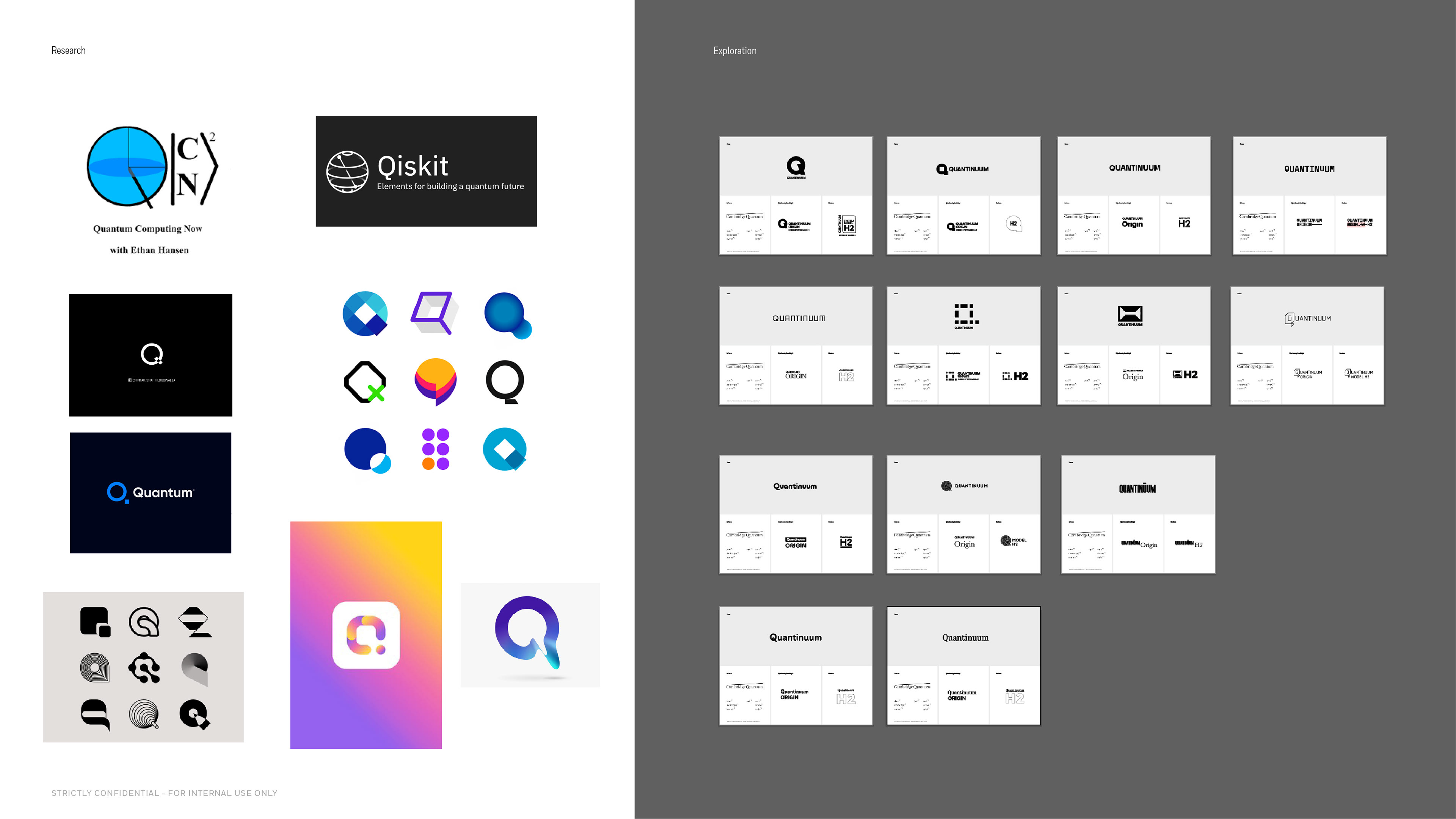
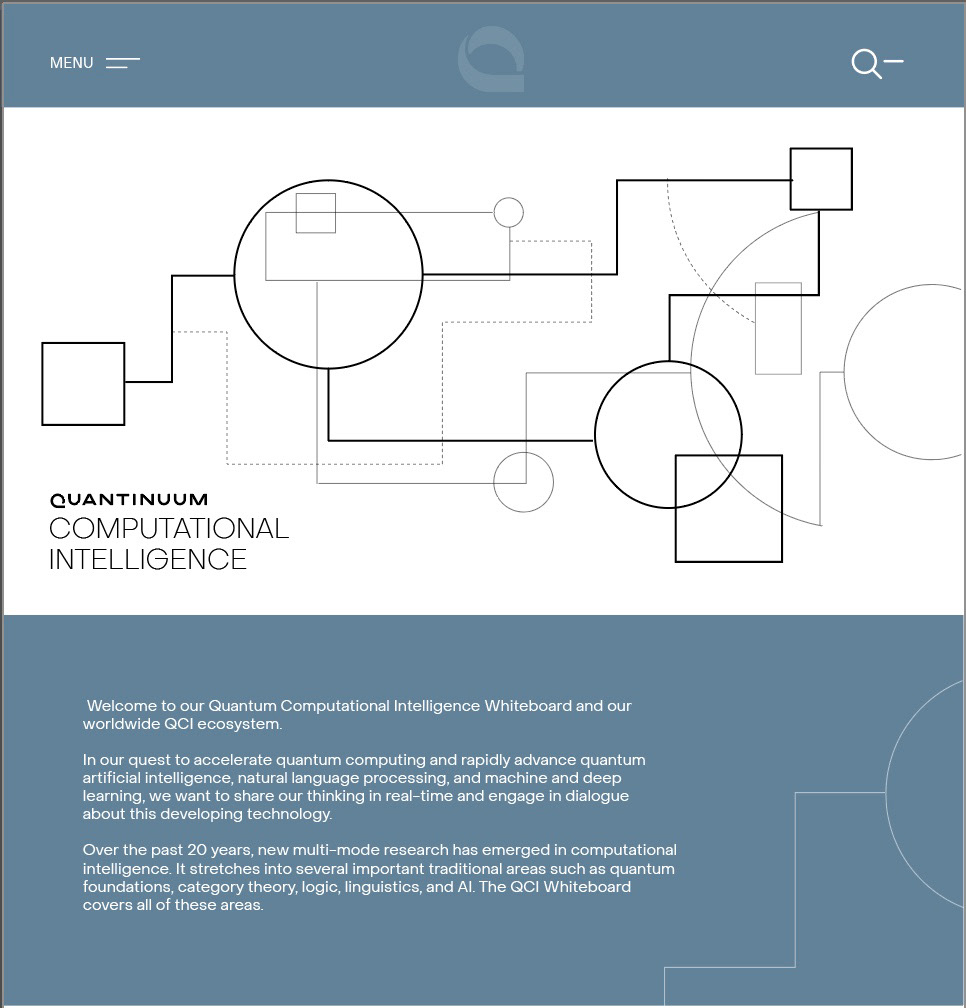
During the design exploration phase, we focused on creating a distinctive and memorable capital letter Q that encapsulated the idea of a continuum.
We narrowed down to 2 ideas. One was a literal interpretation of the distinctive Q idea and the other incorporated a laser beam element which was a nod to the lasers used in the quantum computer.
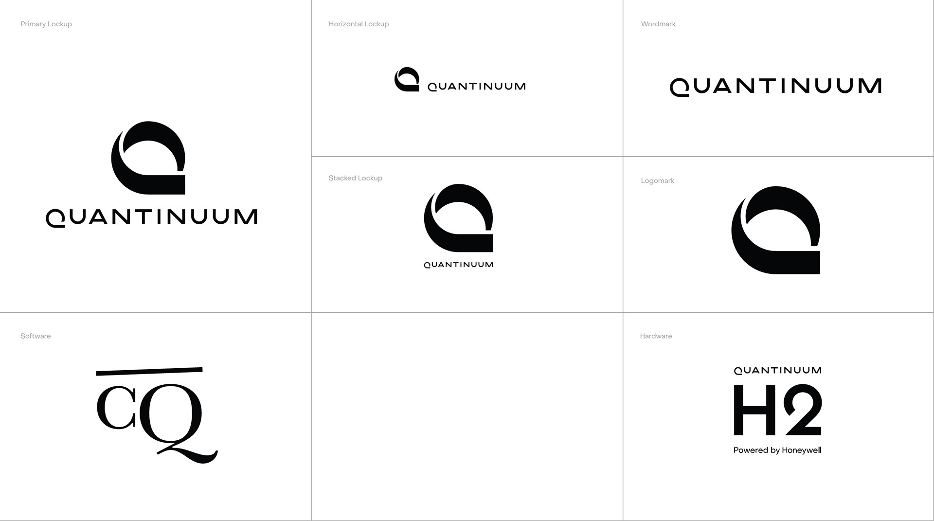
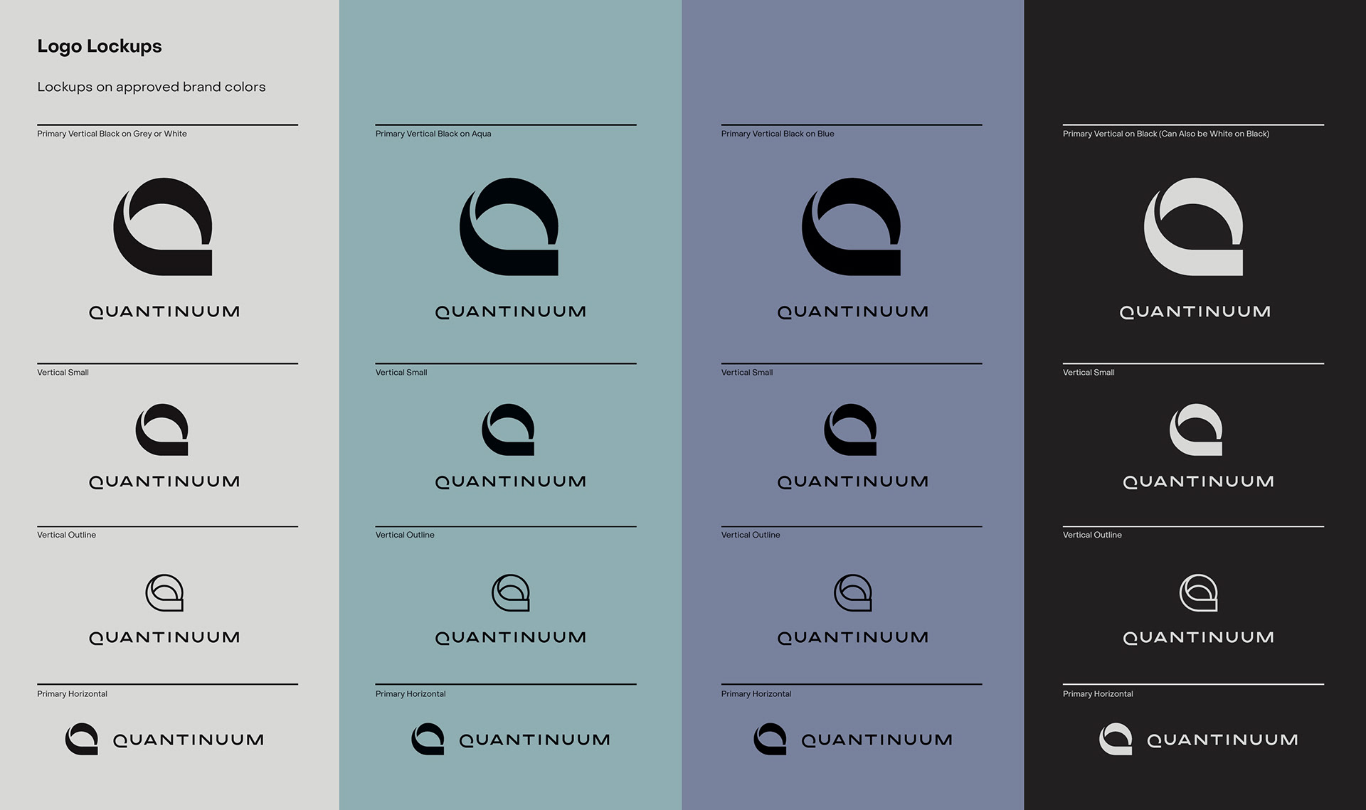
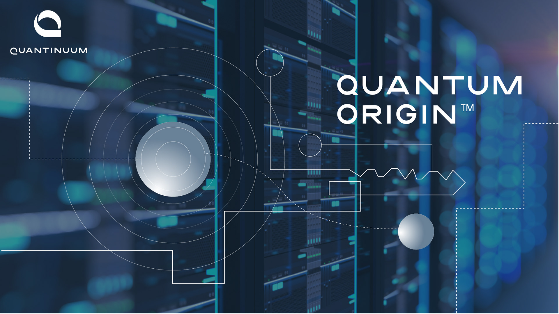
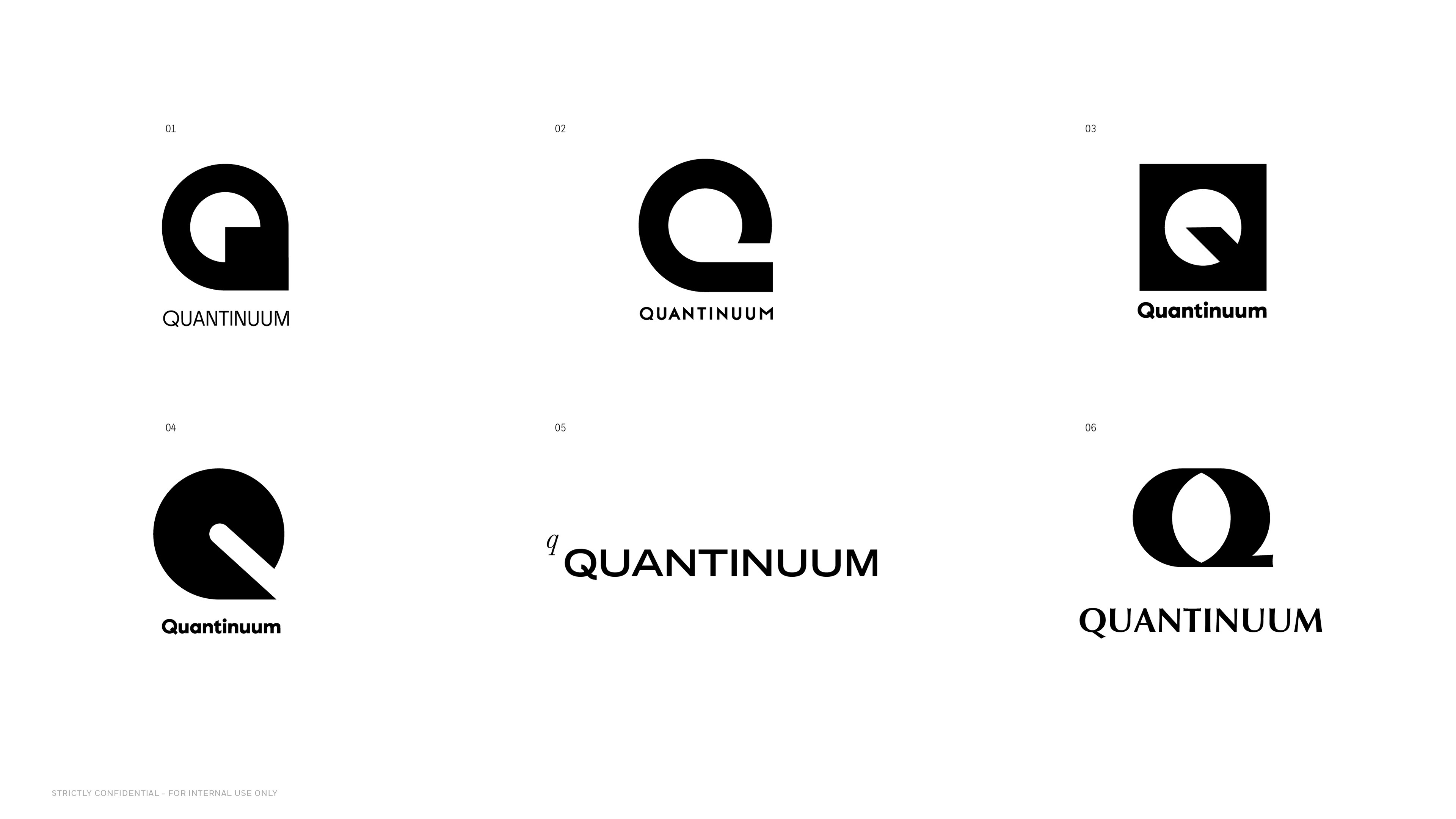
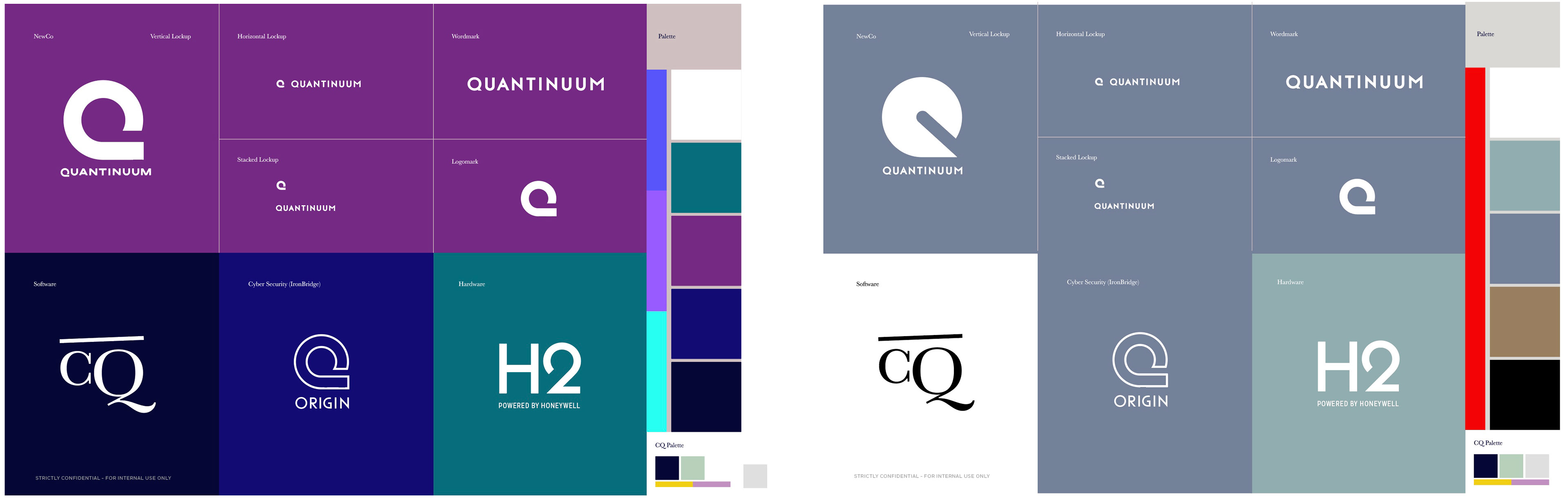
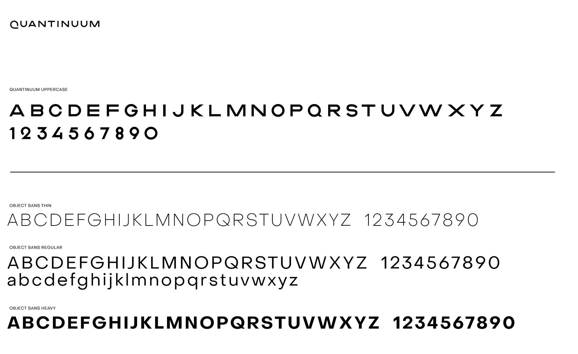
The final identity for Quantinuum is a bold representation of fluidity and forward movement. The circular flowing shape embodies the continuum idea. The word mark is made from a custom font that reflects the design language of the Q.
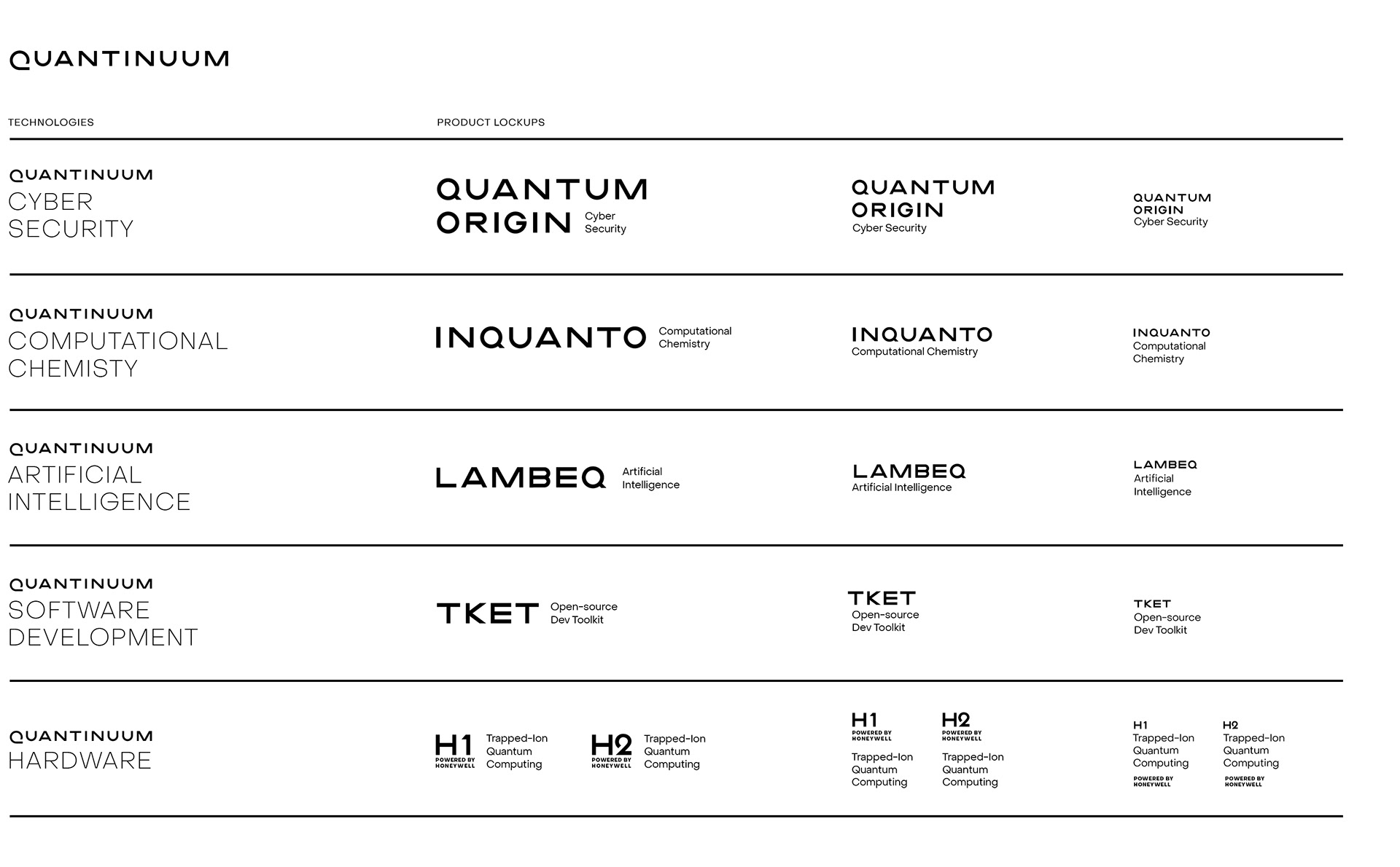
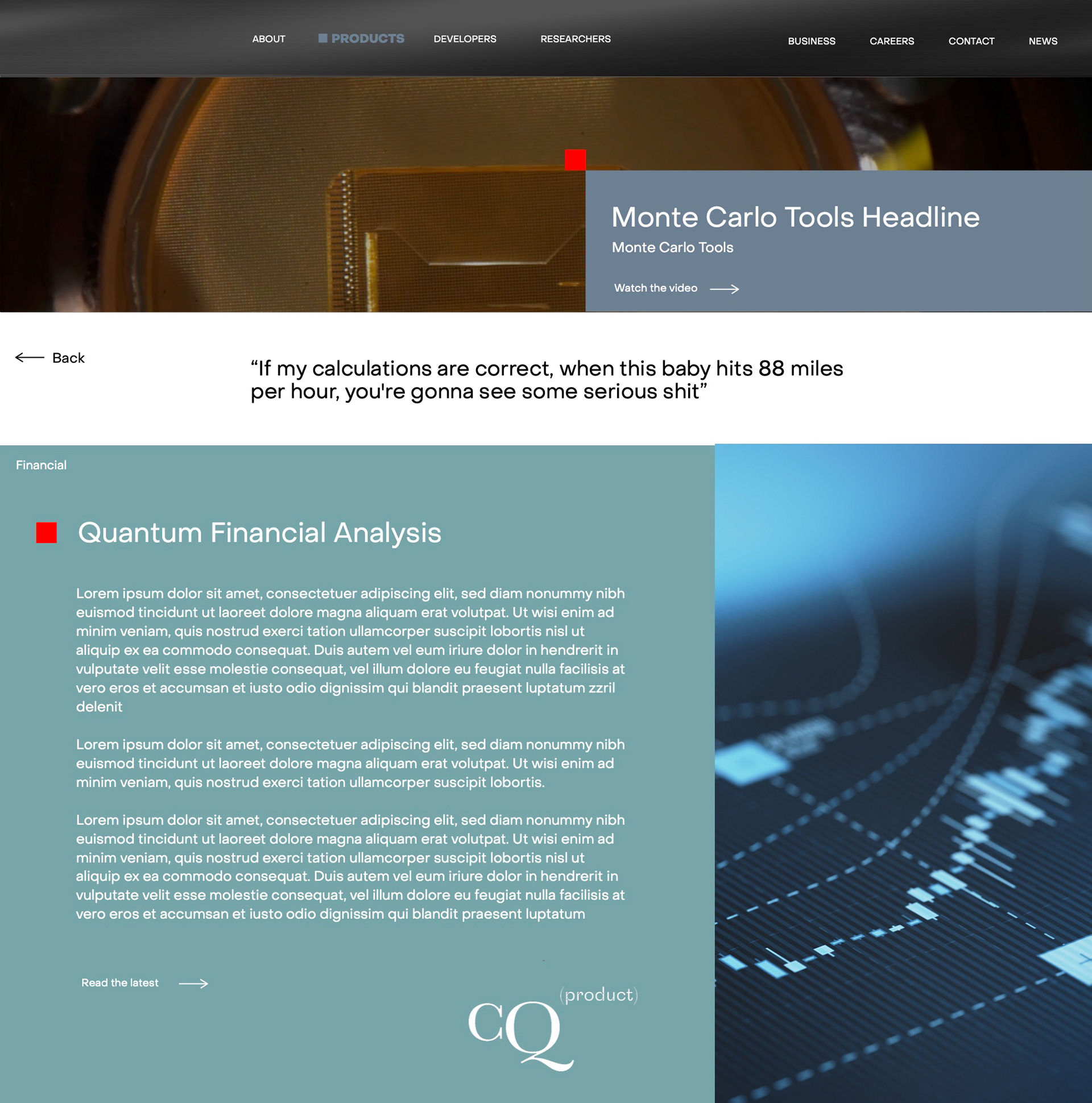
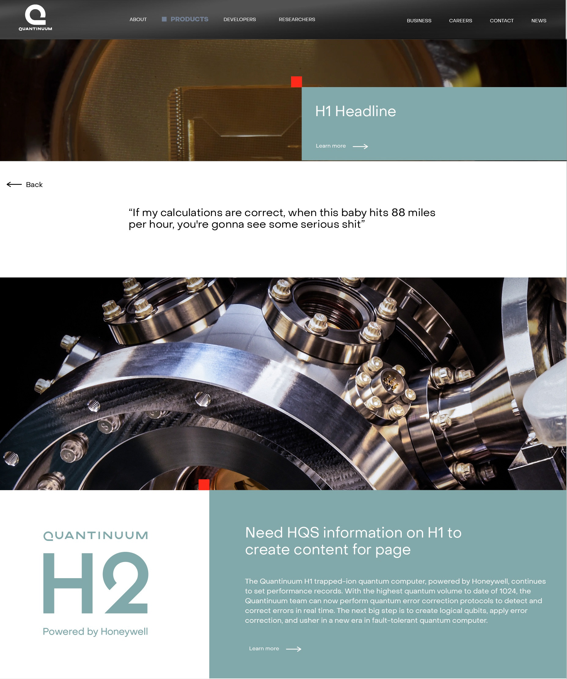
We used the Quantinuum alphabet to soft brand Quantinuum's software solutions. They visually relate to the established design language without the need for creating individual brands for each offering.
"The intersection of art and technology"
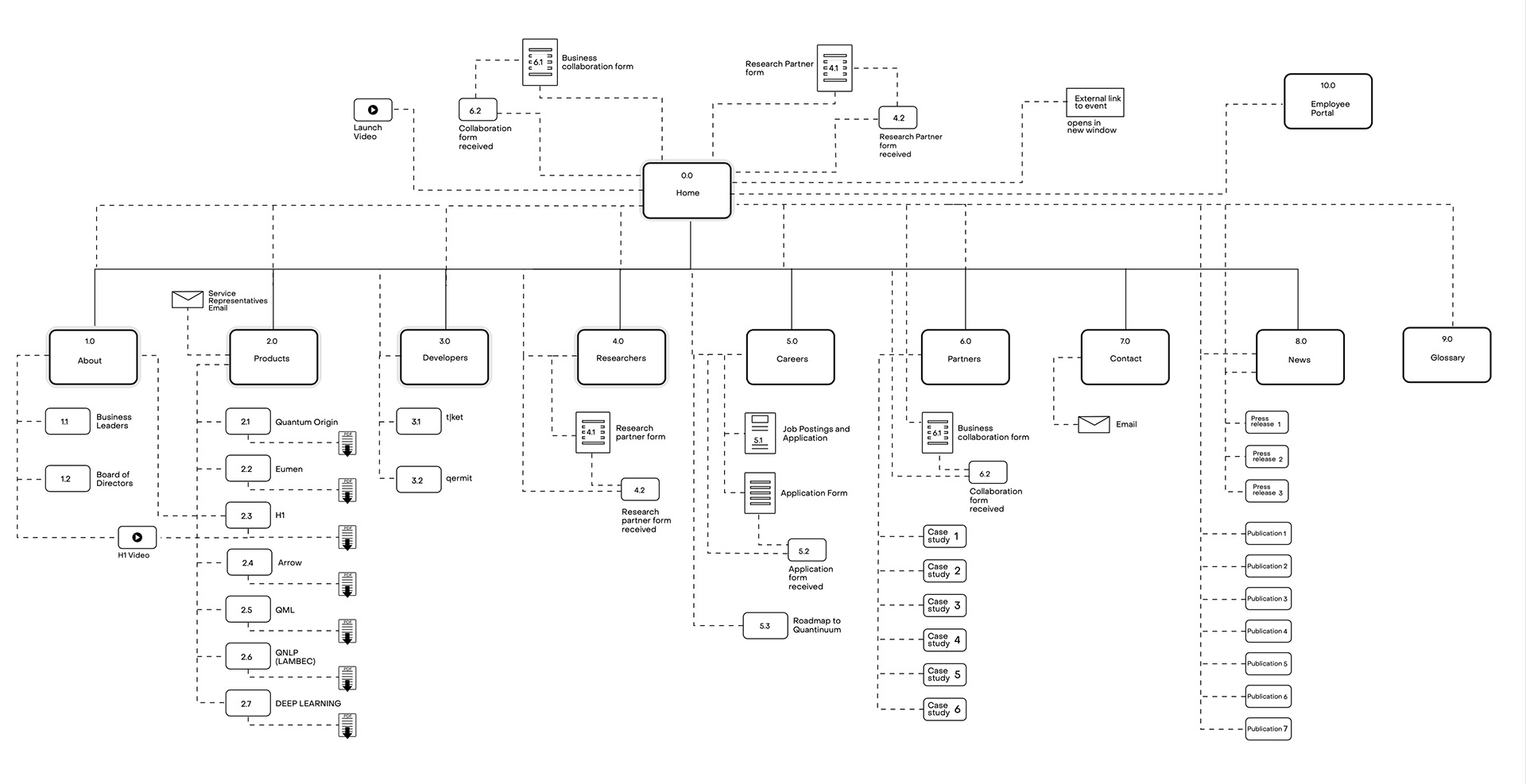
While the brand identity was being developed, we dove right into the website. Initial interviews with the researchers, developers, and scientists started to shed light on the what components the site needed to support Quantinuum's business model and expanding company. To start a dialogue and gather additional feedback, a basic navigation scheme and fast wireframes were built and presented to the Quantinuum stakeholders. Approaching the site in an agile way was critical to keep the process moving while we were gathering information.
The initial objectives for the launch site.
- Create brand awareness to the Quantum computing community/industry.
- Provide motivational content for investors.
- Develop the framework for the 1.0 website and create a scalable framework to leverage.
- Showcase Quantinuum's software solutions and hardware.
- Collect information on prospective customers for software sales.
- Website should be created in a CMS platform.
Inspiration
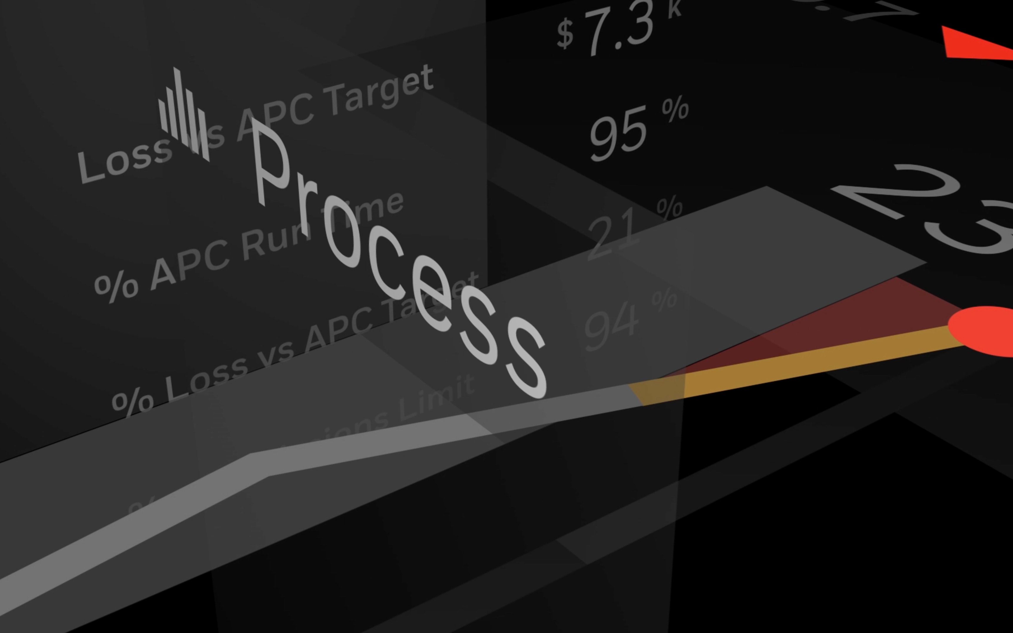
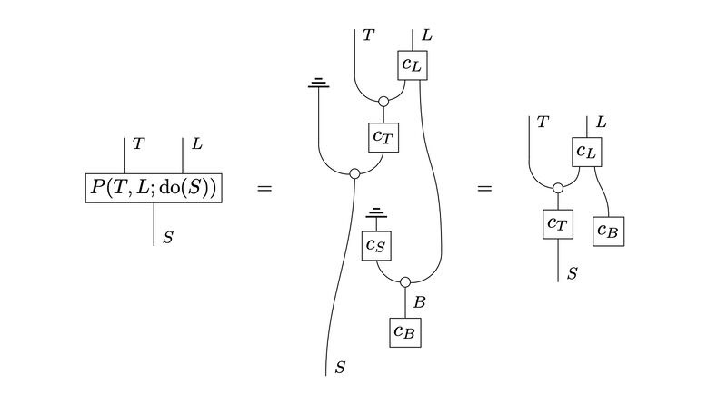
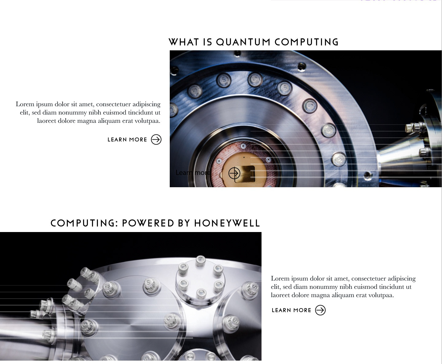
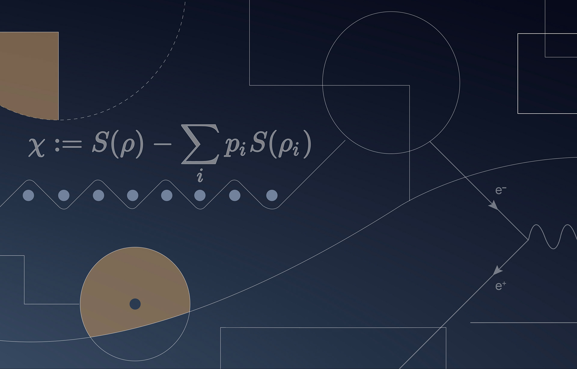
Through continued interviews with researchers, developers, and scientists, we discovered their frequent use of quantum schematic diagrams, including circuits, strings, and process diagrams. This valuable insight served as a unique inspiration for us, prompting us to create a visually familiar design language for them.
By incorporating elements from quantum schematic diagrams, such as circuits, strings, and process diagrams, we were able to develop a linear design approach that differentiates itself visually while still providing a sense of familiarity to researchers and scientists. This approach not only allowed for an intuitive representation of complex systems but also made it easier for them to understand and interact with the platform.
By incorporating elements from quantum schematic diagrams, such as circuits, strings, and process diagrams, we were able to develop a linear design approach that differentiates itself visually while still providing a sense of familiarity to researchers and scientists. This approach not only allowed for an intuitive representation of complex systems but also made it easier for them to understand and interact with the platform.


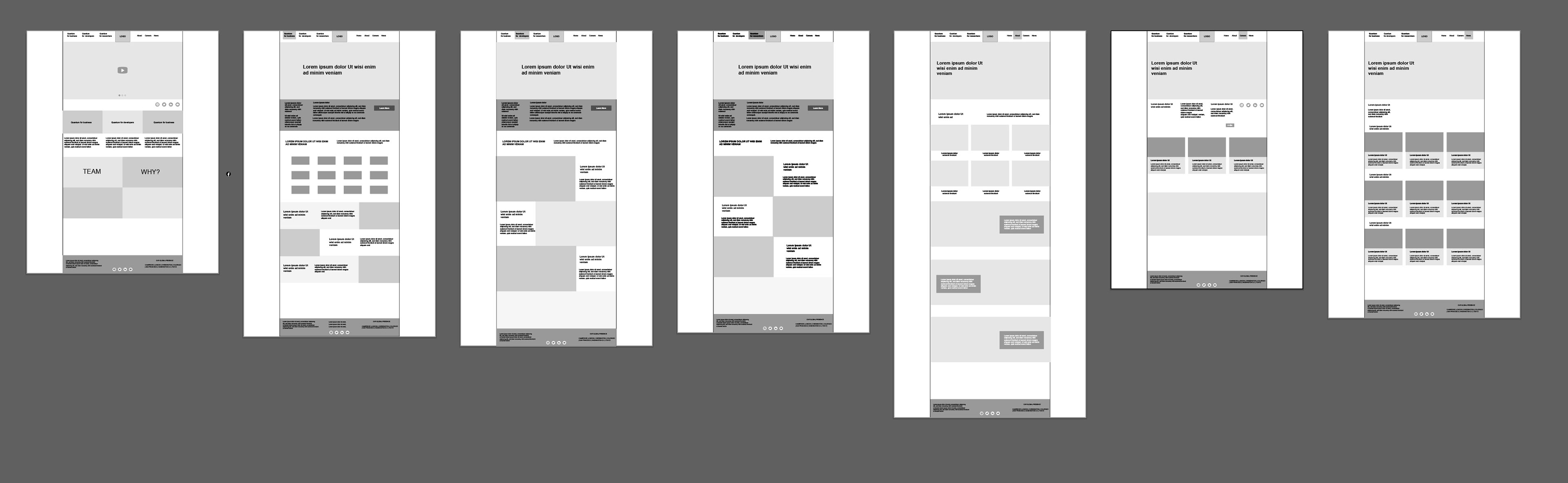
Exploration
The linear look was widely accepted but we needed to create a complete system and library of drawn elements. Coupled with the time constraints due to the launch, we decided to wait and implement this when we would develop Quantinuum 1.0 after the launch. It would eventually become a common thread through all of Quantinuum's brand touch points.
More exploration
Despite the challenges presented by the chaotic nature of the merger and limited asset access, we continued with an iterative approach to the layout development process, involving both our team, developers, scientists, and stakeholders. The original objective of integrating our design into version 1.0 remained a top priority, as we continued to refine the design.
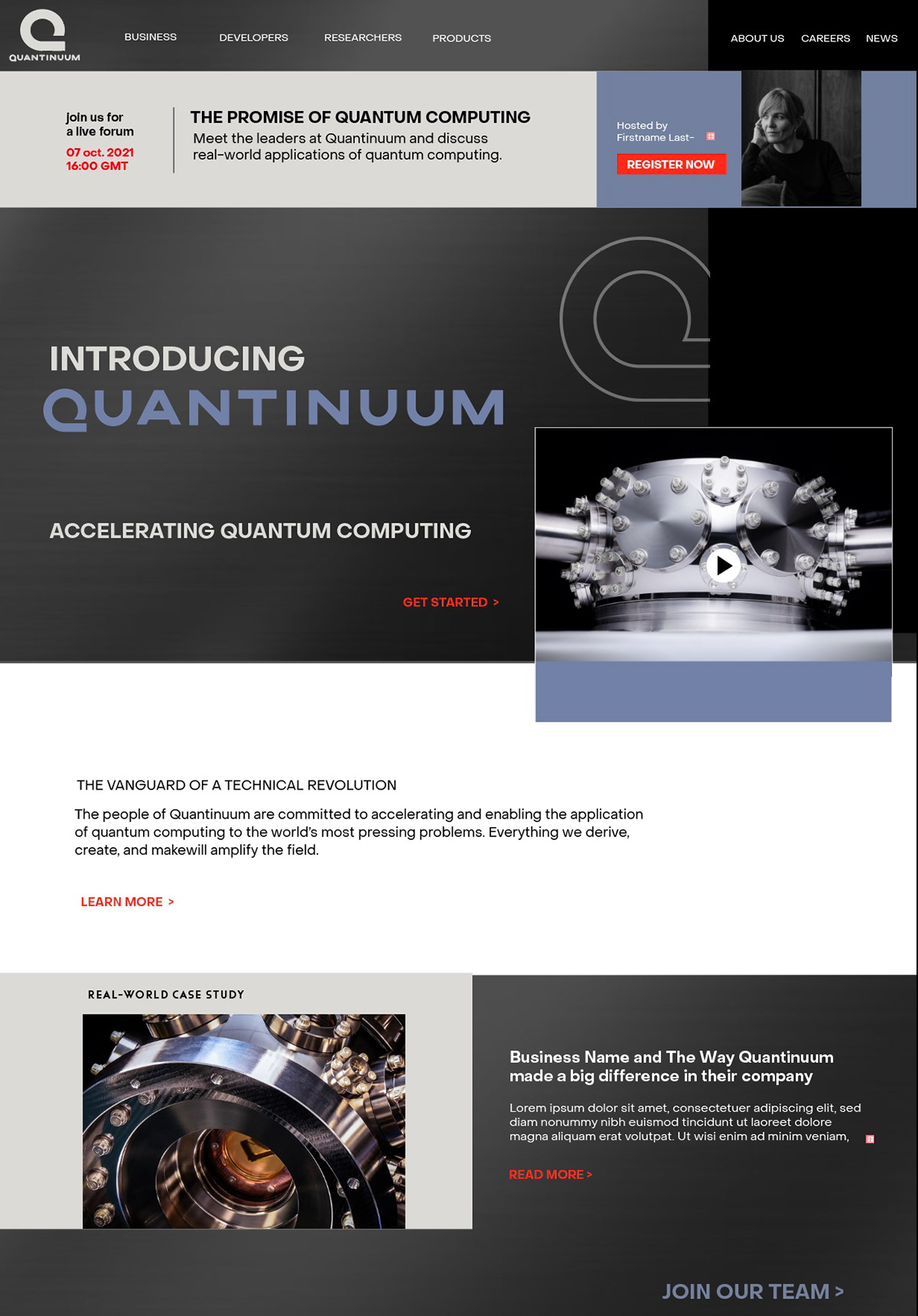
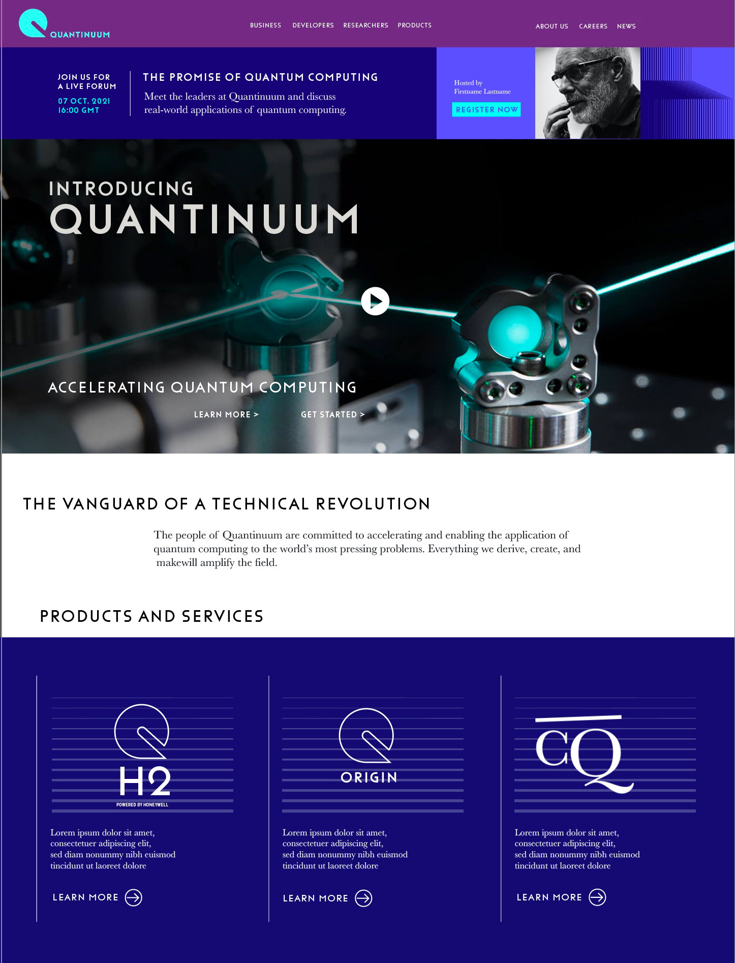
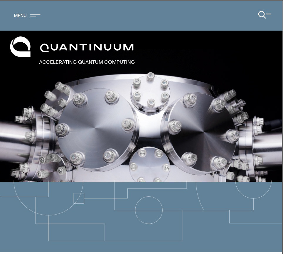
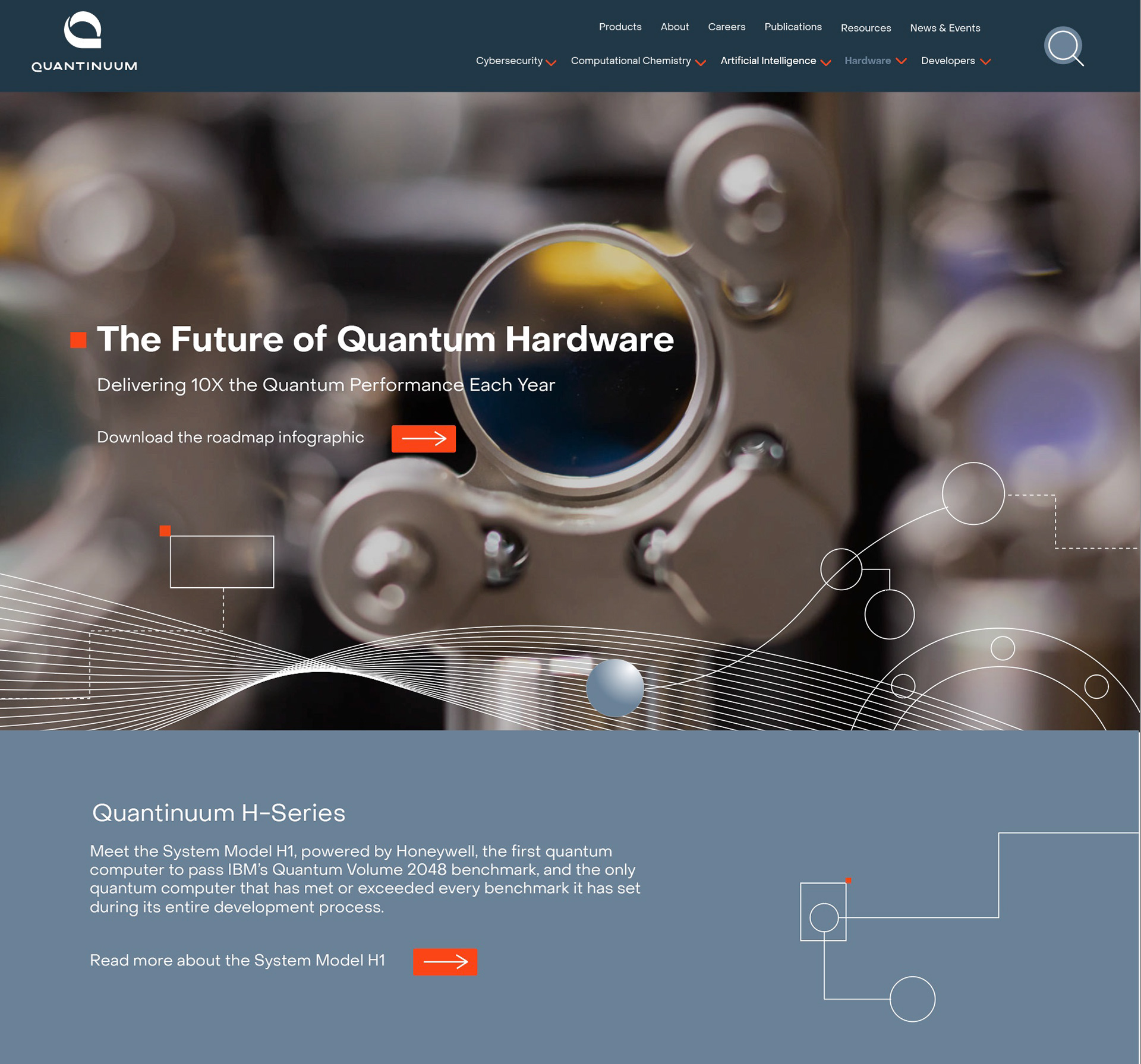
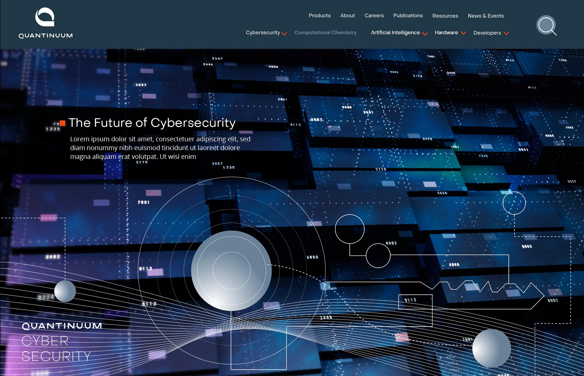
Website for launch!
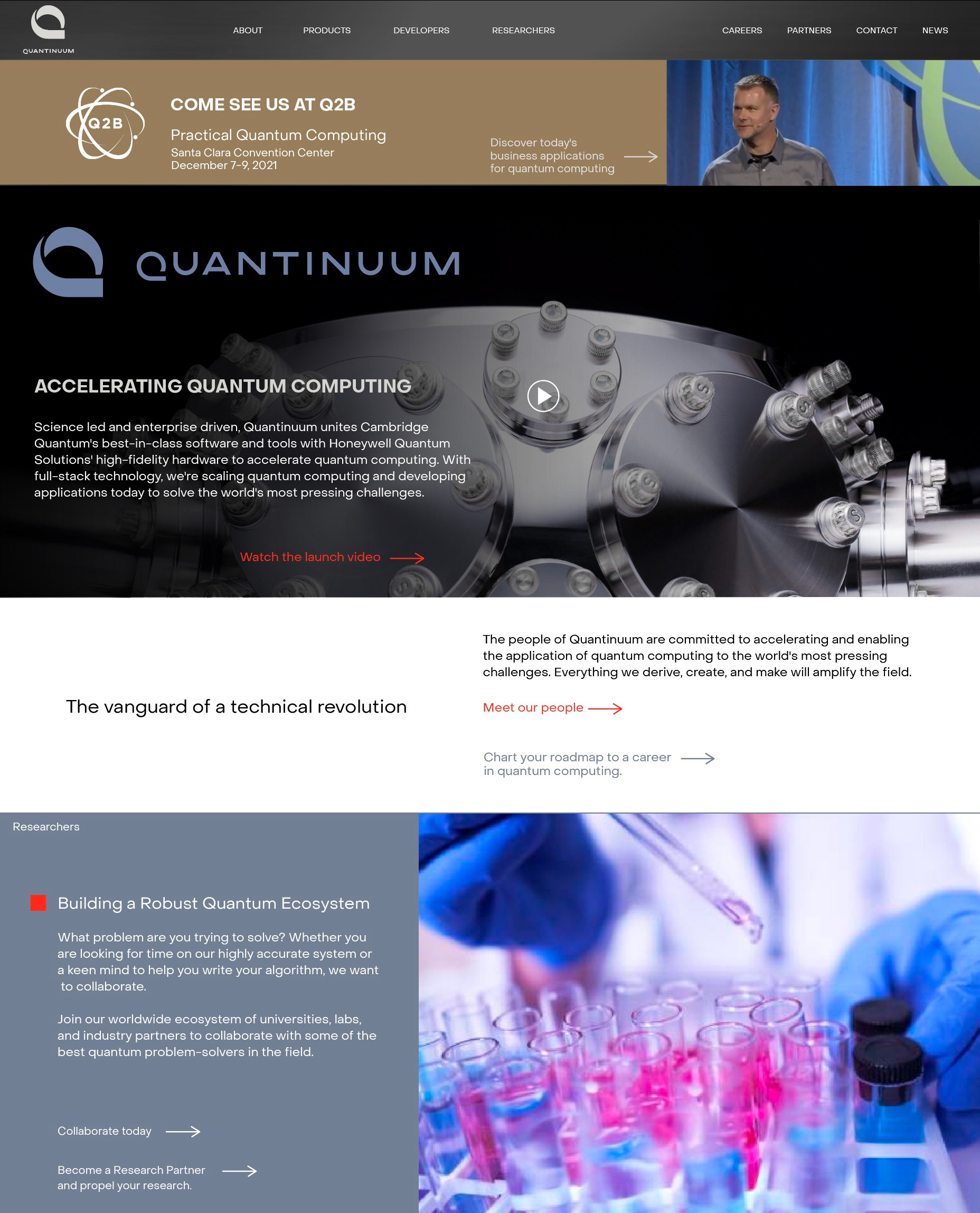
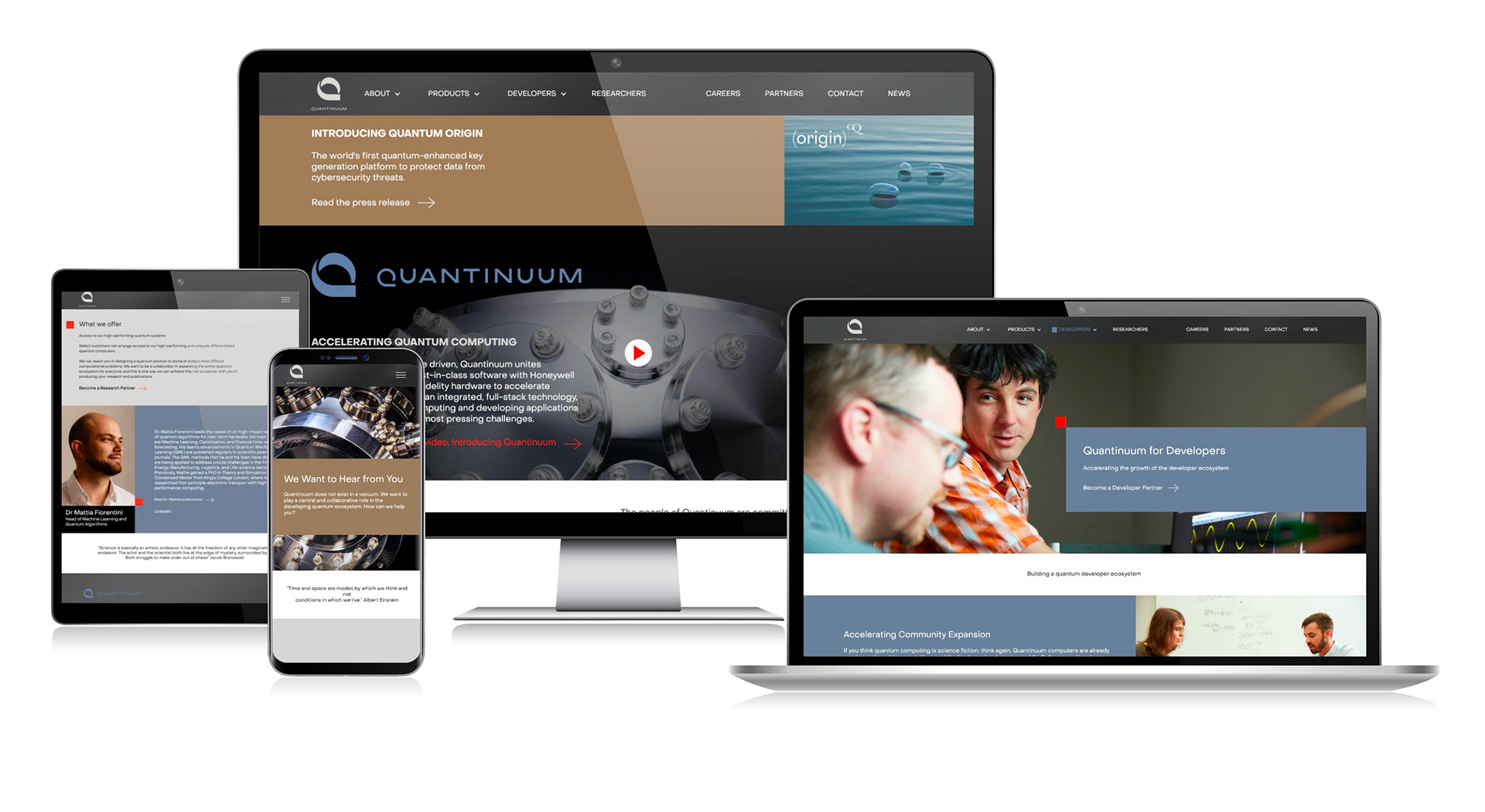
The Quantinuum launch site was a fully responsive and intuitive content management system. The site included tracking capabilities through Google Analytics for potential software customers and the ability to promote future marketing events. Our iterative development approach allowed for real-time feedback from team stakeholders, ultimately leading us to exceed our primary objectives and deliver the result within the set deadline.
Launch!
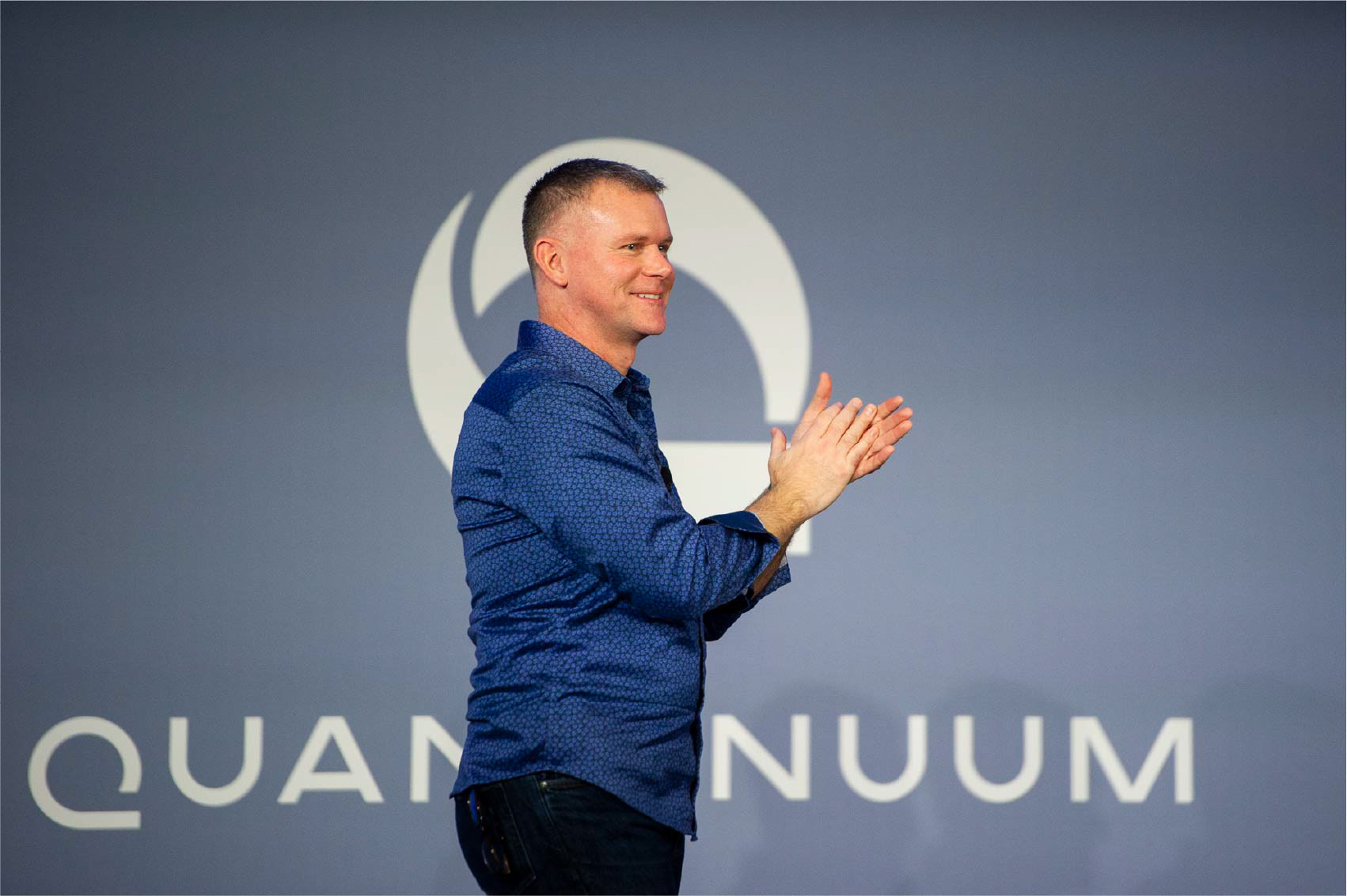
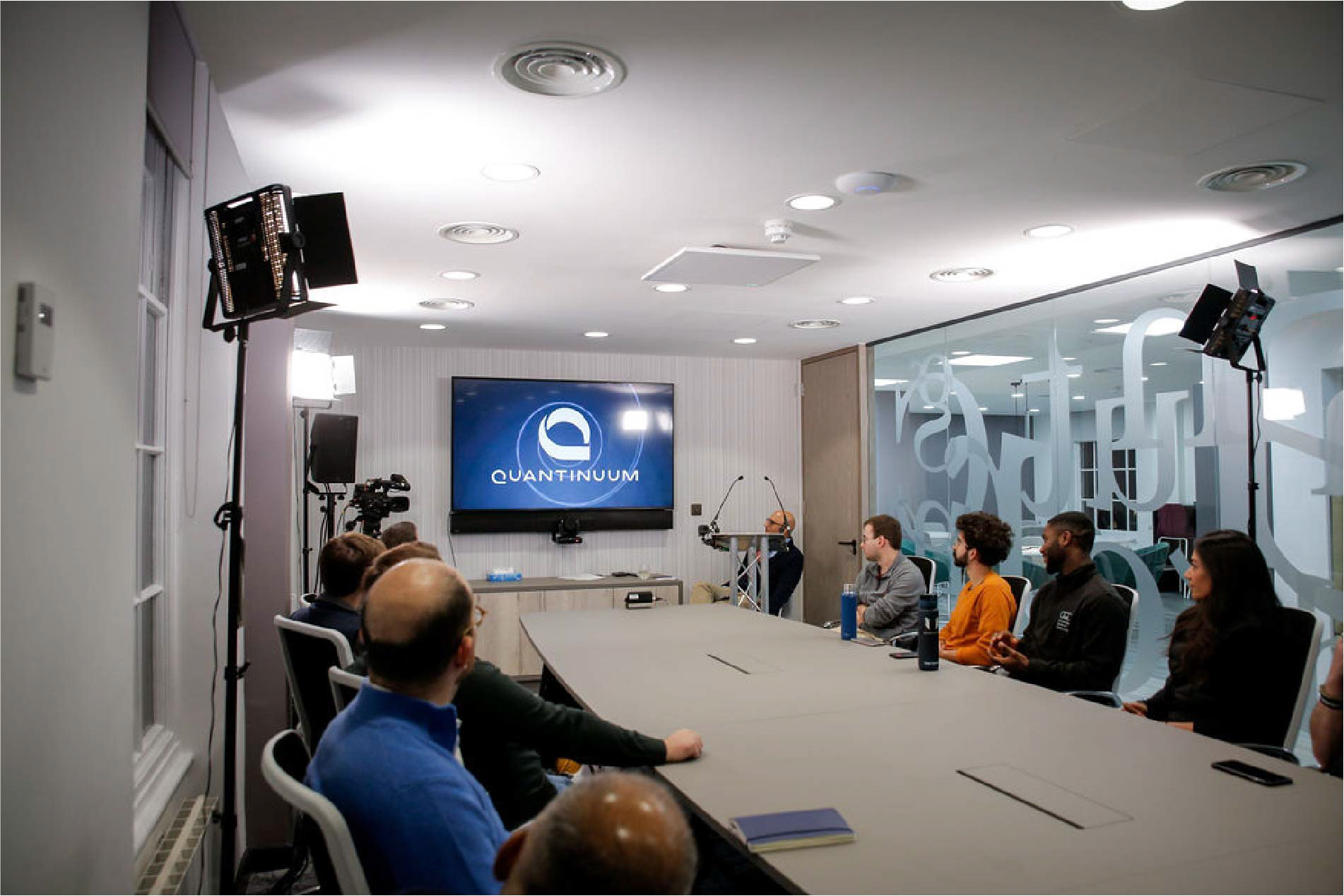
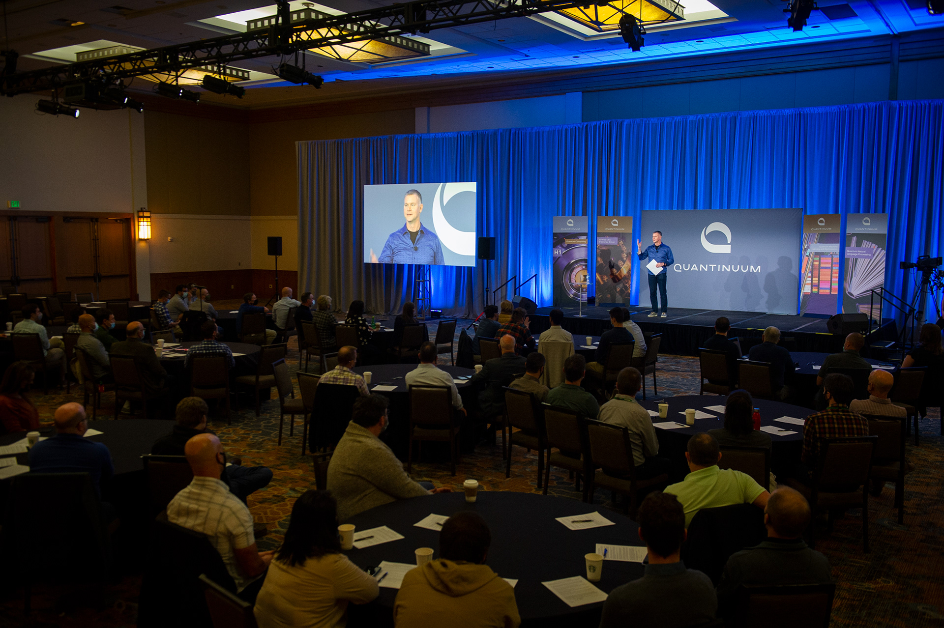
Our team coordinated a live event to introduce the newly merged global company to its employees across multiple time zones. The event was broadcasted simultaneously from the US, UK, and Japan, equating to a time difference of 16 hours. Graphic signage and branded promotional employee products were sent domestically and to the UK for the event.

The launch video for the upcoming press release delved into the principles of quantum physics and mechanics, highlighting the advancement of these fields over time. The video incorporated images that supported this continuum and timeline, seamlessly woven into the flow of information. Schrödinger's cat, Rutherford's Atom, Bohr's Atom, and Feynman Diagrams were explored, along with equations such as Newton's 2nd Law, The Wave Equations, Faraday's Law of Electromagnetic Induction, and Maxwell's 2nd Law of Thermodynamics. The use of waves reinforced the idea that science is a continuum of discovery.

Line work, equations, and illustrated elements were developed for the motion graphics editor and the 3D developer to incorporate into the video. Working closely with this team, I provided creative direction, guiding the creation and choreography of these elements so they conveyed a fluid and continuous movement.
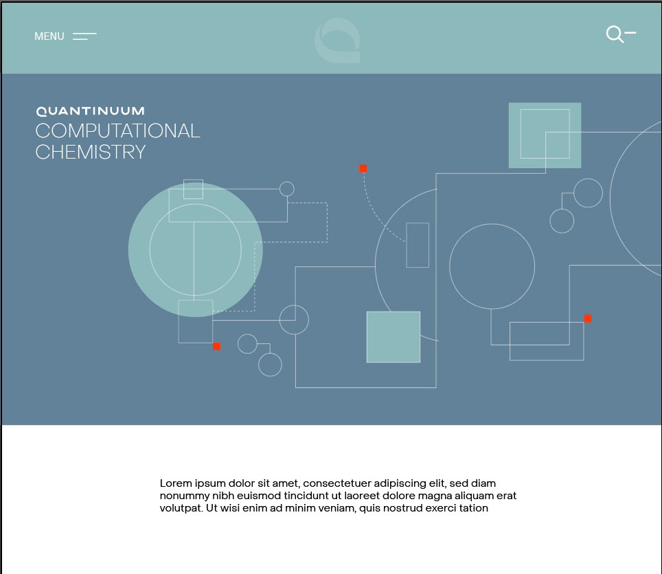
Website 1.0 and more
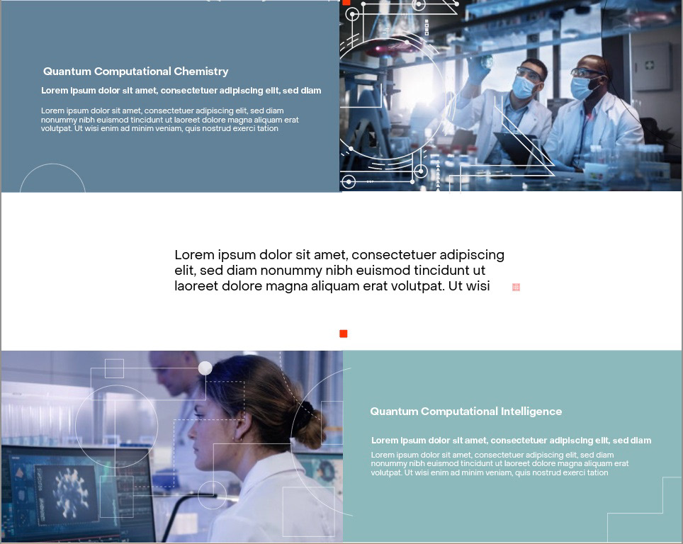
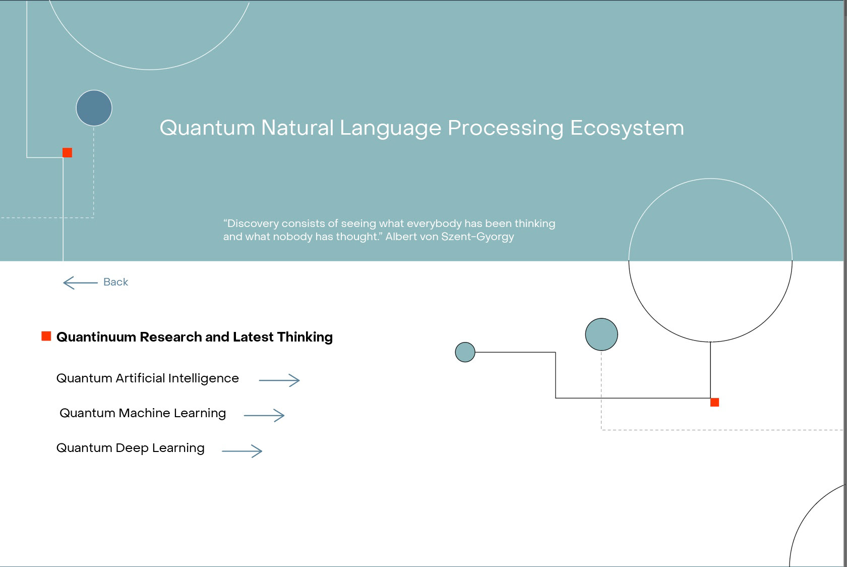
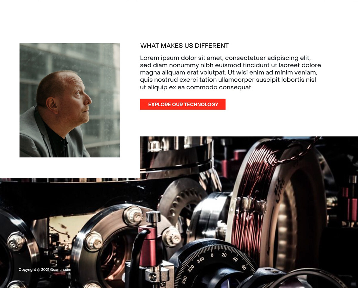
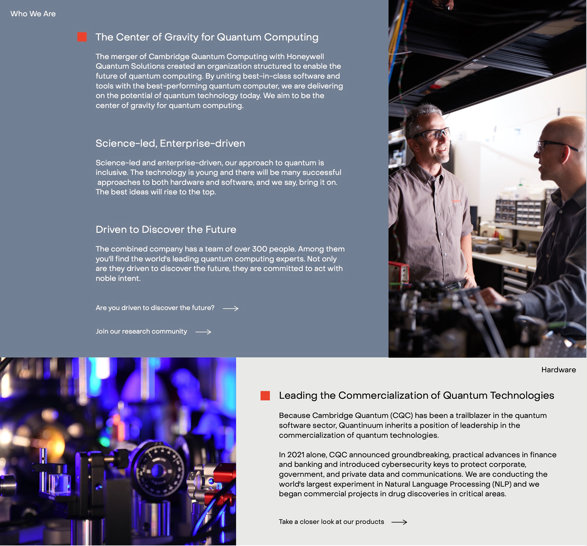
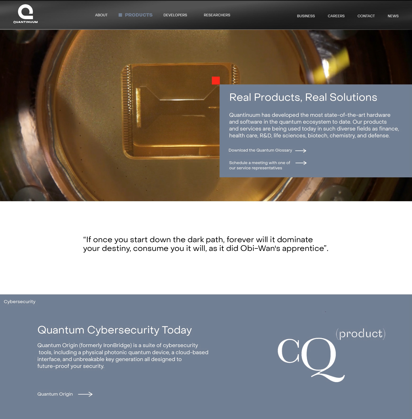
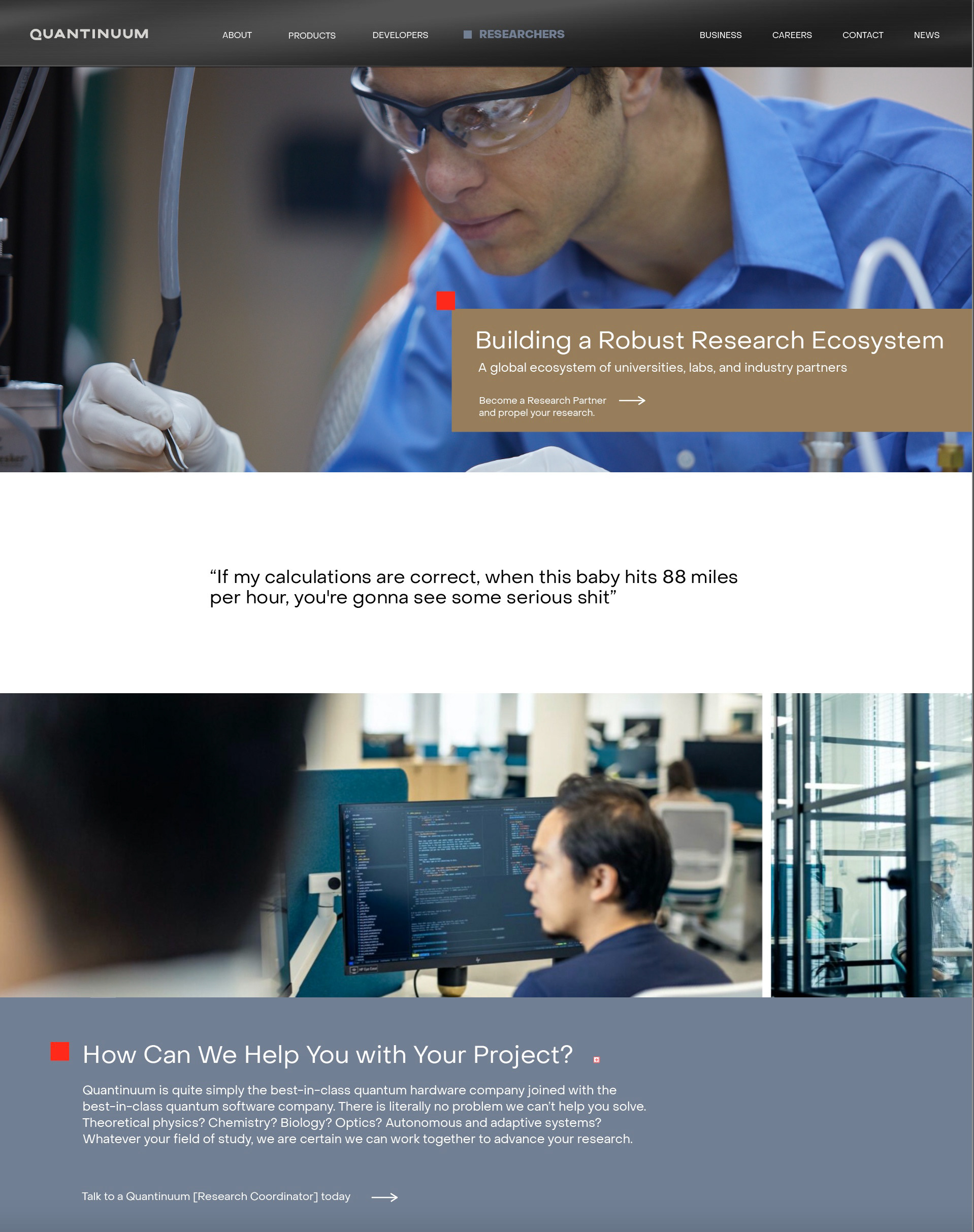
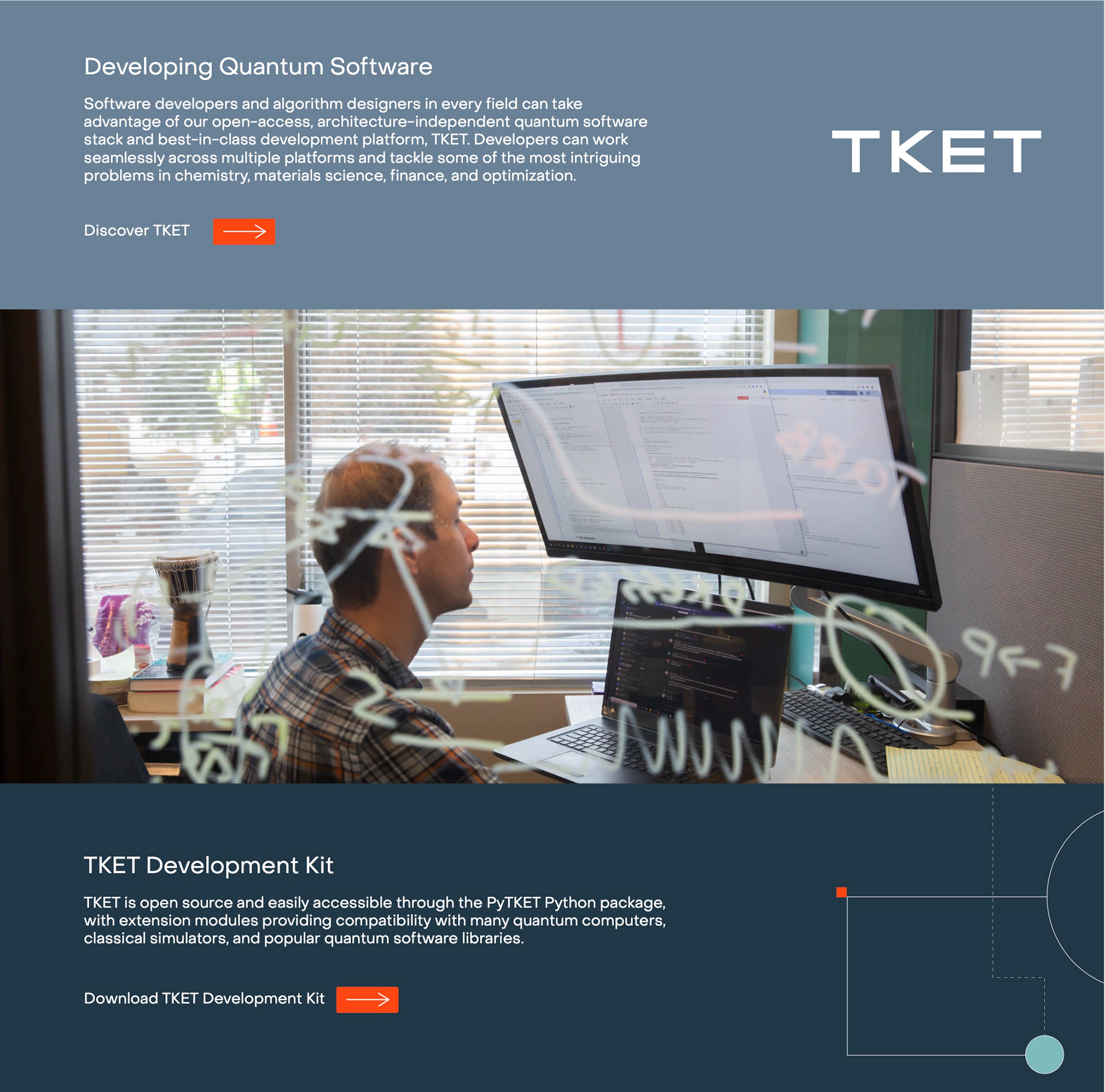
With the launch behind us it was time to move on to Q 1.0. We had created a scalable design framework but now wanted to further explore and refine the linear expression for the brand. All aspects of design were refined and finalized. New assets from photo shoots in the UK and in Boulder CO were integrated into the site. In addition we expanded the navigation menu to reflect feedback we received from the scientists and researchers. The function of the site was expanded to act as a central information hub with an organic search feature that gives the scientists, researchers, and engineers access to sought-after data.
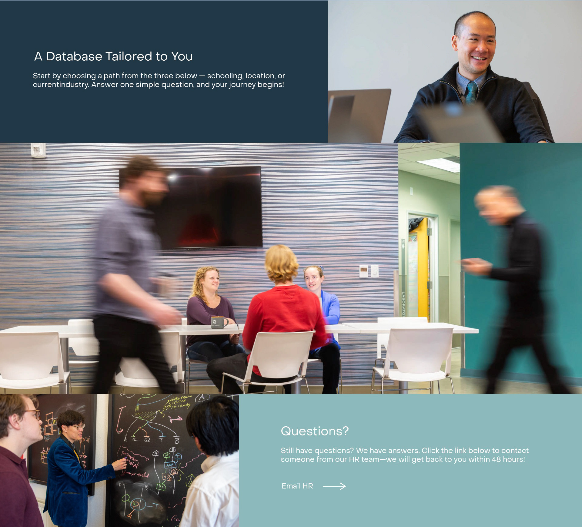
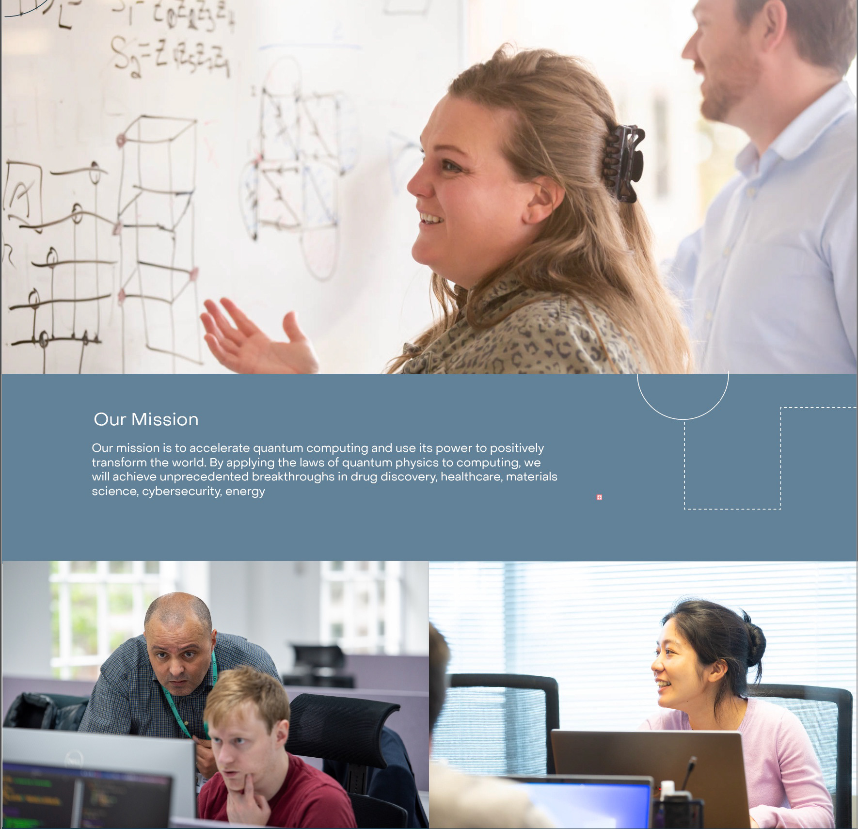
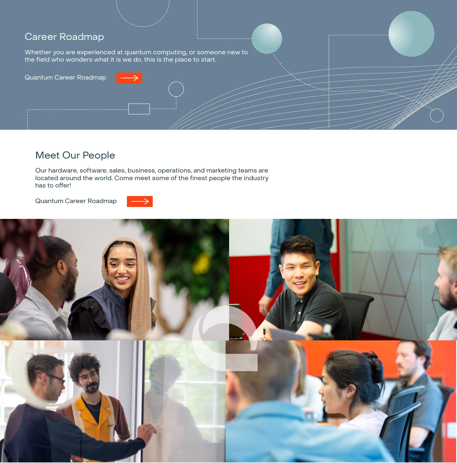
We felt it was crucial to highlight the significance of featuring actual individuals in our imagery, as it effectively conveys the message that real people are actively engaged in tackling genuine problems in quantum computing. By deliberately showcasing Quantinuum personnel both locally and internationally on every page of our website, our goal was to make Quantinuum stand out in a new industry that is sometimes met with a lot of skepticism.
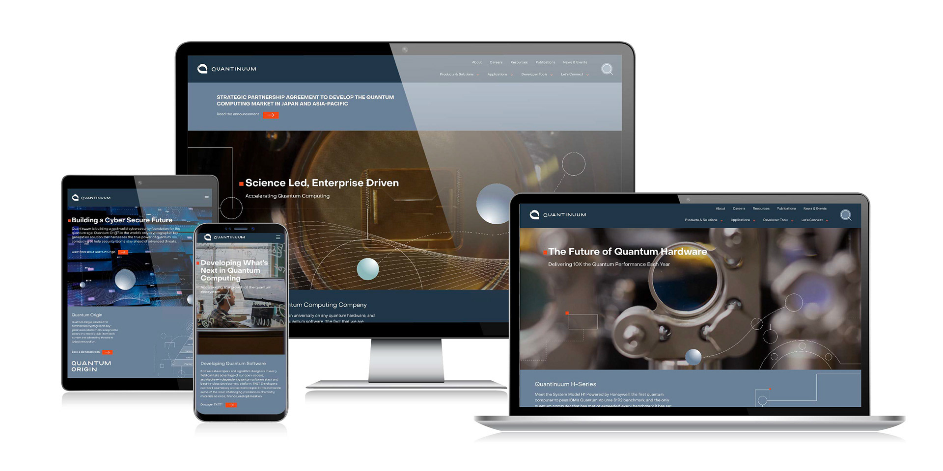
To view Quantinuum website click on image
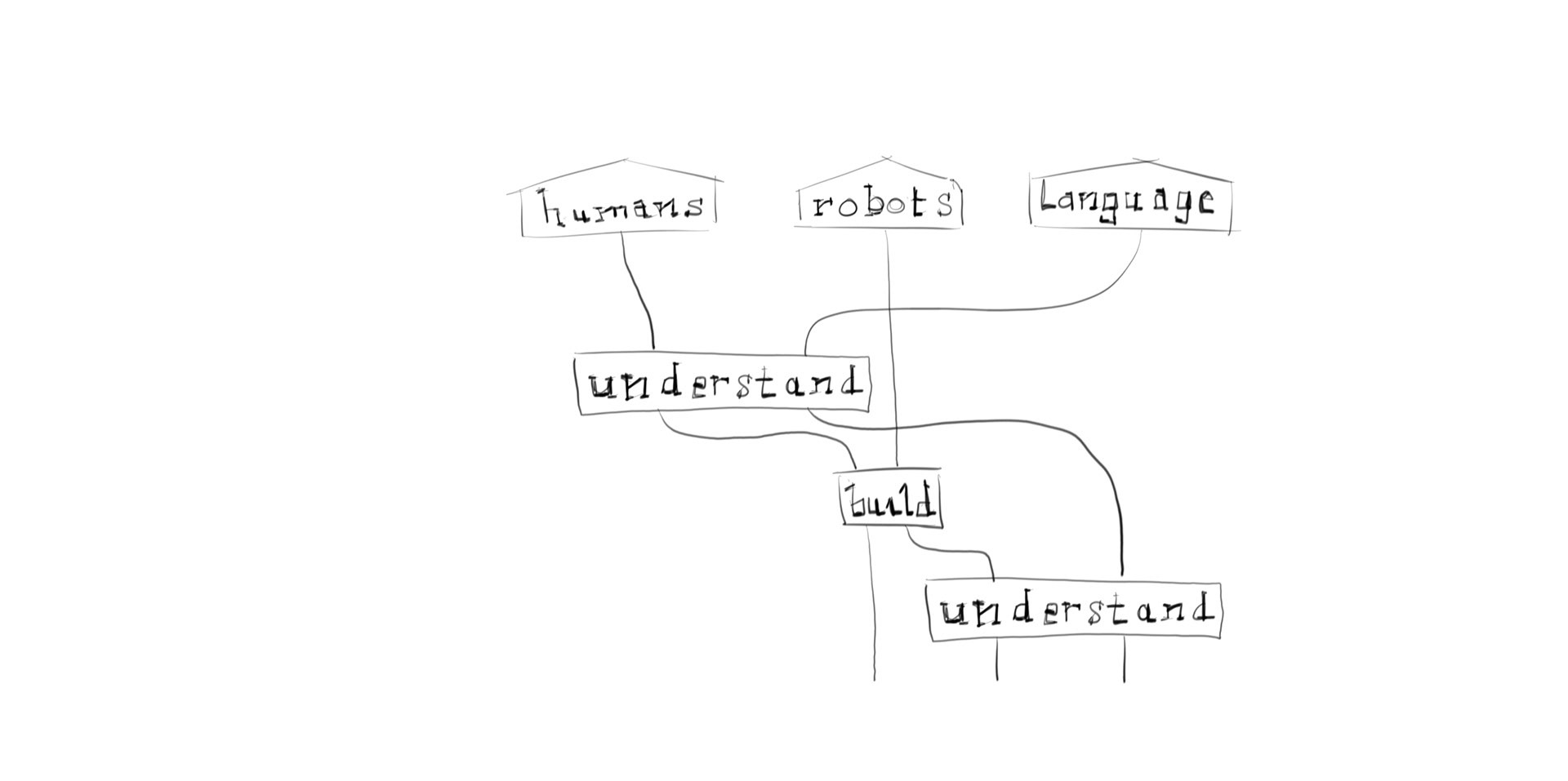
Examples of the brand design language applied to the software solutions.