As the Design Director for the E6 campaign, I was responsible for all aspects of the visual brand strategy for the E6 efficiencies including design and art direction. This included digital and print materials, and video design. I managed both internal and external teams to create all production graphics, 3-D plant sequences, and motion graphics for the video production. My role involved overseeing the entire design process, from concept to execution, ensuring that the E6 campaign aligned seamlessly with the previous Refinery of the Future campaigns visual brand.
Background
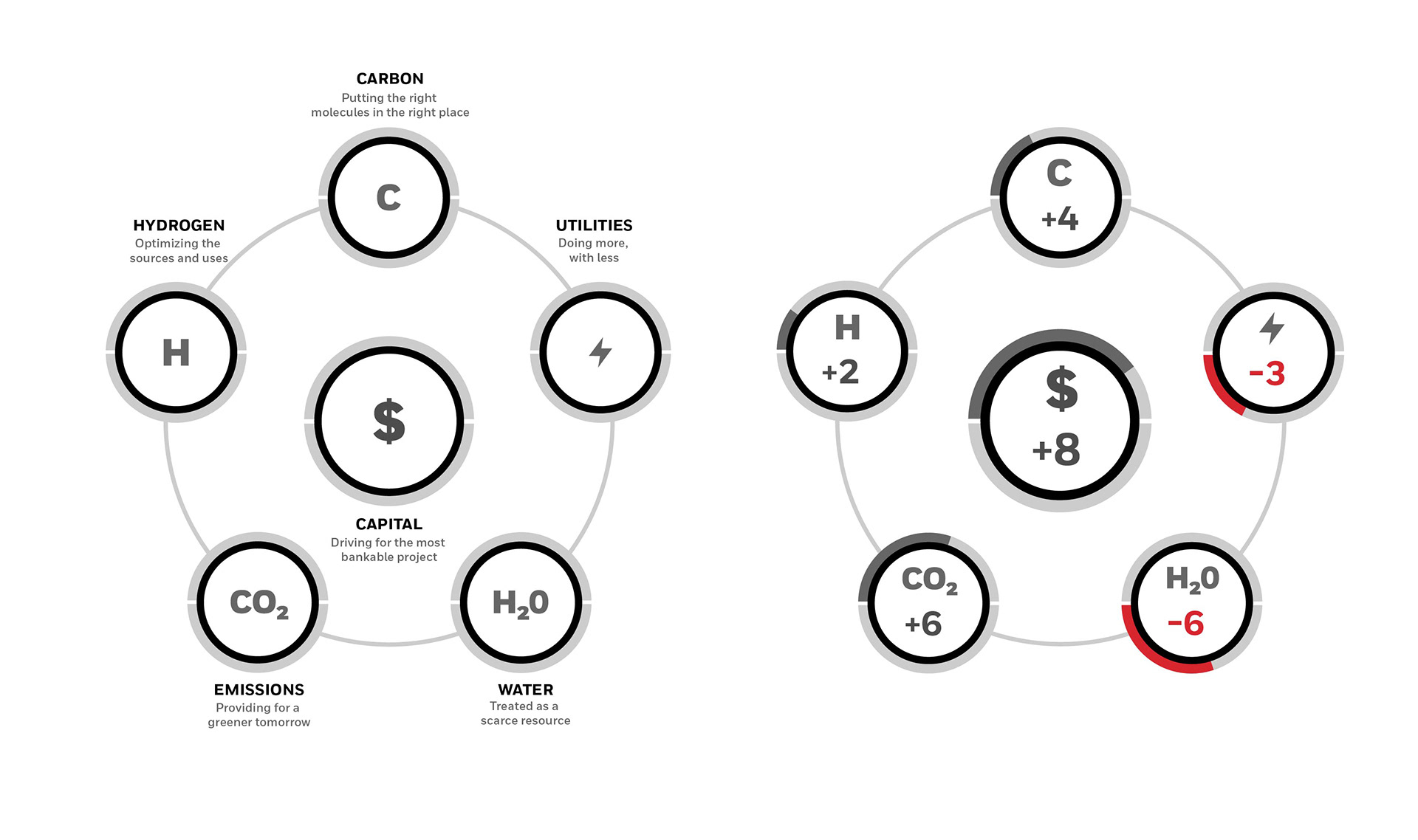
To capitalize off of the success of the Refinery of the Future (ROTF) campaign and to keep momentum going, Storystick Marketing proposed that UOP utilize their E6 refining efficiency approach as a follow-up campaign to the ROTF campaign. By expanding the Refinery of the Future story, Honeywell UOP capitalized on the success of the previous campaign to continue the conversation of the Refinery of the Future. The UOP E6 methodology is a a strategic framework that objectively quantifies and calculates the efficiency of every resource in a potential refinery configuration. This helps define a step-wise investment strategy to capture growth and engineer the most profitable enterprise possible.
Challenge
Our primary challenge was to design and brand the E6 Efficiency system and integrate that into the existing design language from the ROTF campaign. As the numerical system was still being developed by Honeywell, we were faced with a continually evolving system. The other change were were faced with is Honeywell just went through a complete brand refresh and their brand guidelines had changed. Our numerical system needed to live in this new system as did all of the corresponding digital and print ads. Another requirement for the project was to create a library of the separate visual elements for use by Honeywell internal personnel.
Strategy
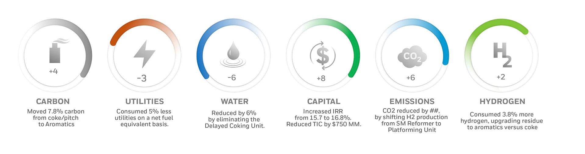
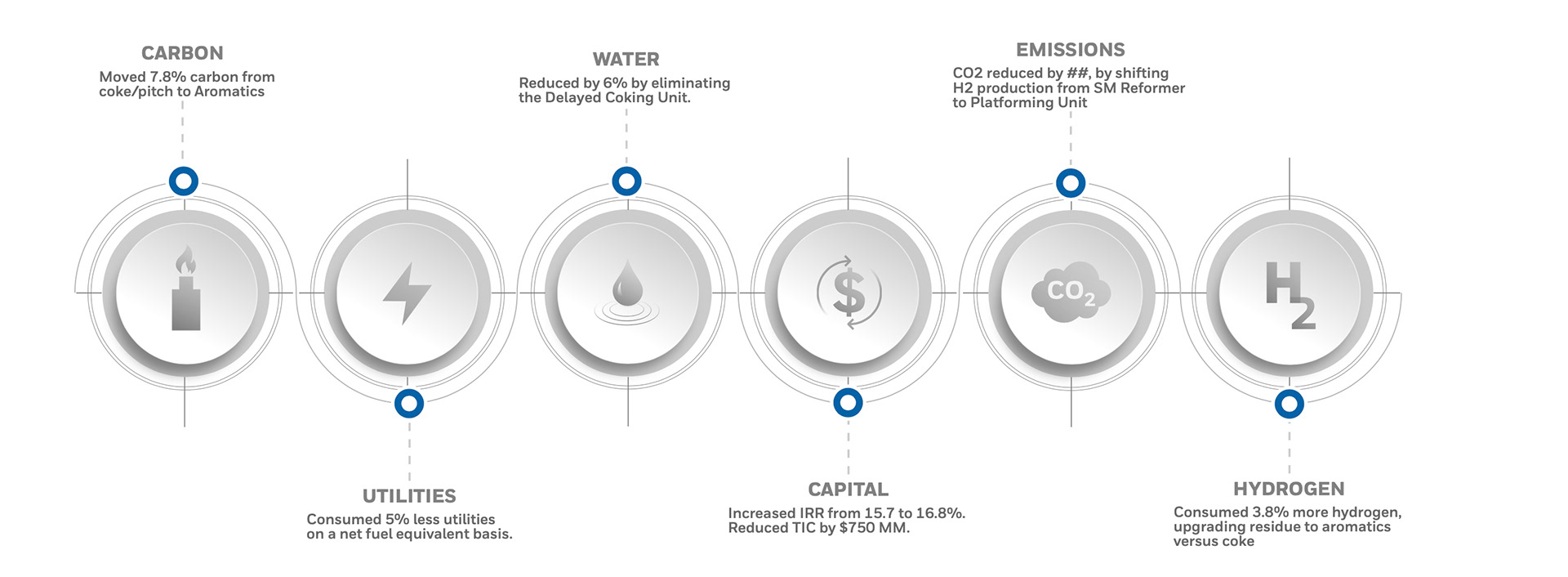
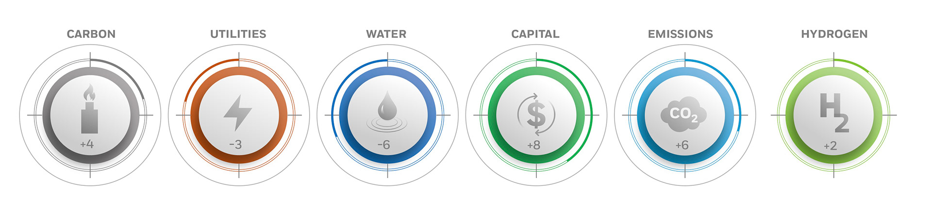
Our strategy for the UOP E6 campaign involved the development of unique numerical graphics that would effectively illustrate each efficiency and it's calculation. We began our exploration of existing Honeywell control graphics, circular technical information graphics, and other calculating control systems.
Our strategy for the UOP E6 campaign involved the development of unique numerical graphics that would effectively illustrate each efficiency and it's calculation. We began our exploration of existing Honeywell control graphics, circular technical information graphics, and other calculating control systems.
What the heck is this thing?
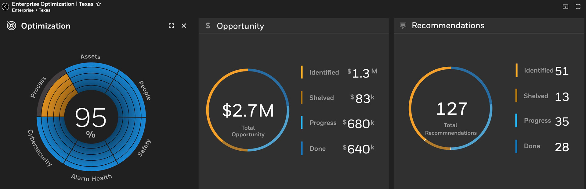
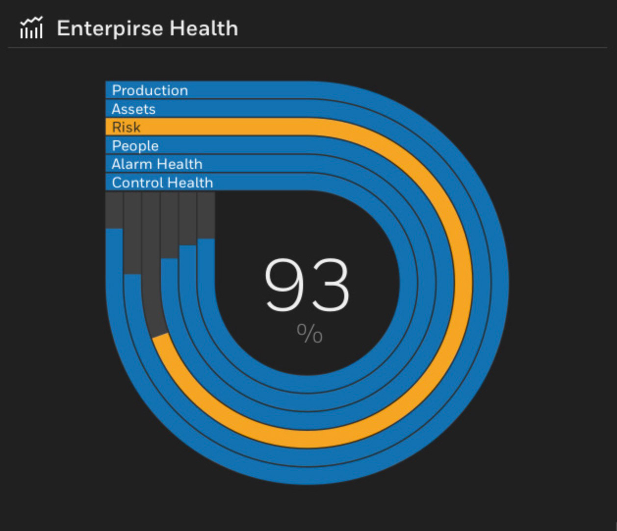
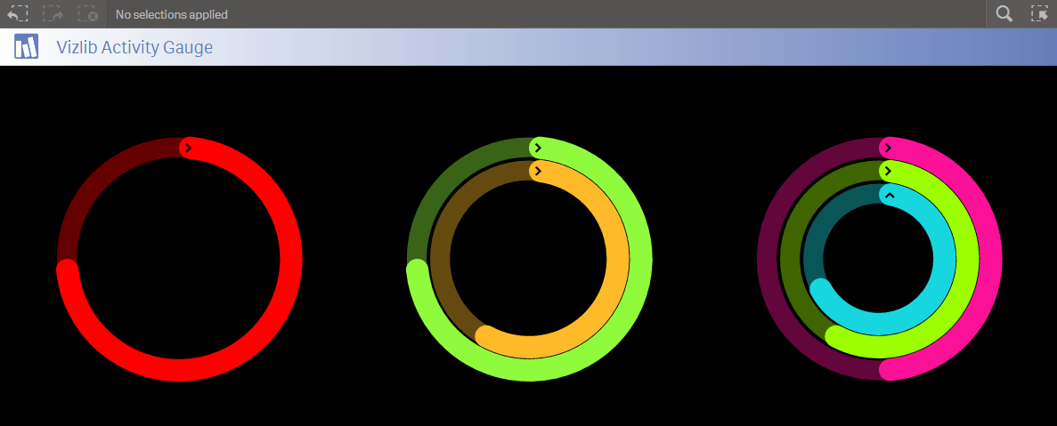
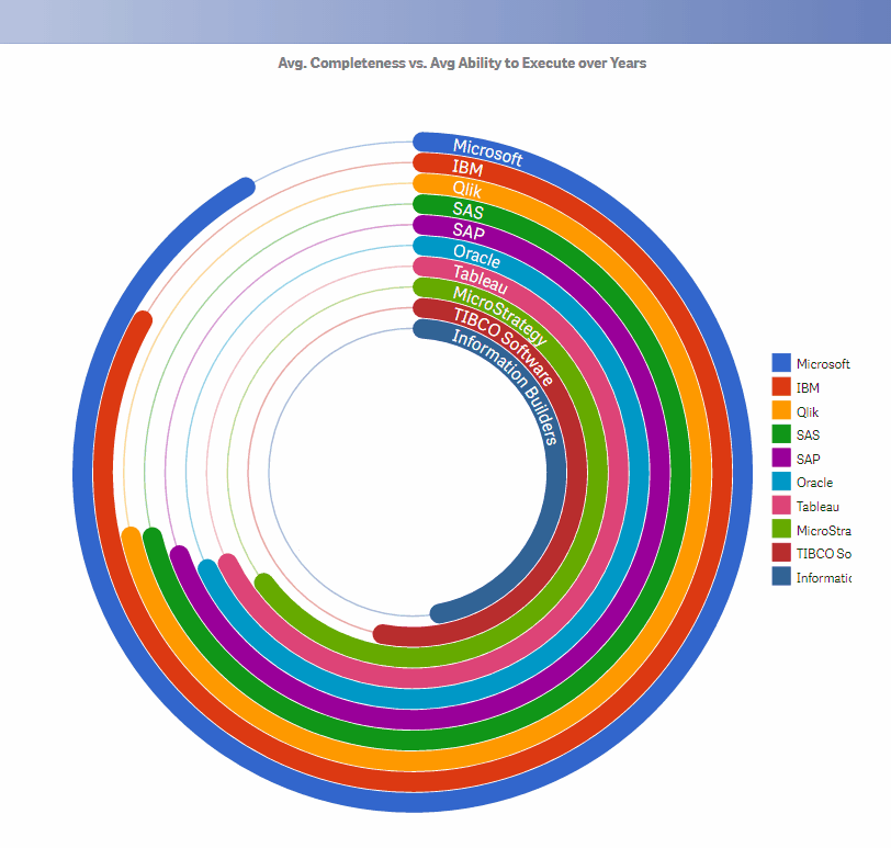
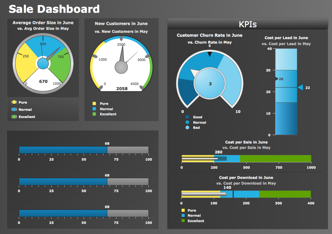
First steps were to explore various data analytical dashboard calculation methods from various industries including Honeywells. Below are some of the examples.

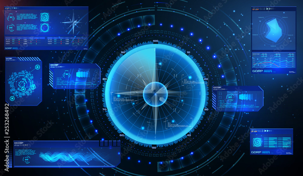
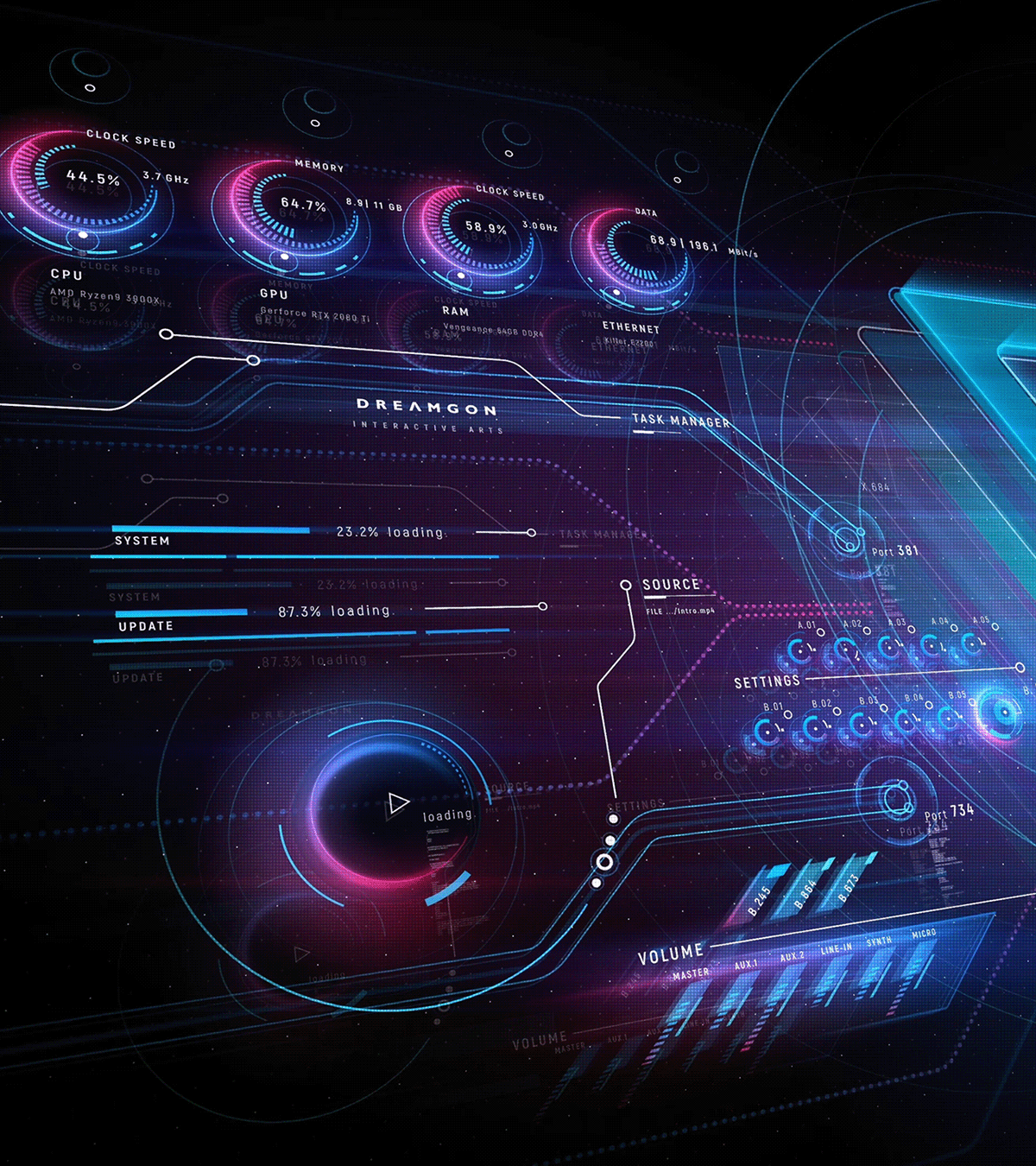
Even peeked at futuristic conceptual imagery.

Getting started was slow as Honeywell was still in the early development stages of knowing exactly how
the efficiencies would be calculated. So to start a conversation we created some very rough, quick ideas
to get a reaction and see if spawned some thinking on the Honeywell team.
Initially the Honeywell team thought that the design should be a singular unit and that it would calculate
the efficiencies in real time based on data input. An. exciting idea but it created a whole new set of criteria.

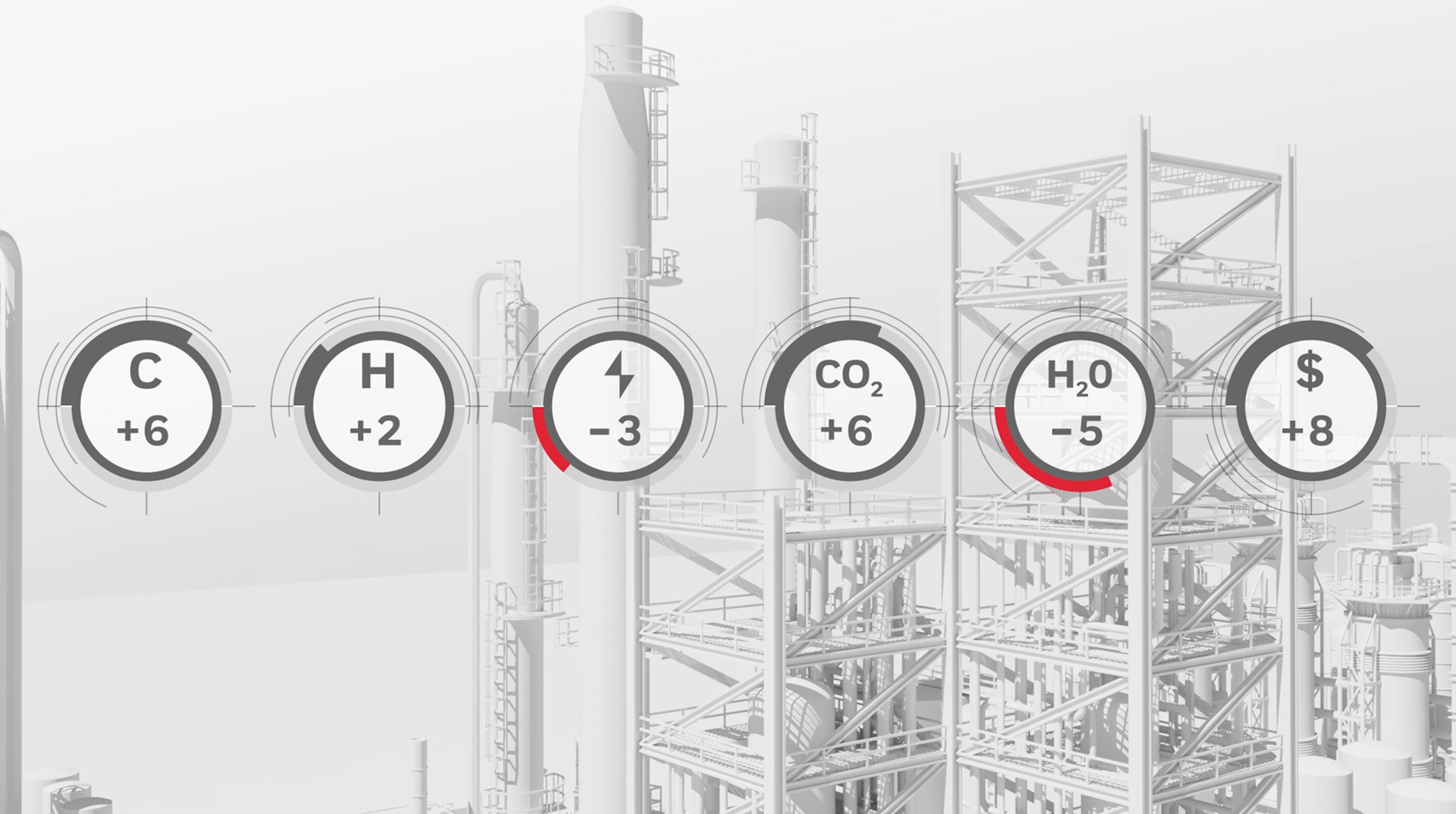
Feedback now established we would further explore individual circular expressions of the calculations. We thought a graphic icon would help with quickly identifying the efficiency and we tried some refinery type line work as a backdrop.
Next version but we needed to better communicate the aspect of the positive and negative
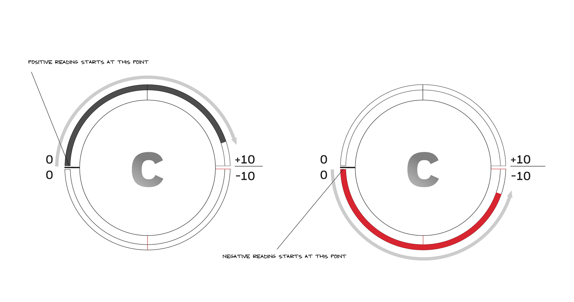
On this version I created a small circular track and divided that in quadrants. This started to work better in communicating the positive and negative reading.
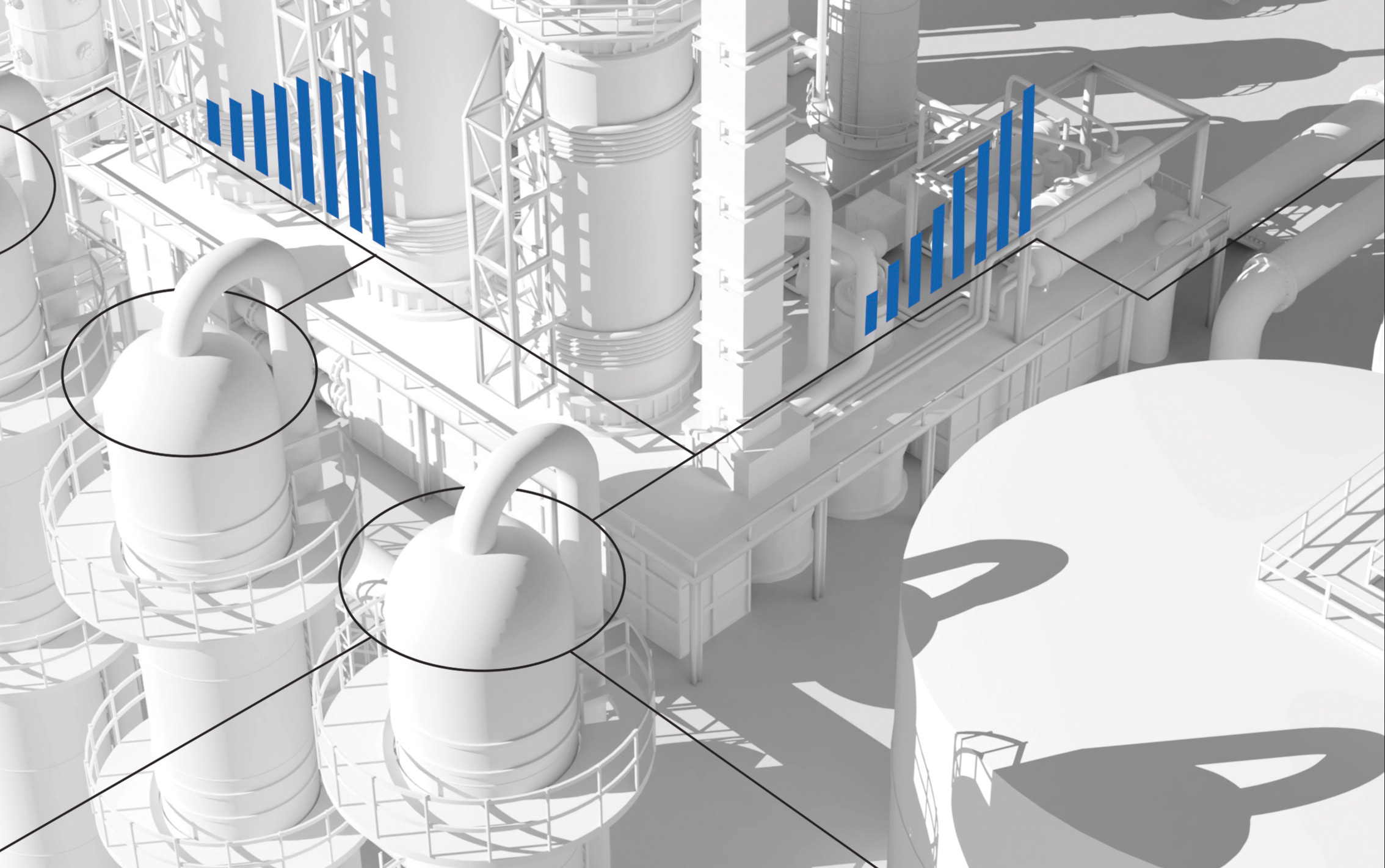
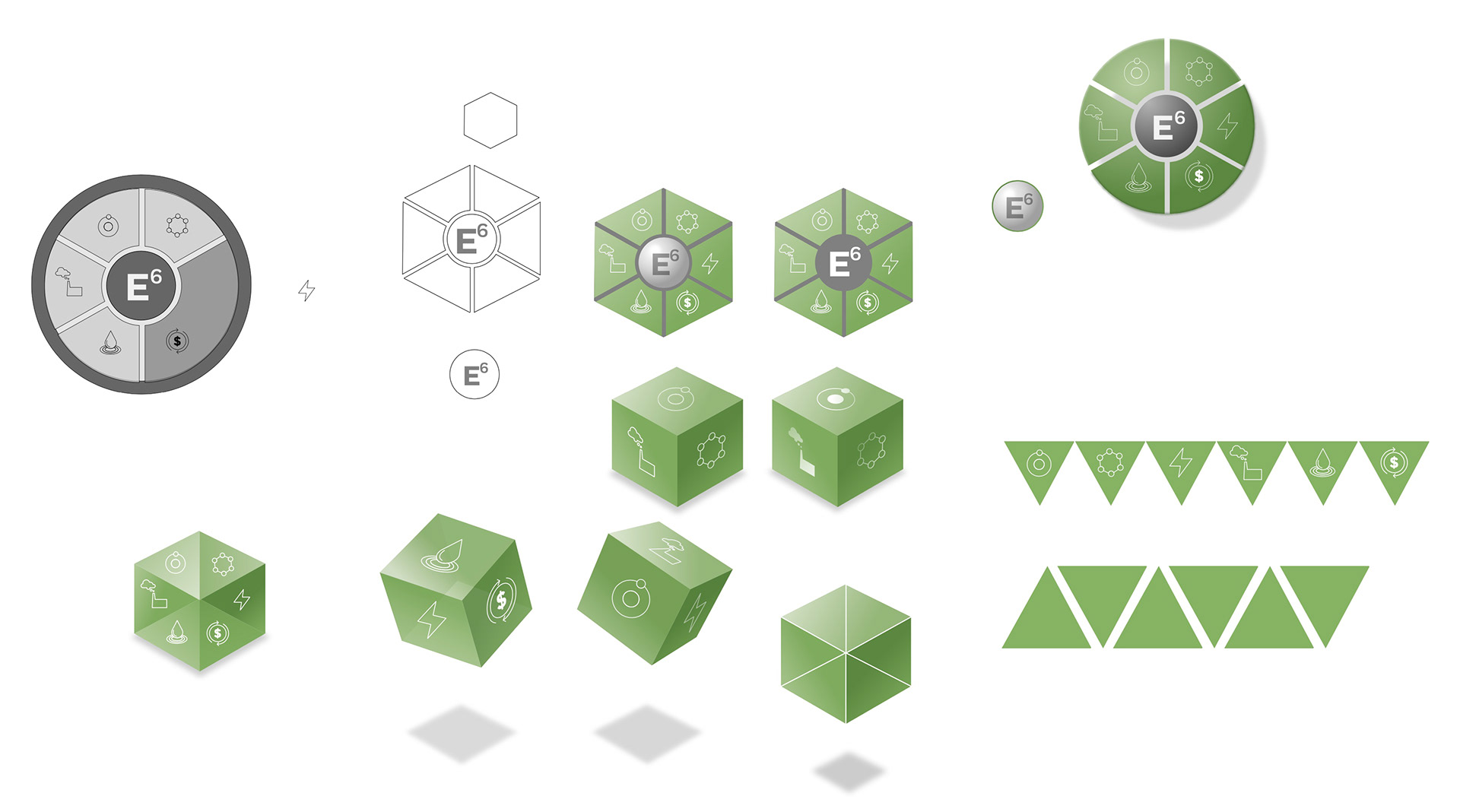
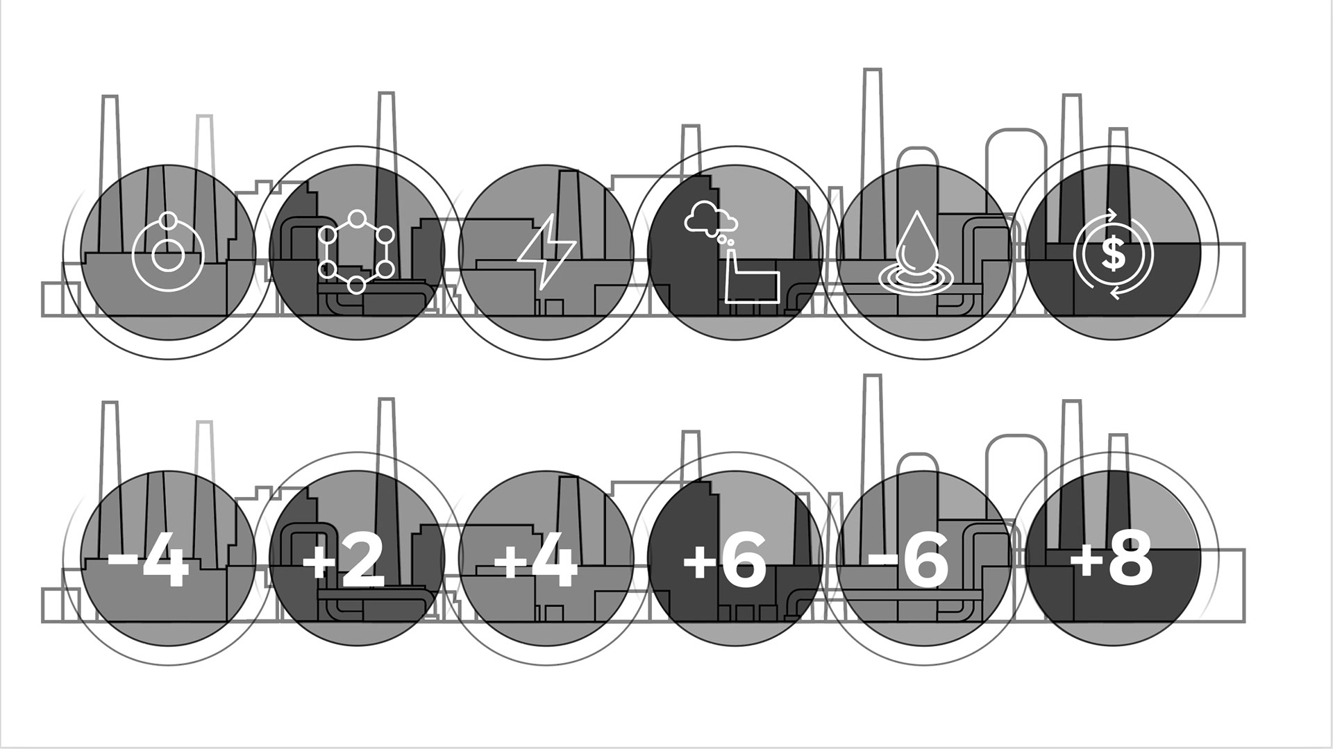
Further refinement of the design. The circular configuration was explored further. The look and feel of the white plant was applied in attempt to adopt the established design language.
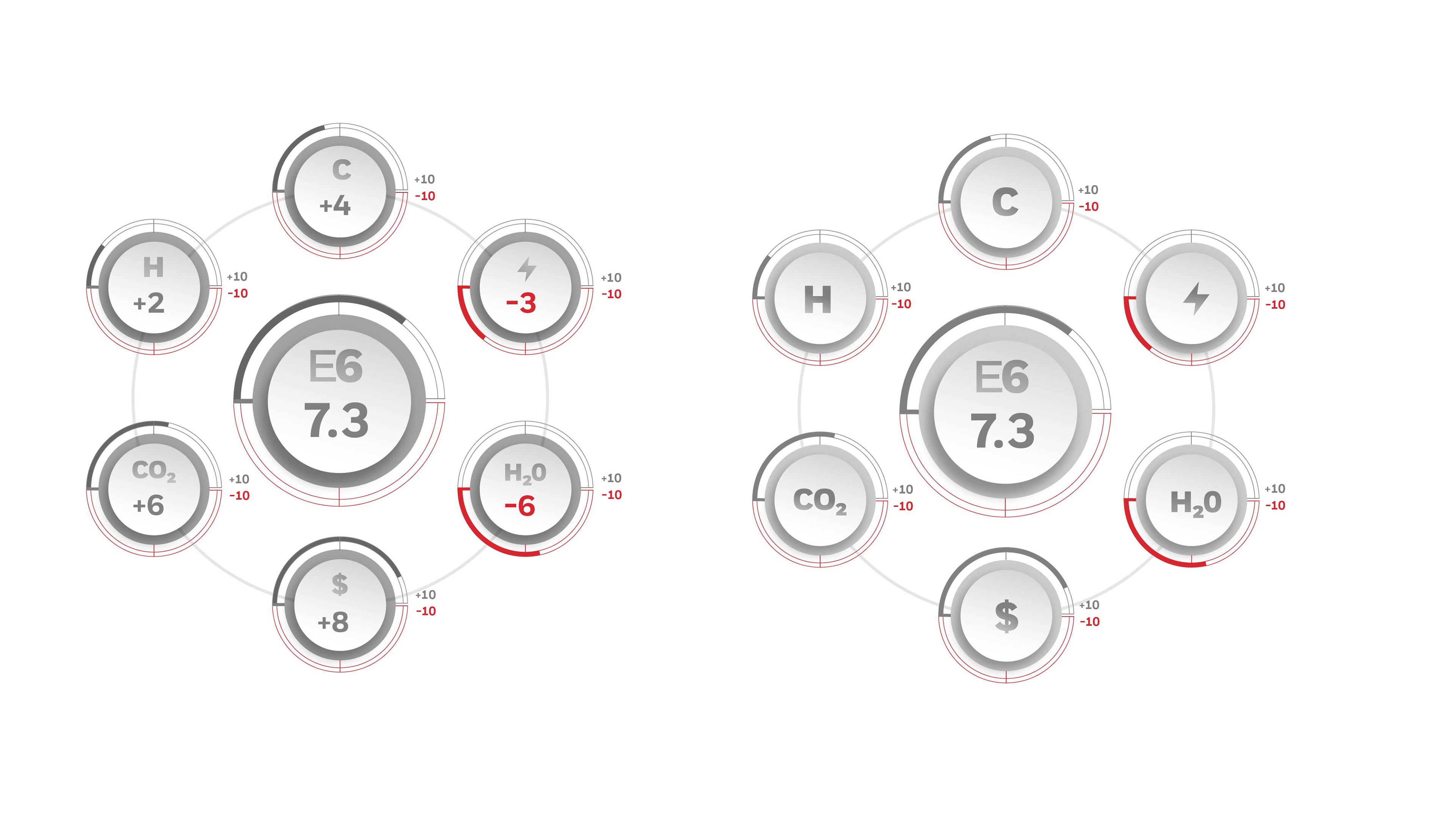

Due to the ever-changing requirements for the final library of elements, a major recommendation was made to the team to create the artwork in all vector format. This decision was made to simplify the design and make it easier to use in all marketing channels. As a result, the look and feel of the elements were well received, and the vector artwork provided a more useful and scalable system for use. Consequently, any use of rasterized images was rejected, and all elements were created in vector format.
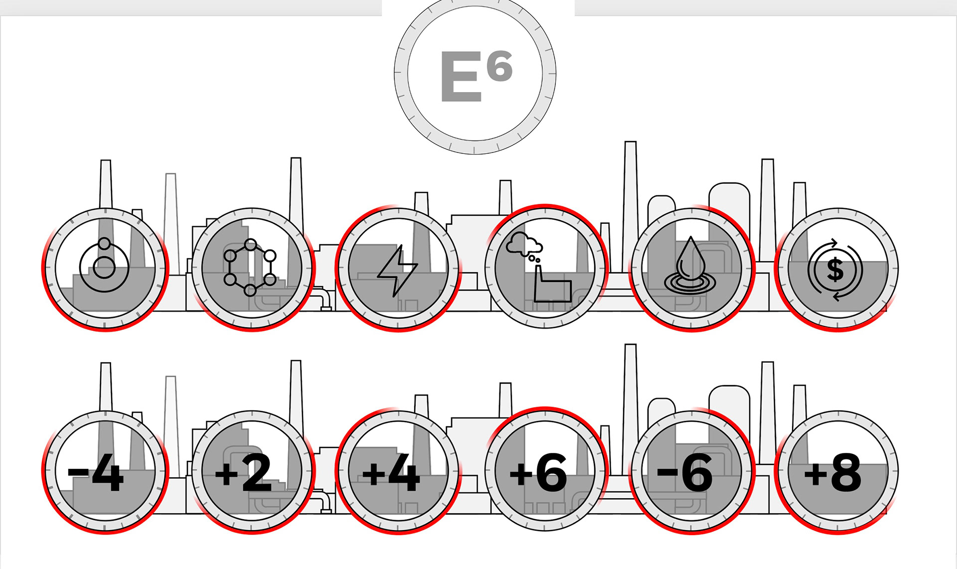
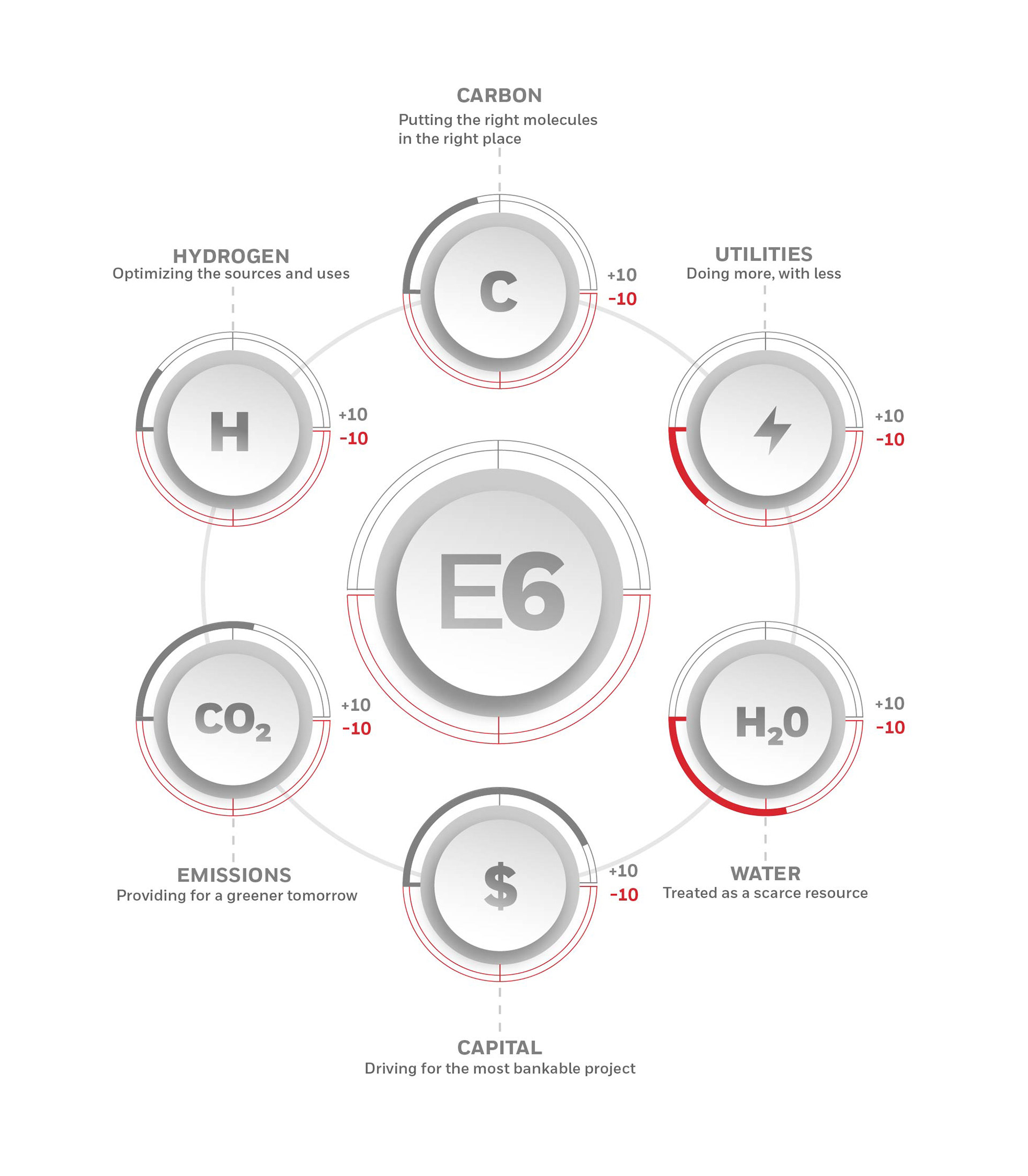
Final design please!
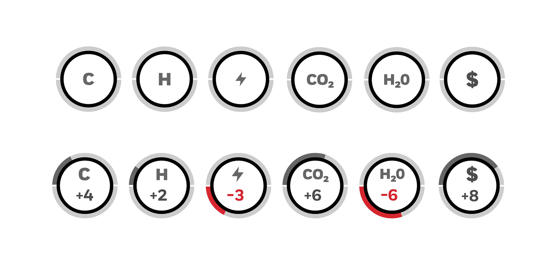
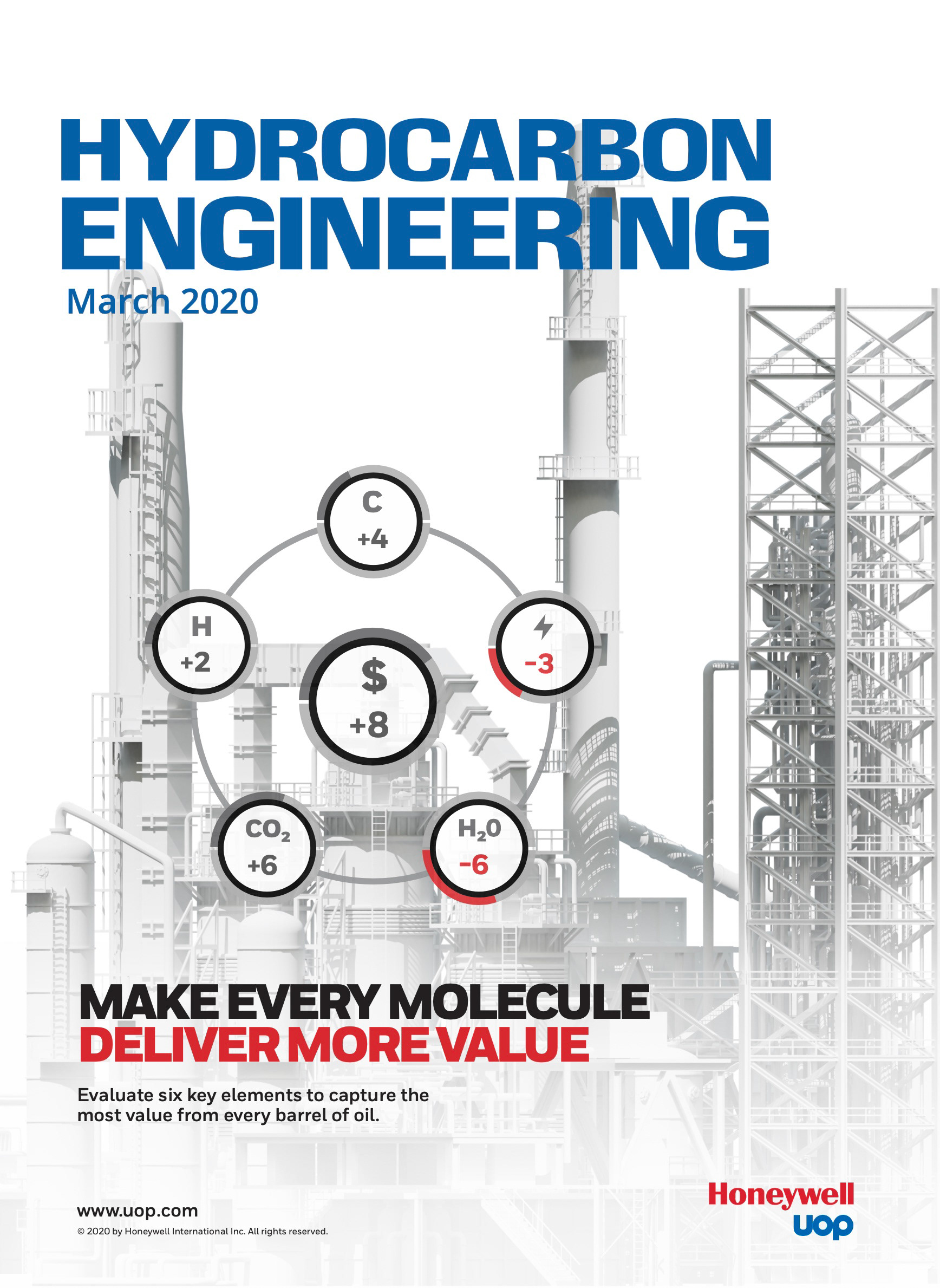
Our final solution for the E6 graphics is a streamlined, clean and visually appealing look that utilizes vector graphics and flat design. We have enhanced the visible area of the dial and increased the text size to ensure
optimal visibility and readability. The final design made it easier to create our library system of elements.
optimal visibility and readability. The final design made it easier to create our library system of elements.
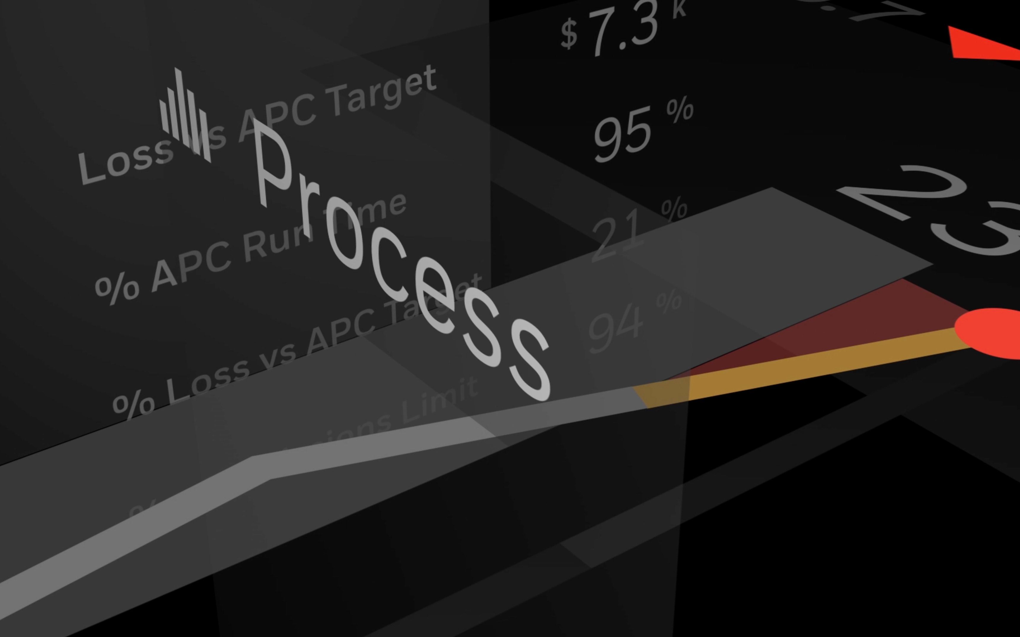
The new E6 video was created. We leveraged a variety of assets and previous messaging in the new video and modified the control room graphics to adopt the E6 calculations. New sections was added to the white plant to reflect new Honeywell technology.
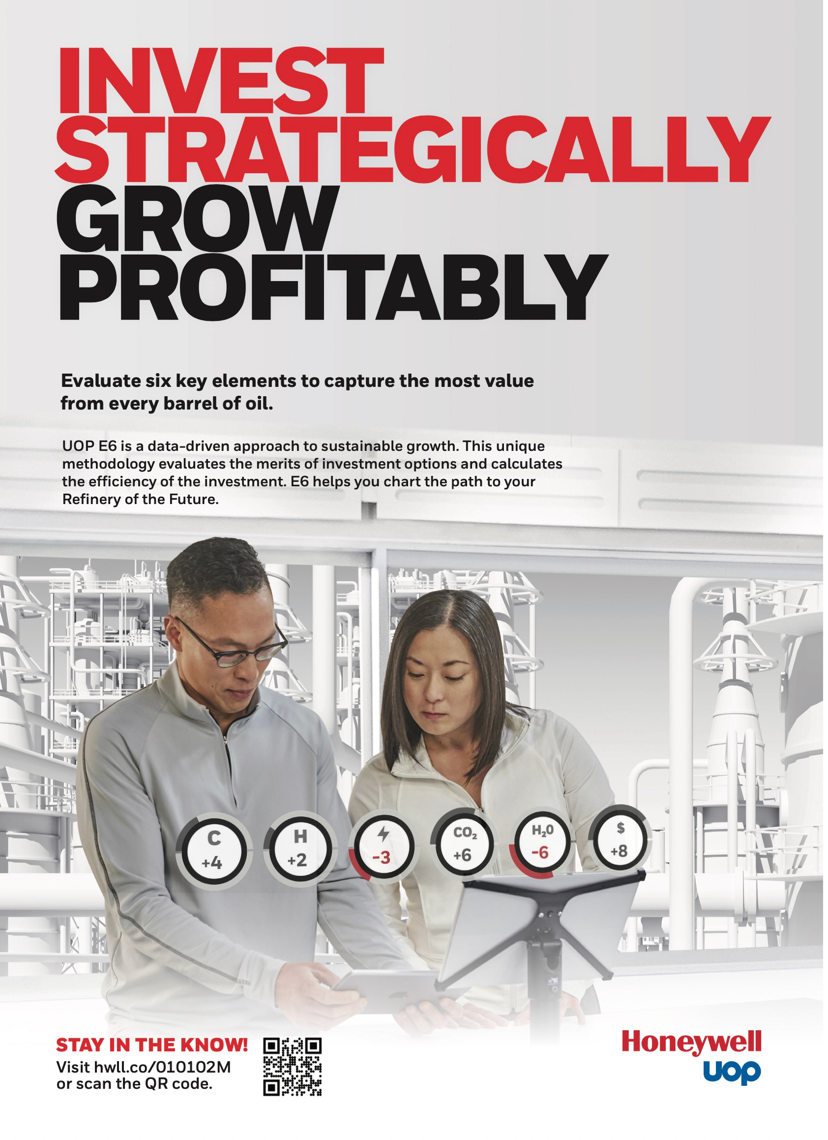
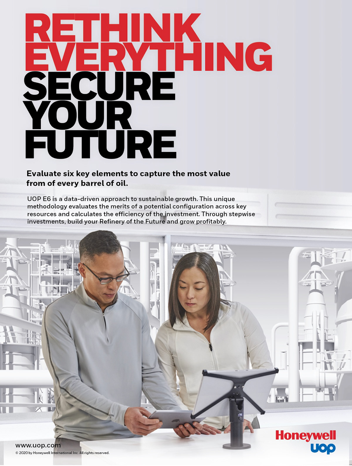
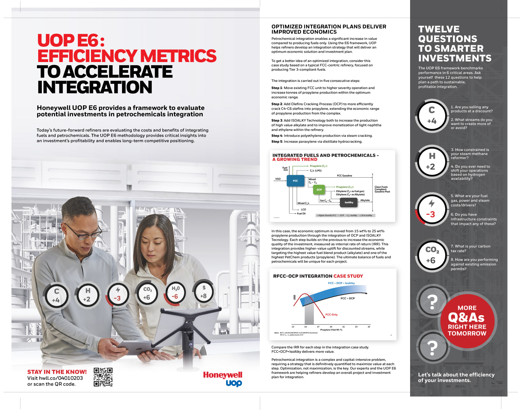
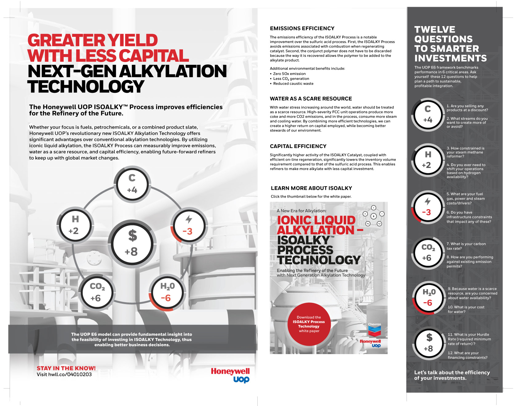
This was just one element of the new campaign. Digital and print ads were created for various trade journals and to promote ME-TECH 2020. The new variable was that we had to work within Honeywells unique new brand standards. Note the different title treatments and colors. We created a new signature image of two scientists working on a problem in the control room.
This was just one element of the new campaign. Digital and print ads were created for various trade journals and to promote ME-TECH 2020. The new variable was that we had to work within Honeywells unique new brand standards. Note the different title treatments and colors. We created a new signature image of two scientists working on a problem in the control room.


The E6 follow-up campaign effectively built upon the momentum of our ROTF campaign, allowing us to further distinguish Honeywell in the marketplace by emphasizing and showcasing the six key efficiencies.
Our success was also attributable to the seamless integration of Honeywell's new brand standards into the campaign.
Our success was also attributable to the seamless integration of Honeywell's new brand standards into the campaign.