As the Design Director for the Refinery of the Future campaign, I was responsible for all aspects of the visual brand strategy including design and art direction. This included digital and print materials, set design, and video design. I managed both internal and external teams to create all production graphics, set design and construction, 3-D plant sequences, and motion graphics for the video production. My role involved overseeing the entire design process, from concept to execution, ensuring that all materials were visually cohesive and aligned with the campaign's messaging.

Background
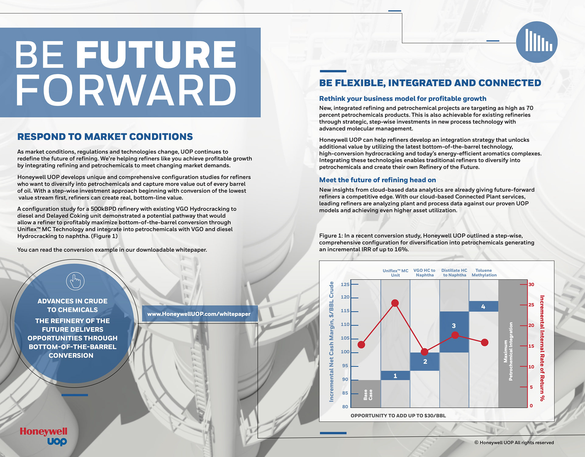
Honeywell's UOP provides industrial process solutions for the oil and gas industry. To remain relevant in the
changing market, Storystick Marketing was tasked with a comprehensive brand refresh, including a new visual identity. A comprehensive marketing campaign was created around the theme, Future Forward and Refinery of the Future. We were tasked to give UOP a new face to help promote their innovative technologies and solutions for modernizing and optimizing oil refineries.
Honeywell's UOP Refinery of the Future campaign included a range of marketing and advertising activities, such as video, white papers, case studies, print and digital ads, and social media promotions. The campaign aimed to educate and engage refinery operators, engineers, and other stakeholders about the benefits of Honeywell's technologies and solutions
Challenge
Our biggest challenge was differentiating UOP in the crowded oil and gas industry head-on. We recognized that the key to success was creating a visually impactful and memorable campaign that would speak to the Future Forward idea, while also providing us with a versatile and flexible solution that could be utilized across multiple mediums.
To accomplish this, we focused on developing a unique visual style that would capture the attention of our target audience and stand out from the sea of stock refinery shots and footage. We also recognized that the amount of marketing materials required for this campaign was significant, and we needed a solution that would give us endless options to work with.
To accomplish this, we focused on developing a unique visual style that would capture the attention of our target audience and stand out from the sea of stock refinery shots and footage. We also recognized that the amount of marketing materials required for this campaign was significant, and we needed a solution that would give us endless options to work with.
Strategy
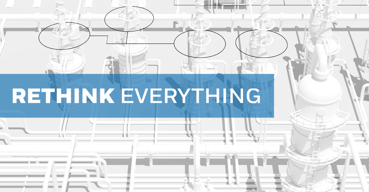
To develop an innovative and exciting visual identity for the refinery, we drew inspiration from futuristic imagery and technology in popular science-fiction media such as Star Trek and The Hunger Games. We decided early on that a 3-dimensional format would be highly versatile across various mediums and decided to incorporate it from the outset. Additionally, we identified a "future control room" as an effective means of integrating a high-tech look while authentically representing the engineers' technologies and solutions.
Let's get started on the plant!
We started with exploration of surface treatments to our 3-Dimensional plant. What should it look like to best say the future?

While exploring various metallic and gray finishes, we presented these images to stakeholders and control engineers, seeking their feedback. The general consensus was that the designs appeared too familiar, lacking the desired futuristic touch and overall visual appeal.
Wait! I think I have an idea!
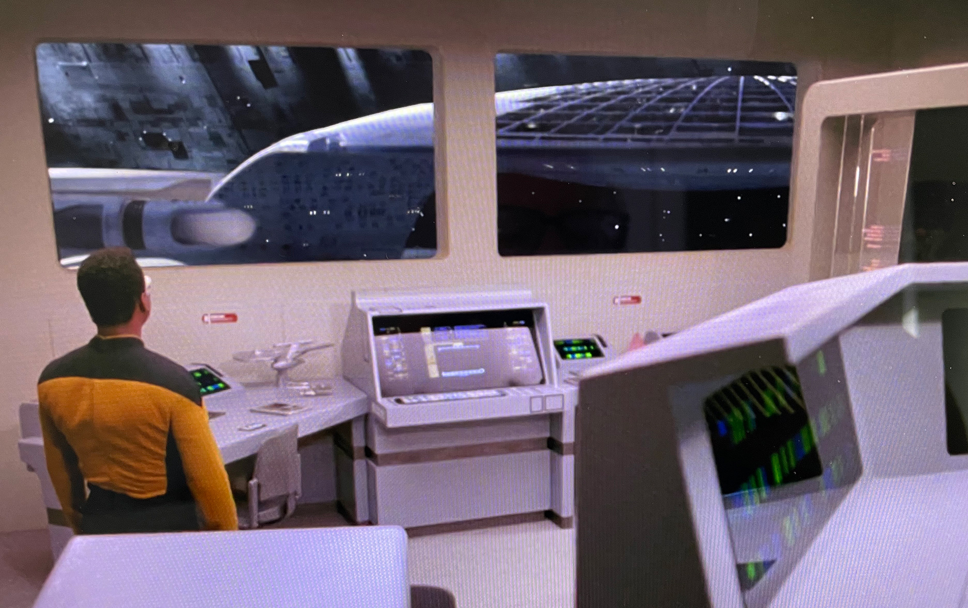
While exploring futuristic mediums, I recalled an image from a Star Trek - The Next Generation episode.
The image of the sleek white ship being built through a window was reminiscent of the white design mock-ups that I made from my industrial design days. The all-white look visually translated the qualities of research, development, and testing which is inherent to UOP. The transparent screens and control room provided additional inspiration.
More to come on that!
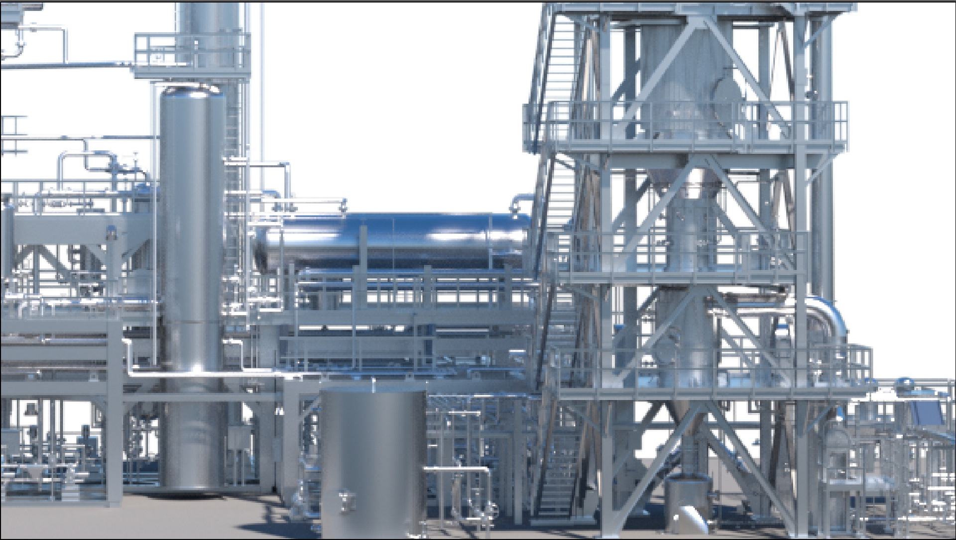
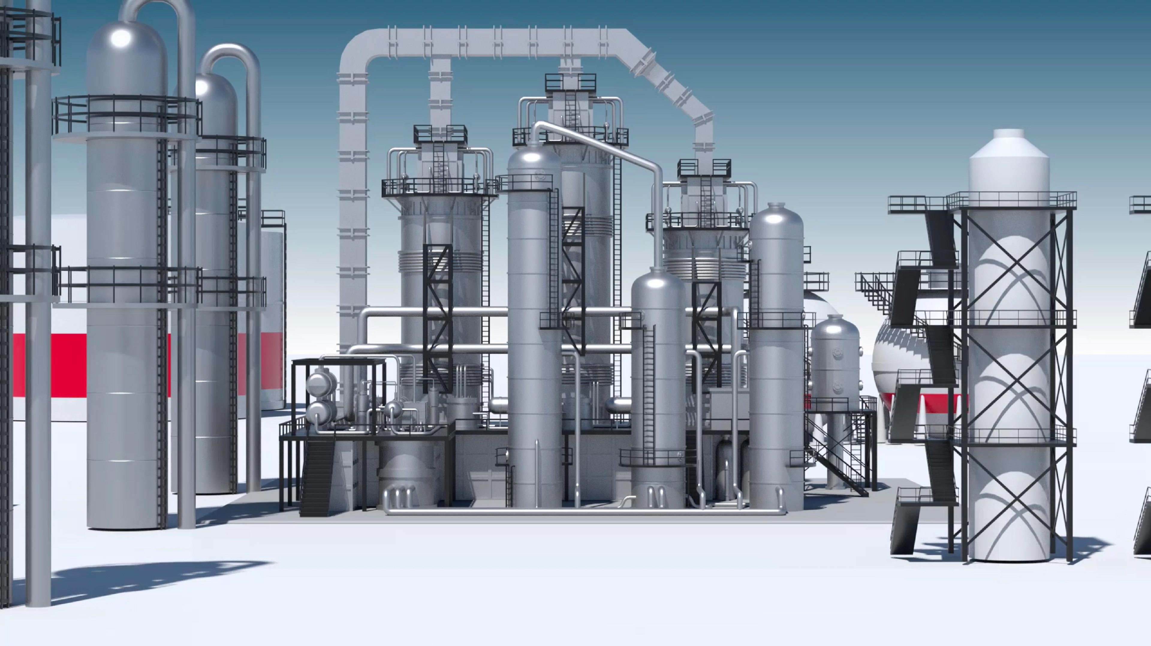
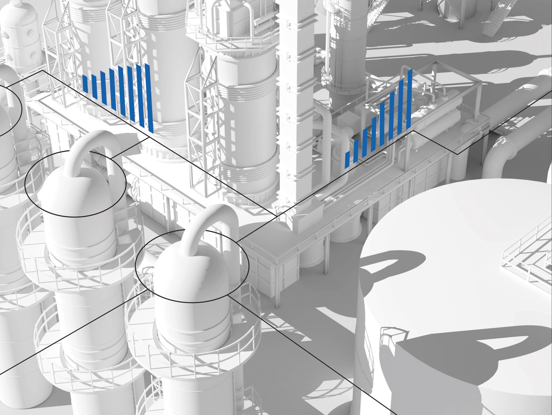
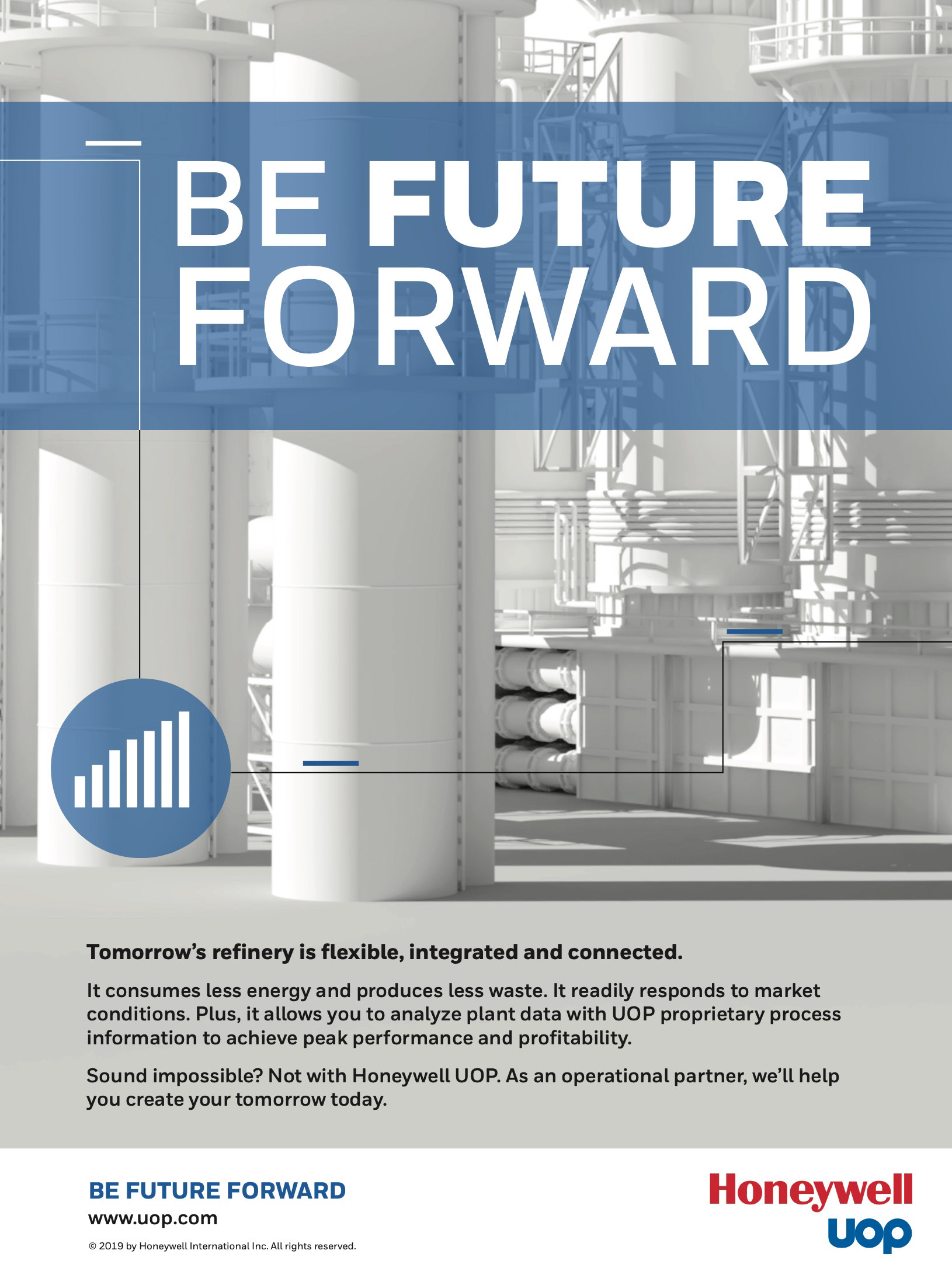
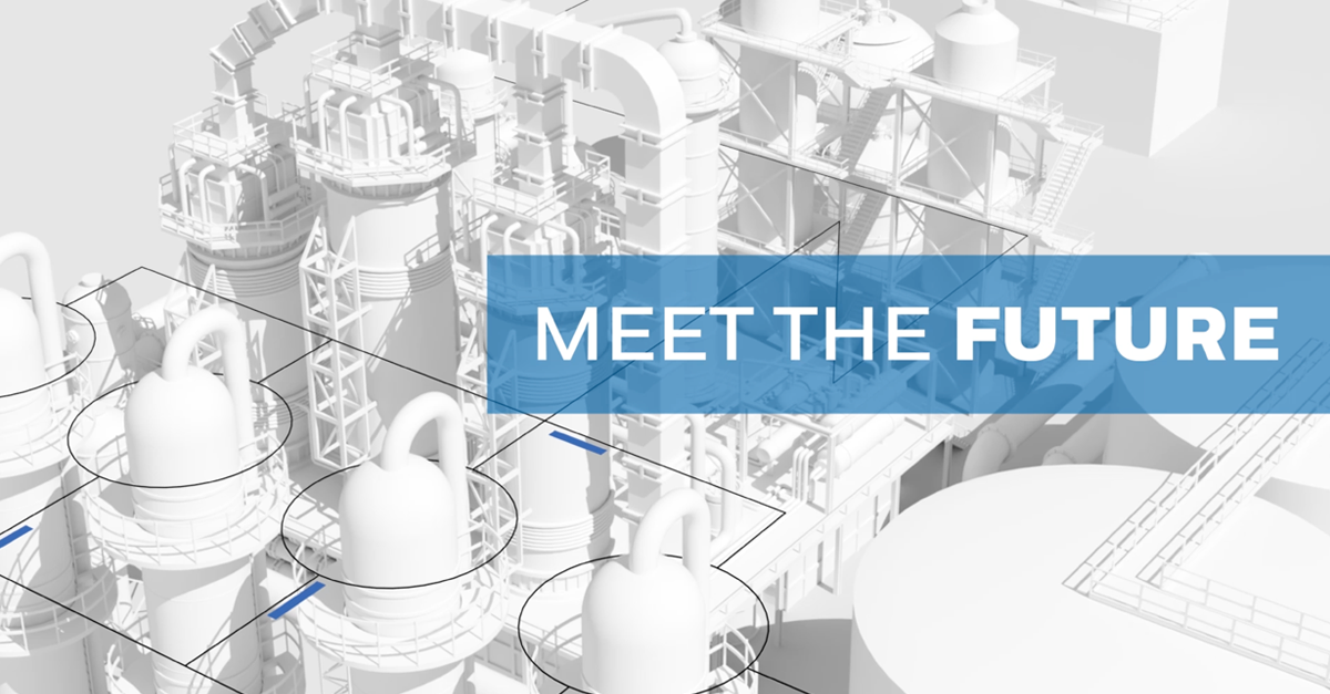
Loving the look of the ship out the window with it's futuristic and sophisticated look, I recommended an
all-white plant treatment on our 3D model. This not only proved to be visually appealing, but also perfectly embodied the "research and development of the future" aesthetic we were striving for. The UOP team was thoroughly impressed with the outcome and the design made a more positive impression on the customers.
Feedback was that we better captured the essence of their cutting-edge technologies. The team felt we were on to a truly unique and impactful brand identity that would help set the refinery apart from its competitors.

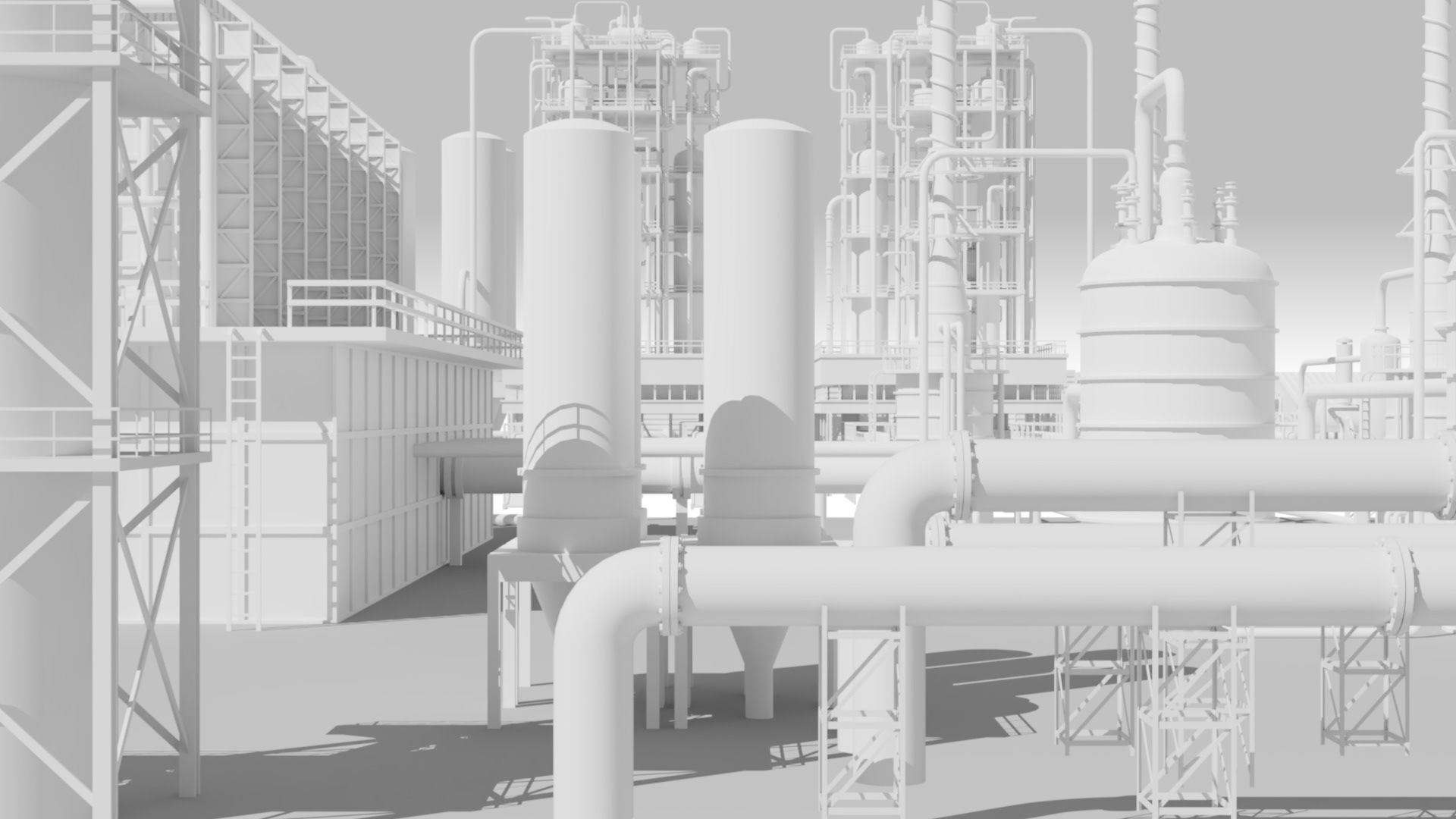
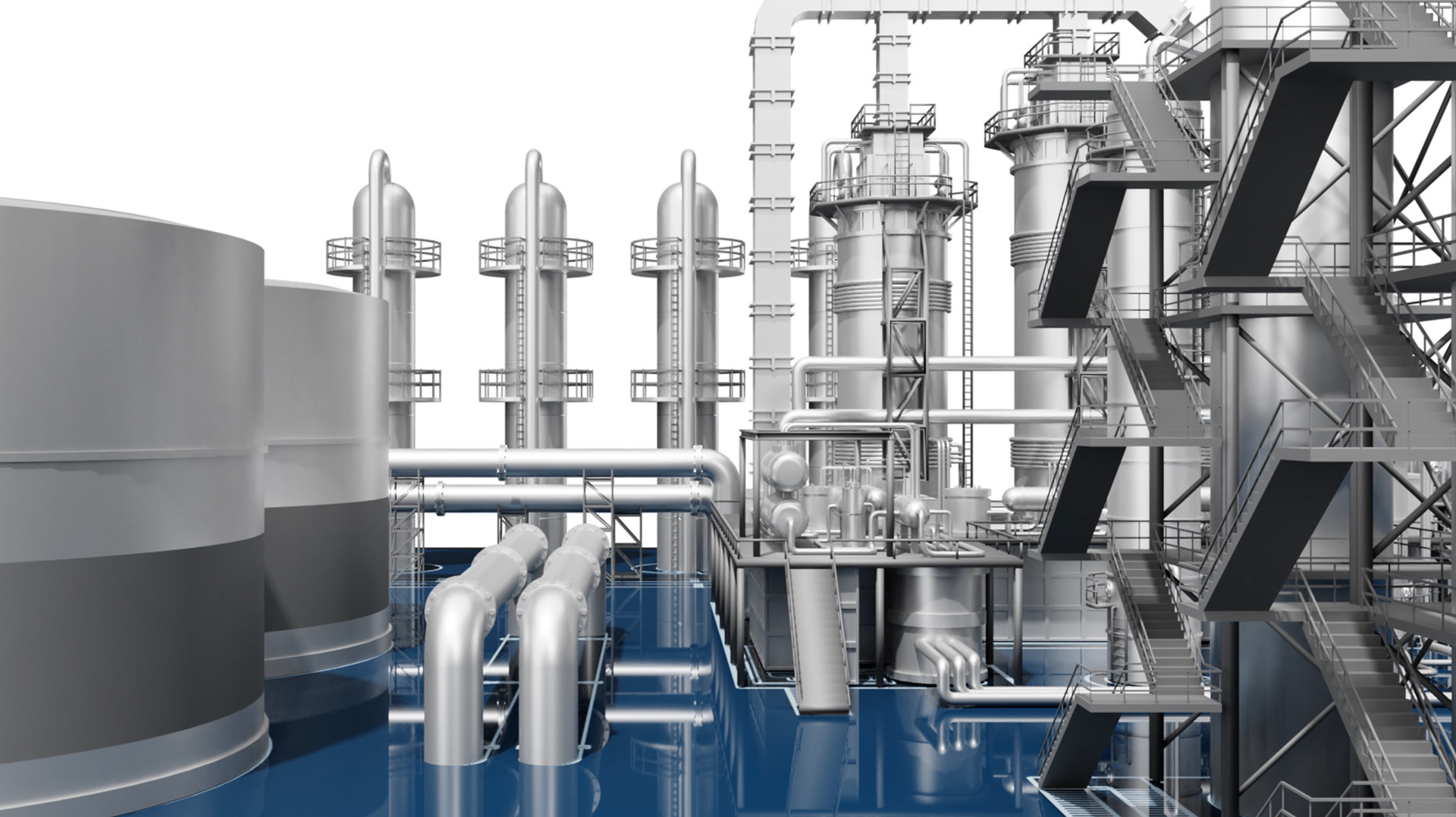
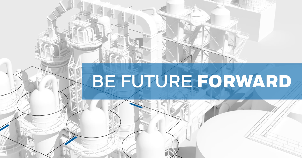
This image became our initial signature image.
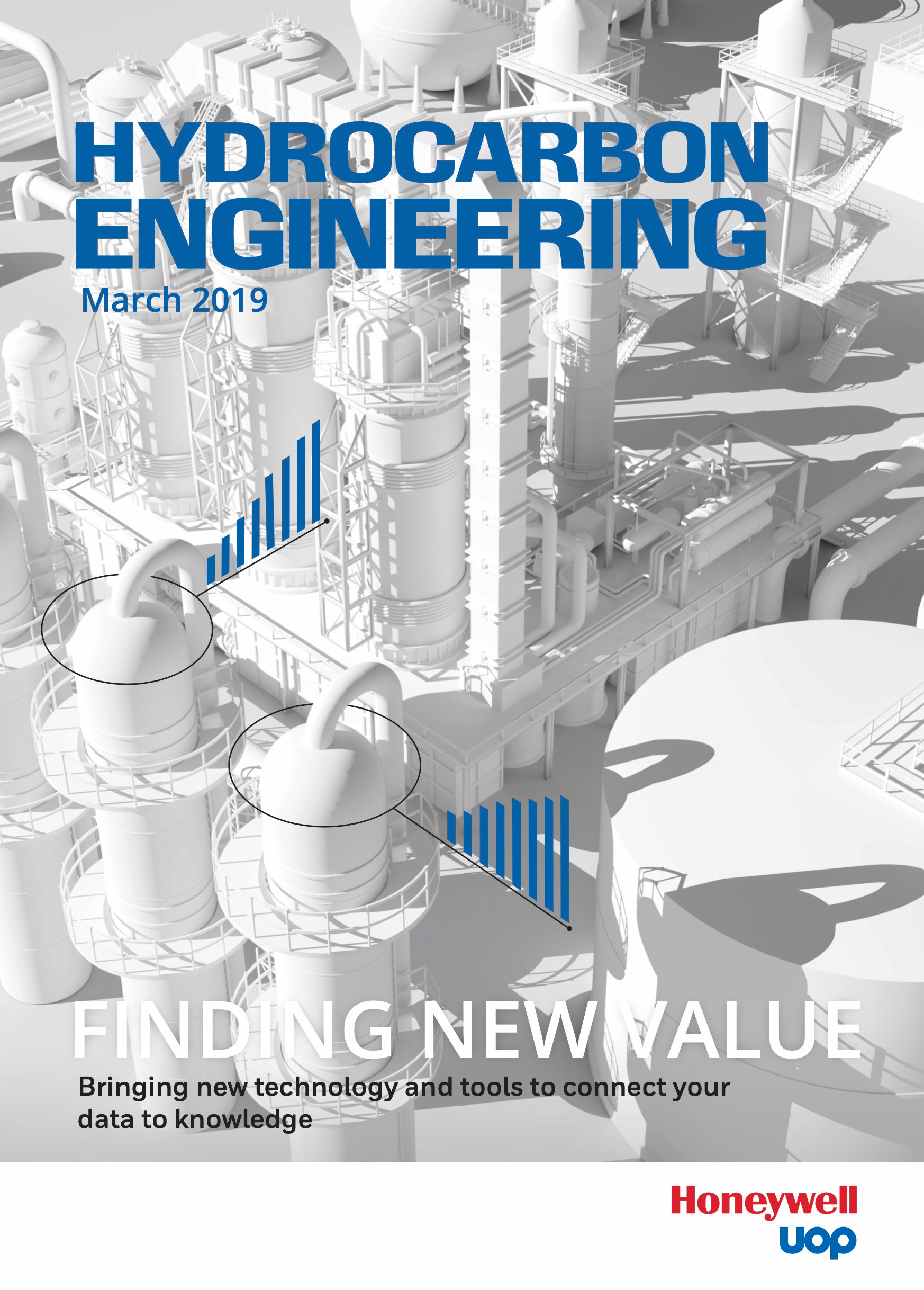
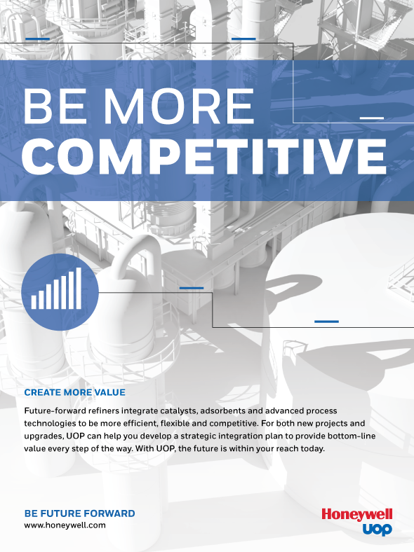
First up were some trade publications covers and full page ads. Also created were a series of Linked-In images. I explored various ad treatments within Honeywells brand guidelines..
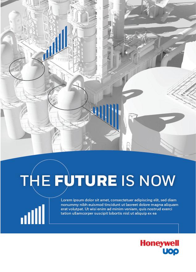
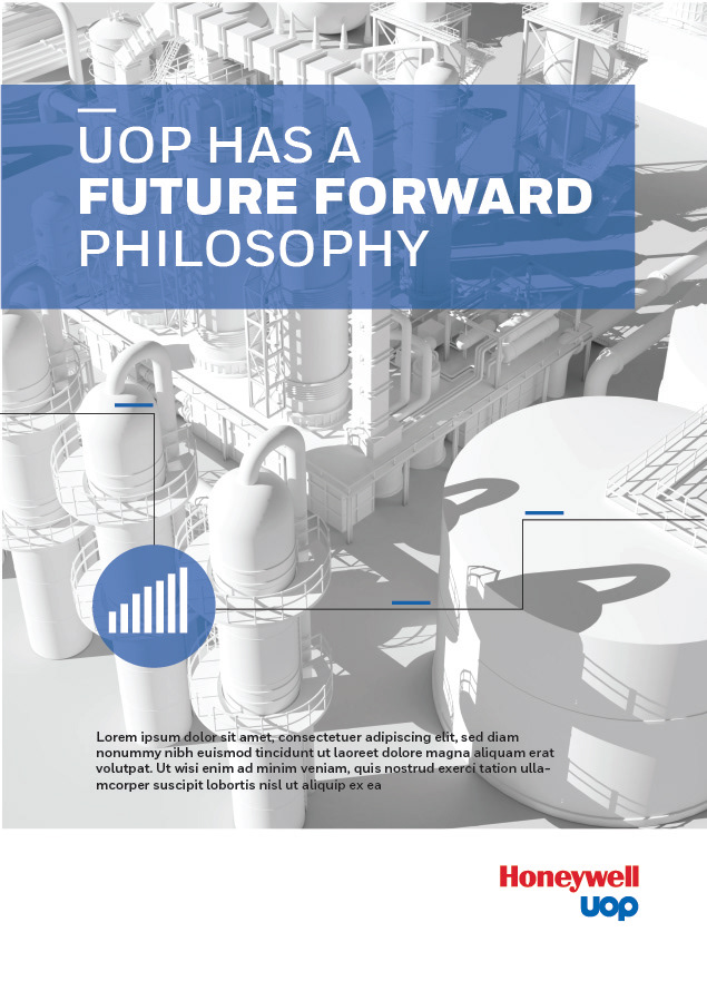
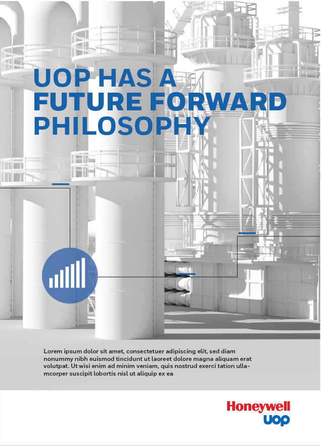
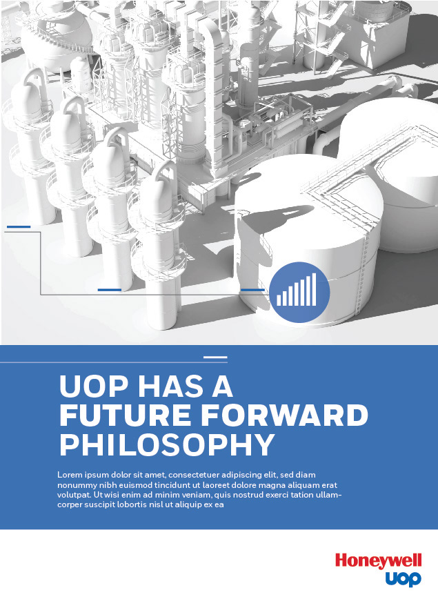
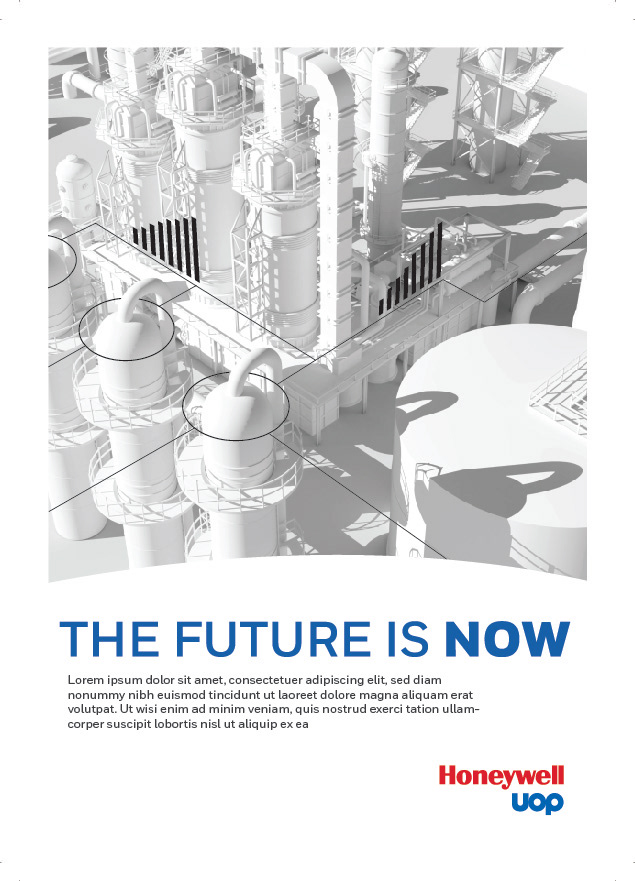
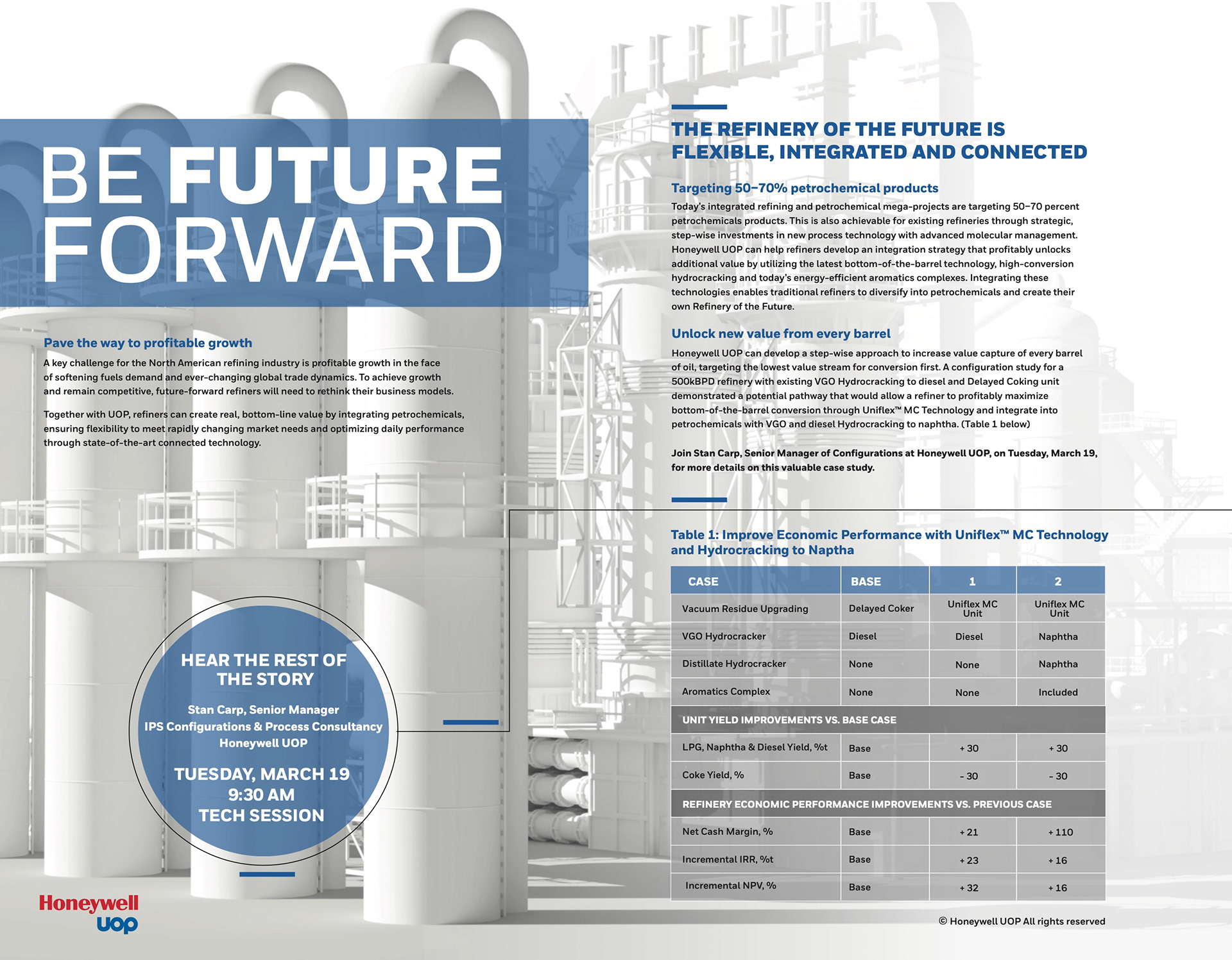
These were the first application of the new visual look. Cover for Hydrocarbon Engineering and two ads for other various trade journals. The white plant as a backdrop proved to be extremely versatile and allowed for basically endless layout possibilities.
Some Linked-In treatments.
Banner treatments

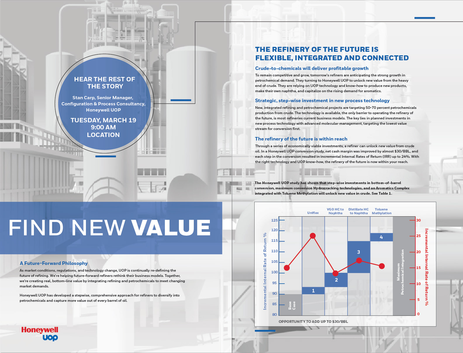
3 Different spreads for AFPM (American Fuel & Petrochemical Manufacturers).
Time to make the video(s)!
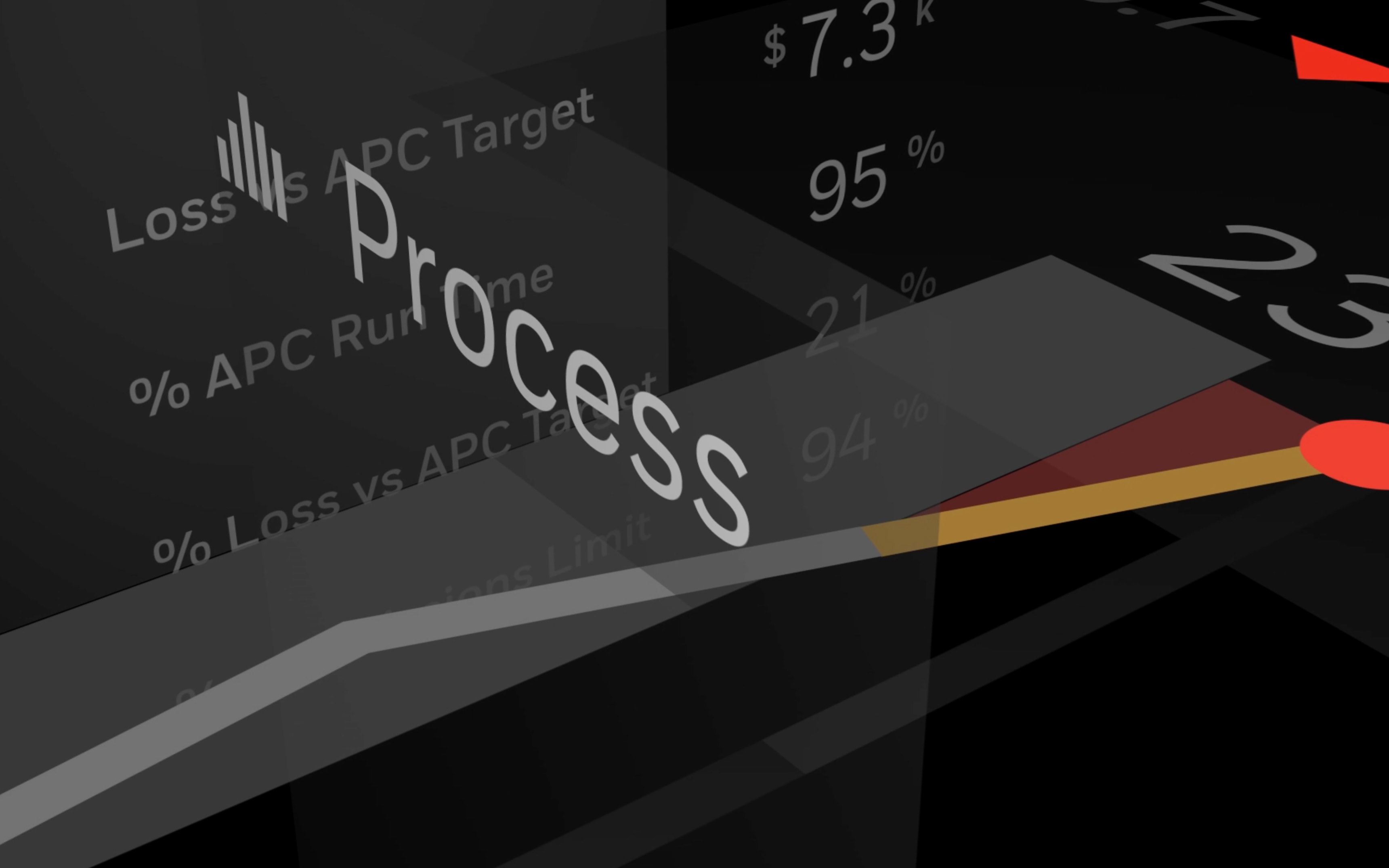
Creative direction was established that a control room of the future and futuristic personnel would be the focal point of the video and be the backdrop for key messaging. The video would depict the control room of a futuristic research refinery for UOP. It would contain high tech screens and control panels and highlight a view of the white plant out the window.
Due to time constraints and an upcoming live event we needed to postpone the full video and create an interim video using the white plant only and some existing assets from a previous video. We intended to leverage as much as possible going forward to the next video. This is how it goes sometimes.
Working with the 3D developer we created the movement sequences for the video and worked out key graphics for the messaging. We carried forward our design language established previously from the ad campaign.
Work began on the next video and we had the following tasks:
- Set design: Create and design the control room containing futuristic screens and a view of the white plant out of the window.
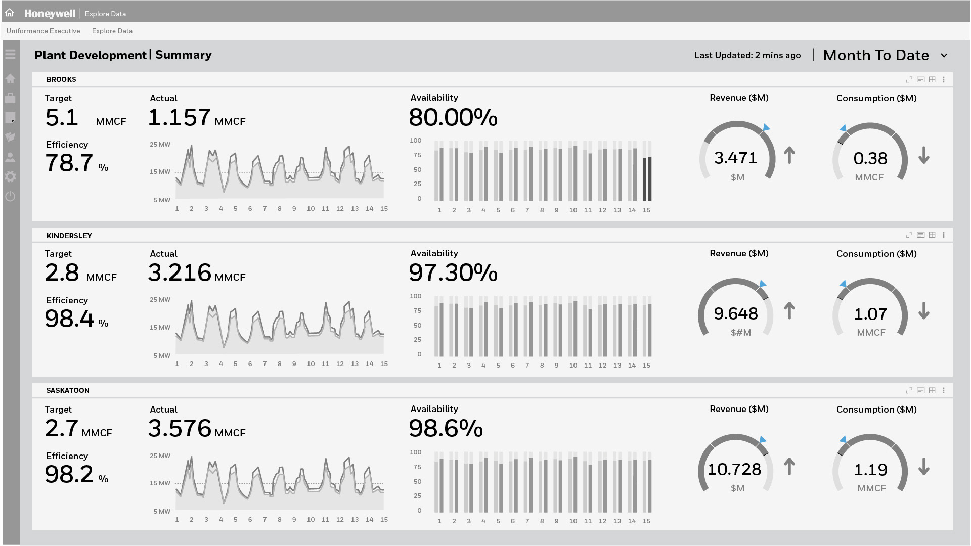
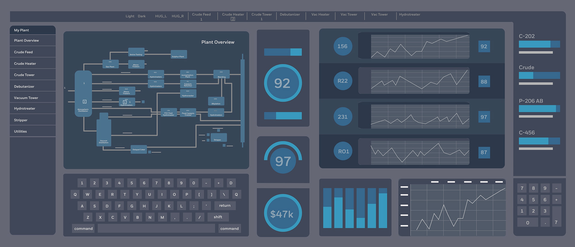
- Art direction: Design all of the digital screens in the control room and all video graphics
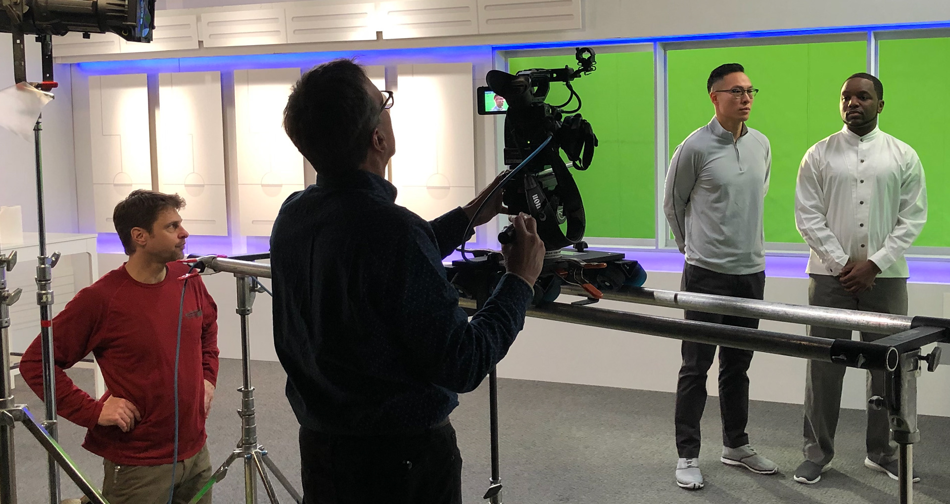
- Casting: Source actors to play the roles of the futuristic personnel in the control room.
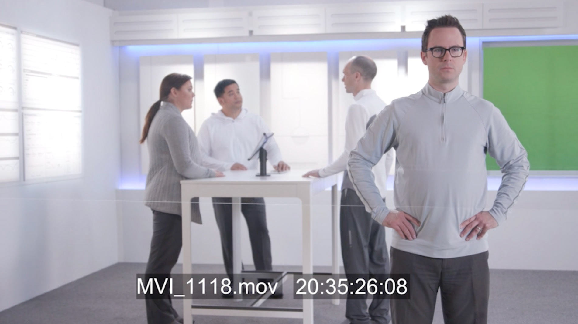
- Filming: Shoot the video with a focus on the futuristic screens and personnel in the control room.
- Post-production: Edit the footage to enhance the futuristic aesthetic and create a cohesive story.
- Final product: Deliver a polished video showcasing the refined me of the future and the control we have over it.
The control room of the future!
Conceptual illustration to sell idea to client.
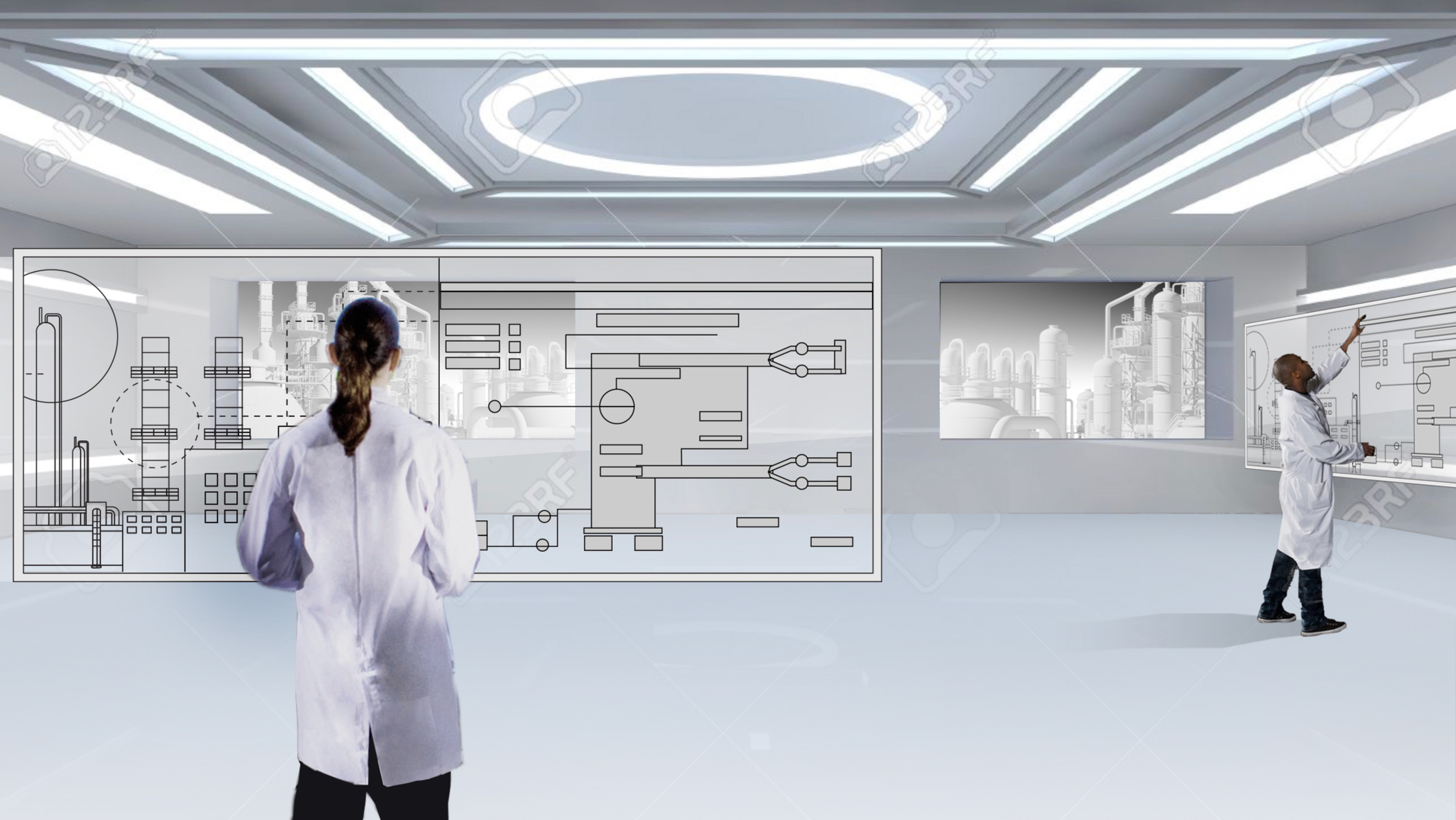
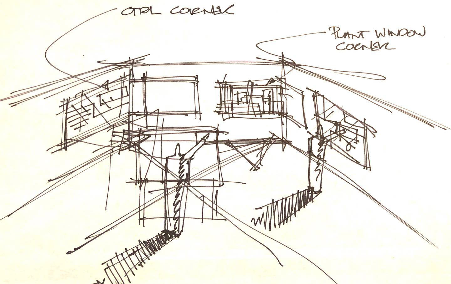
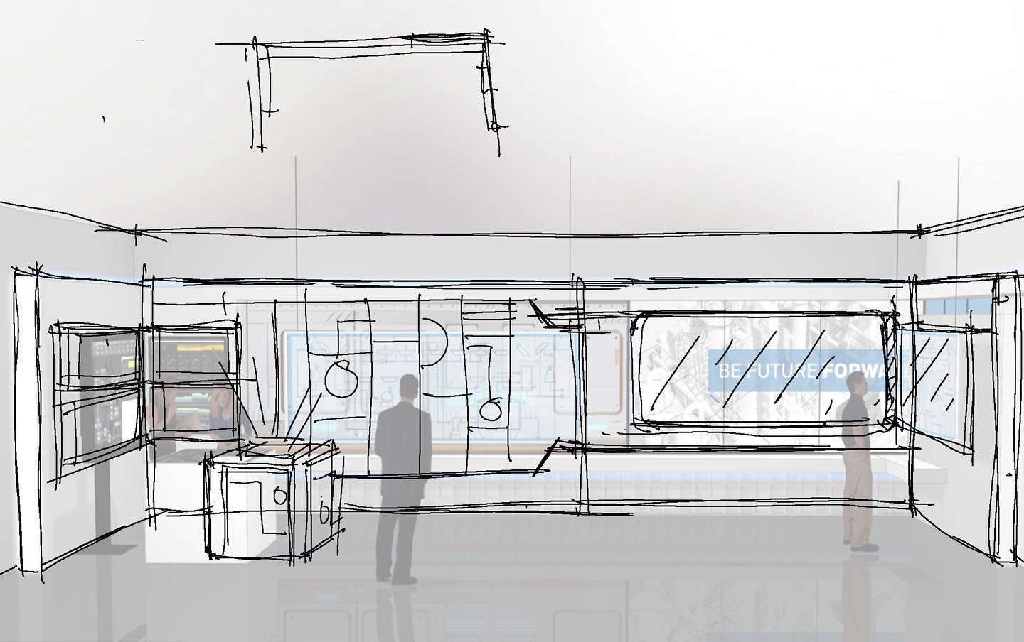

Initial concept design

Final concept design
All relevant screens recreated in vector art including architectural details in control room.

Filming begins. Large artwork of screens are created and green screen backdrops for animated screens sequences to be created in post production


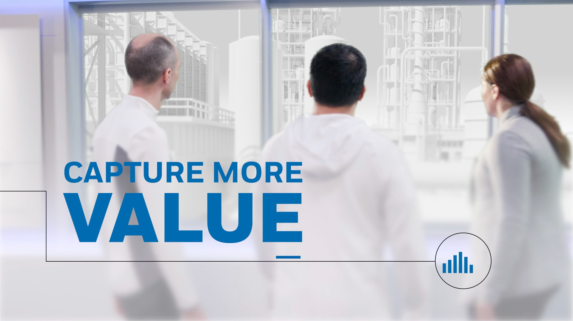
The launch of the Refinery of the Future campaign featuring the innovative use of white plant visuals was a game-changer for UOP. This unique approach differentiated the company from its competitors and reinforced the campaign's tone and messaging. The video was showcased online and at live events, resulting in the campaign exceeding its 12-month lead-generation goals in less than six months. The LinkedIn advertising achieved an exceptional 93% click-through rate, setting a new record for the company's advertising history.