As the design director, I was responsible for overseeing the visual strategy, art direction, and design of the project. Additionally, I managed internal designers who assisted with production, and ensured that all illustration elements were on-brand and visually appealing. I also collaboratively managed the motion graphics editor and managed the video production and animation direction.
Background
The client sought to generate buzz for their new suite of industrial grade SaaS software applications, which enables constant monitoring of refineries, petrochemical or gas processing plants for optimal efficiency and reliability. Although the software development was still in its early stages, we were tasked with producing a launch video for an upcoming press release. I selected this case study due to the obstacles we encountered while working with limited resources and time.
Challenge
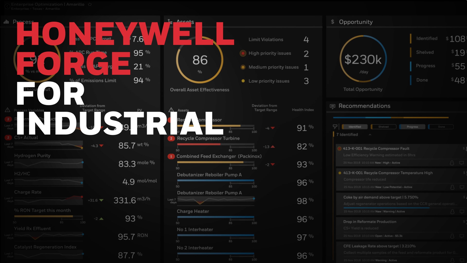
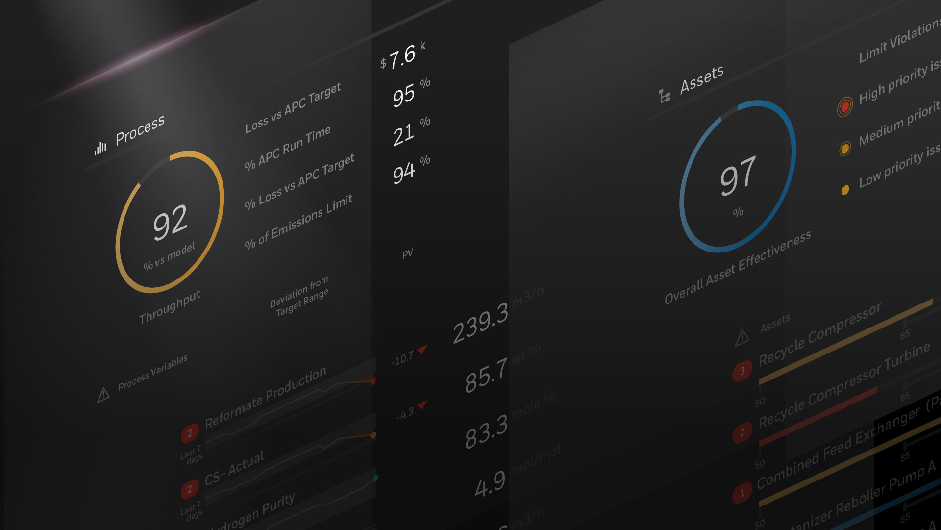
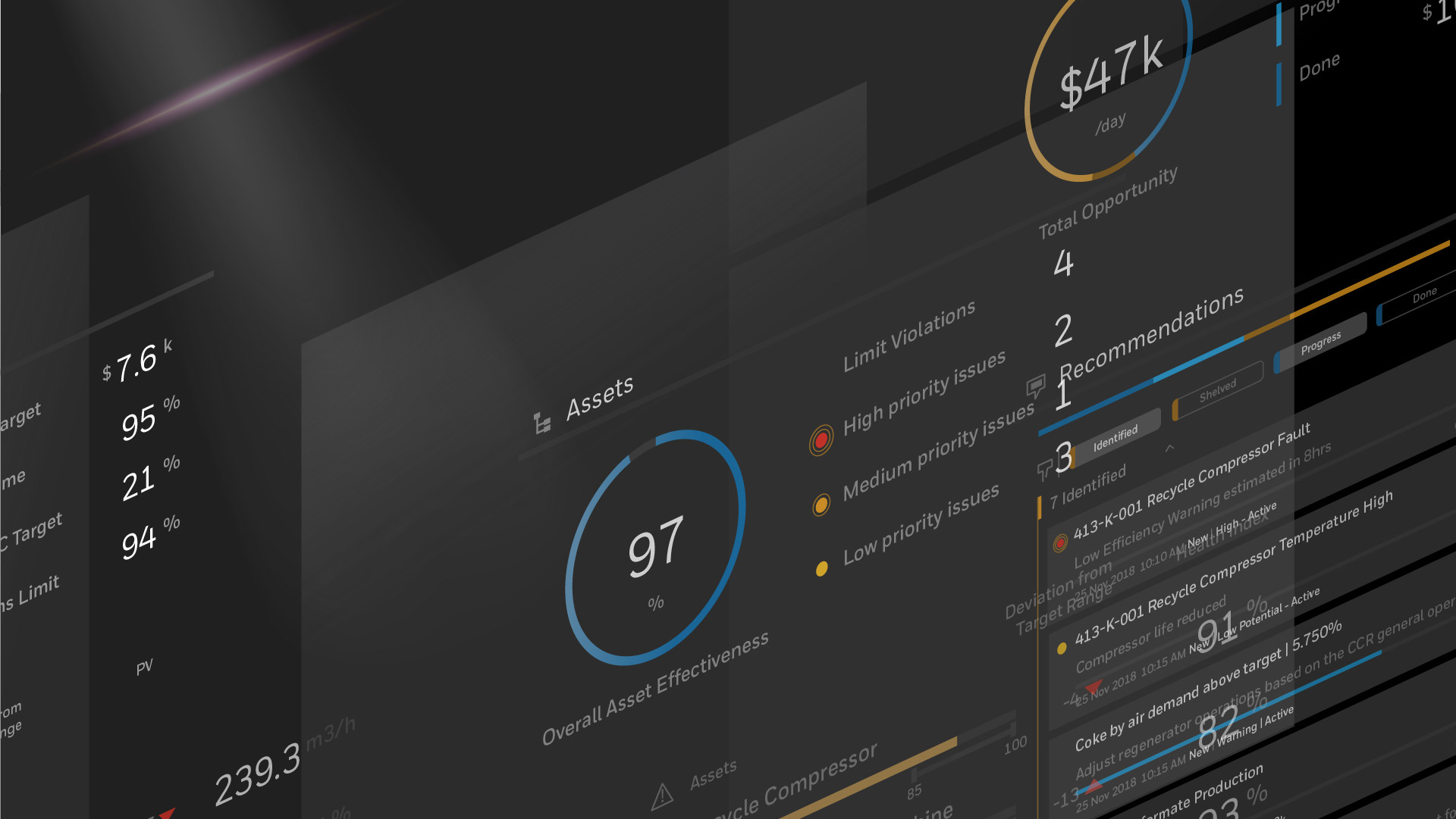
The primary obstacle we encountered during this project was the lack of market assets available for the video. Despite being unable to obtain relevant footage of the monitored refinery areas, we were provided with screen mockups from the developers. Despite these limitations, our goal was to produce a captivating and visually stimulating video that would generate interest in the software.
Strategy
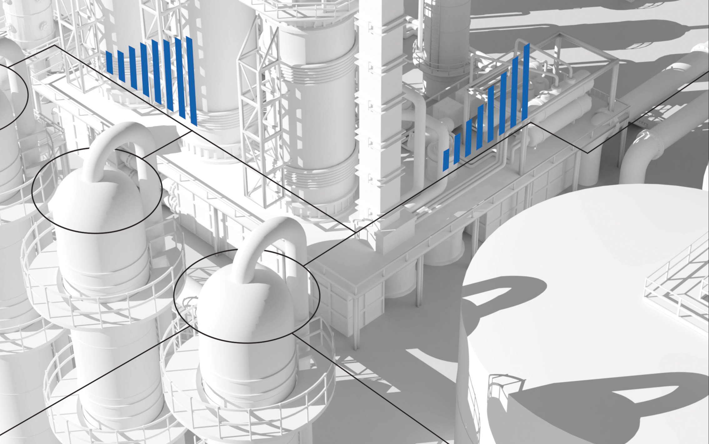
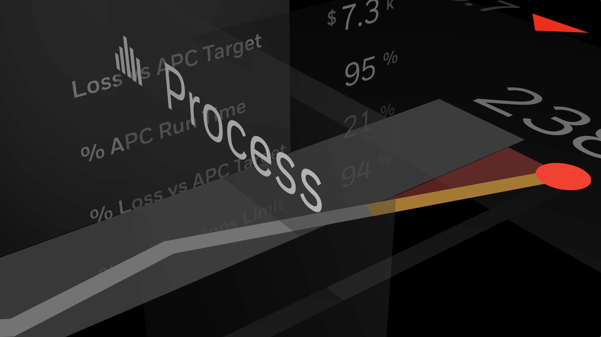
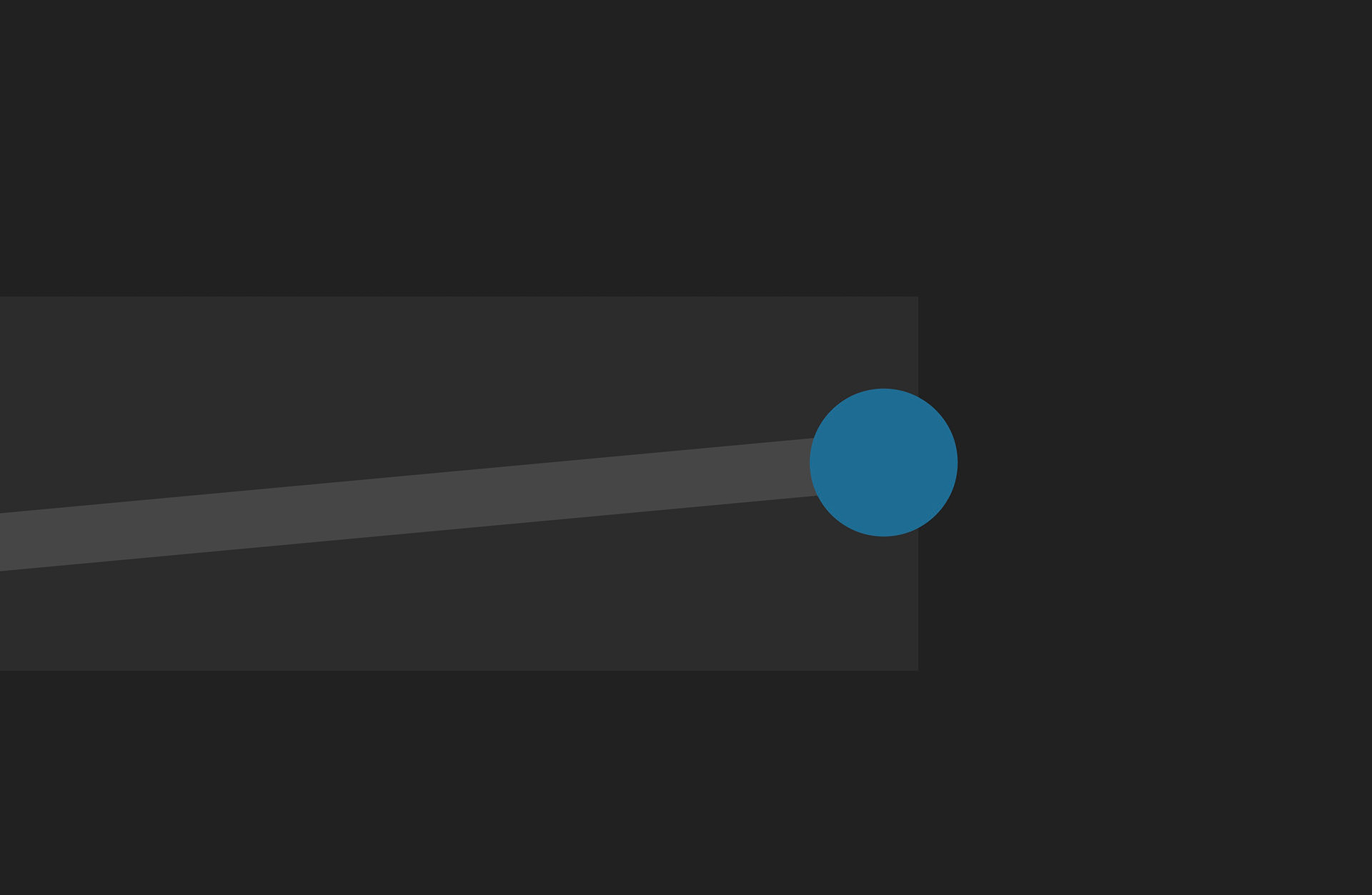
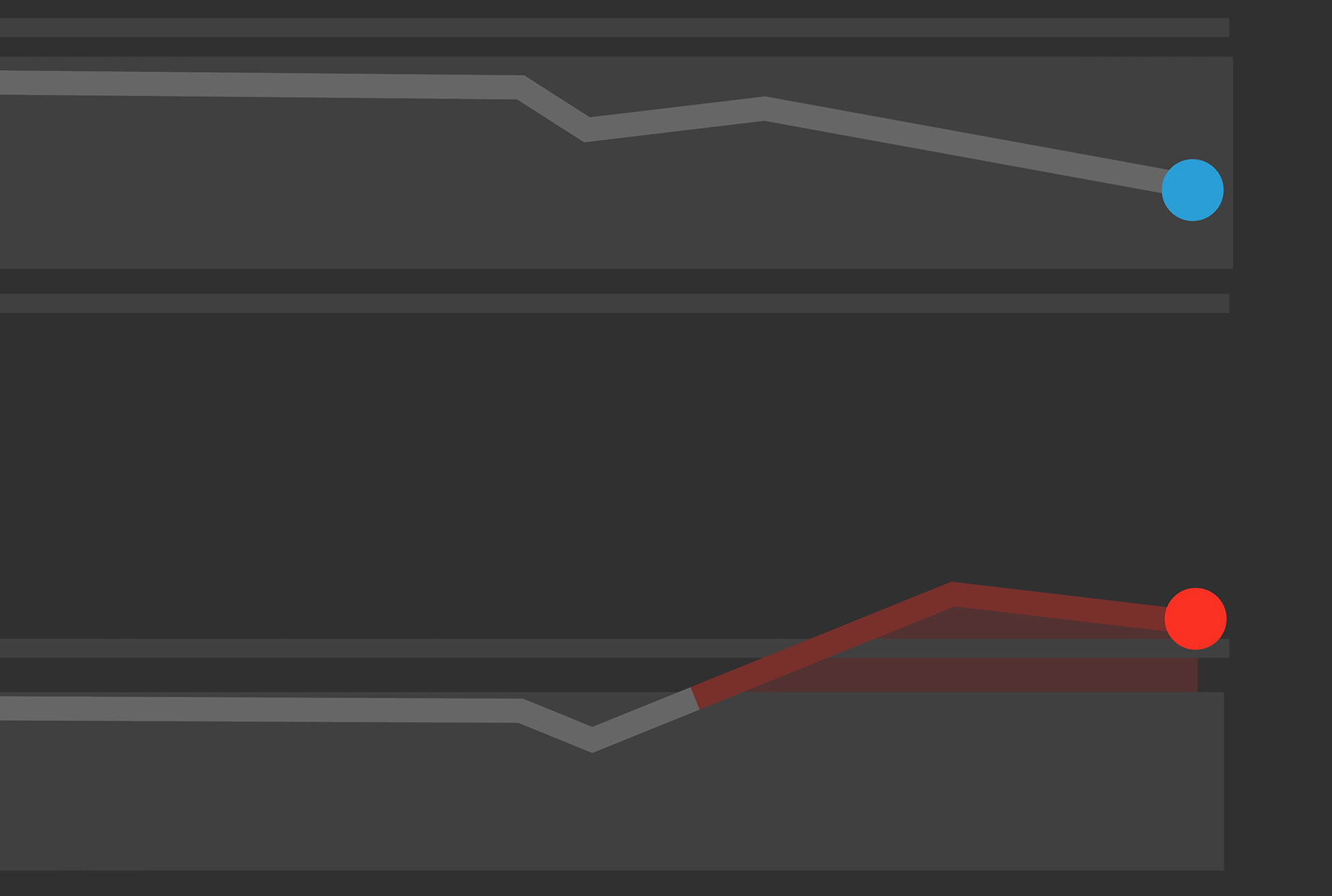
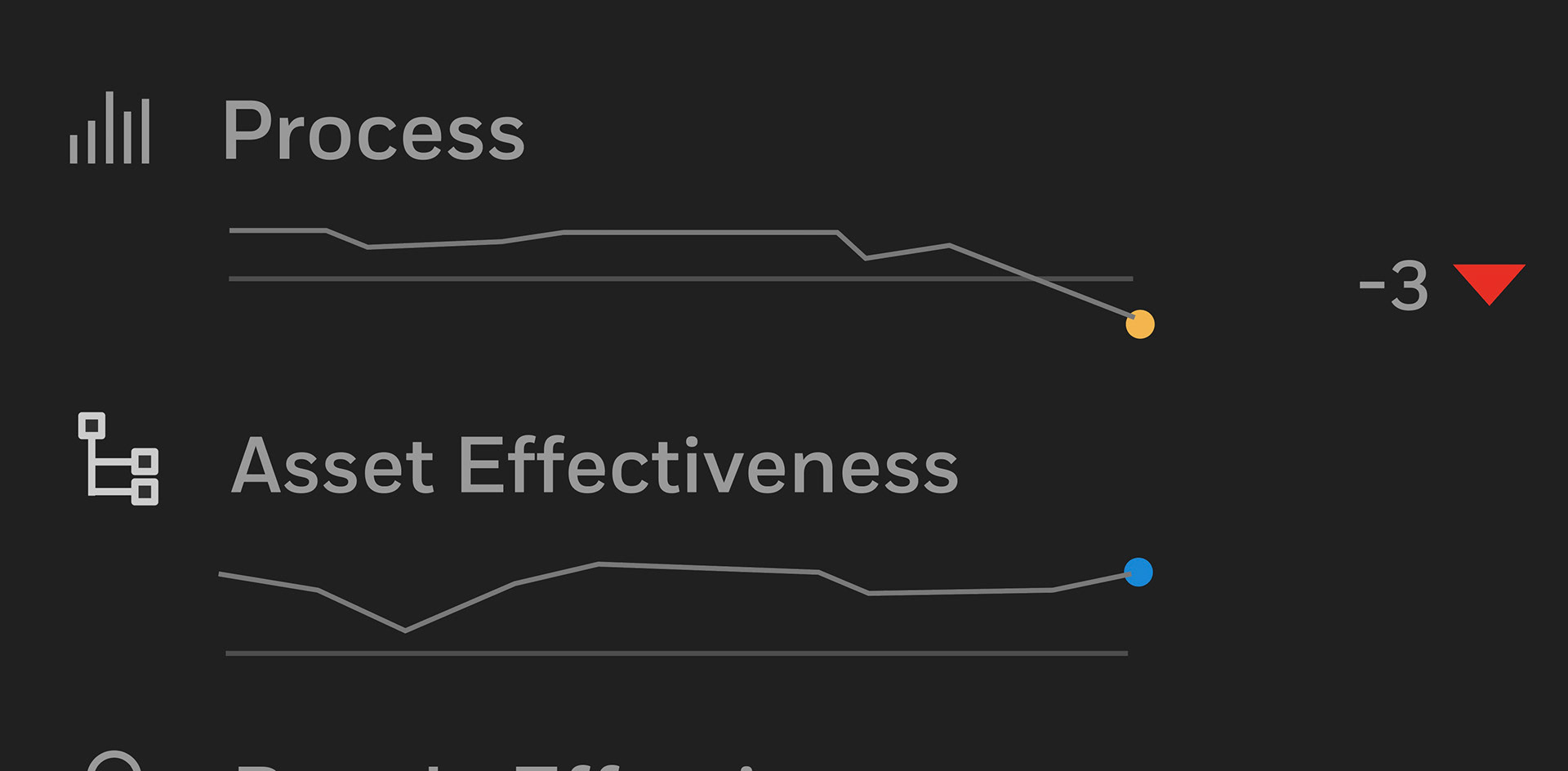
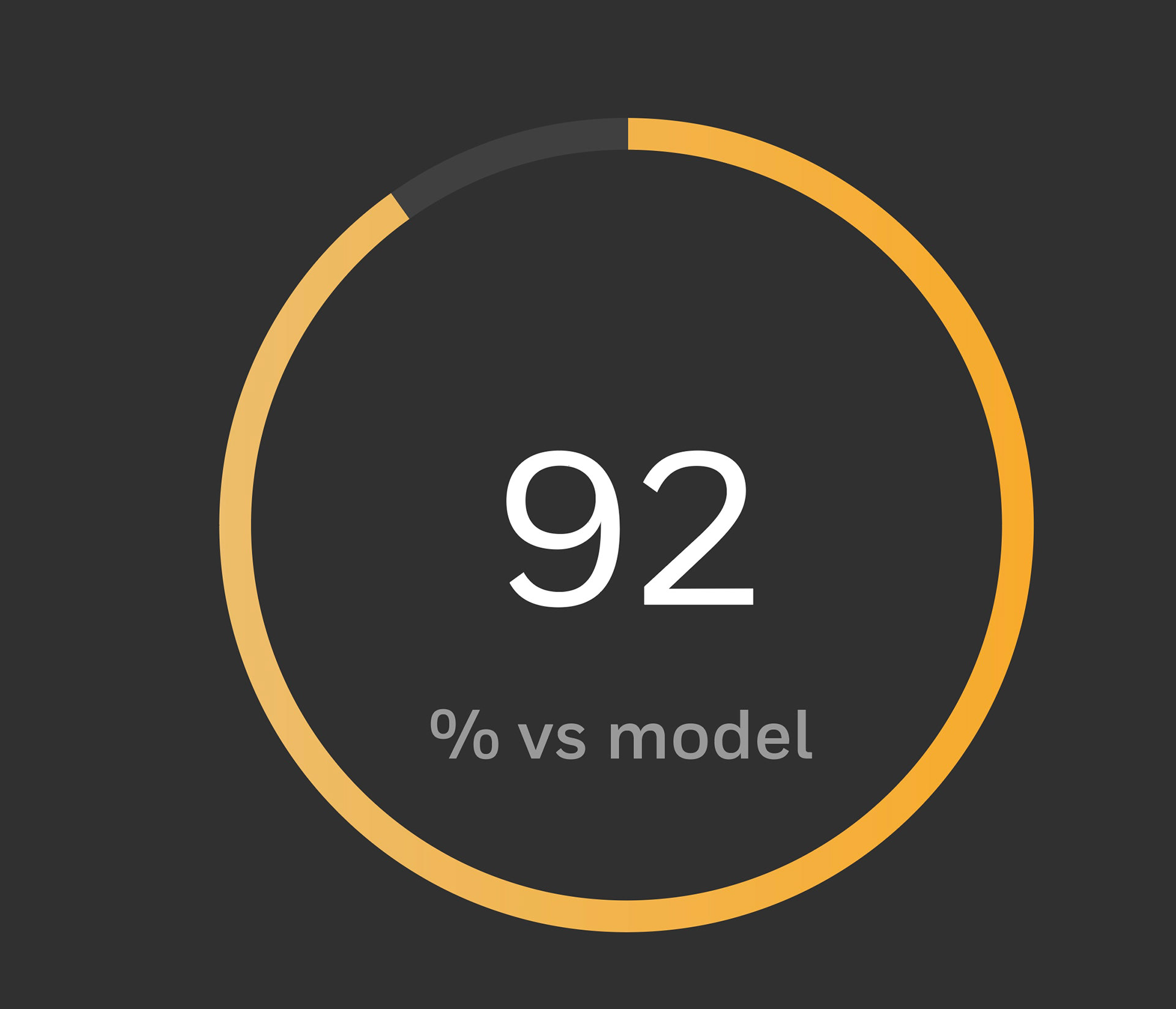
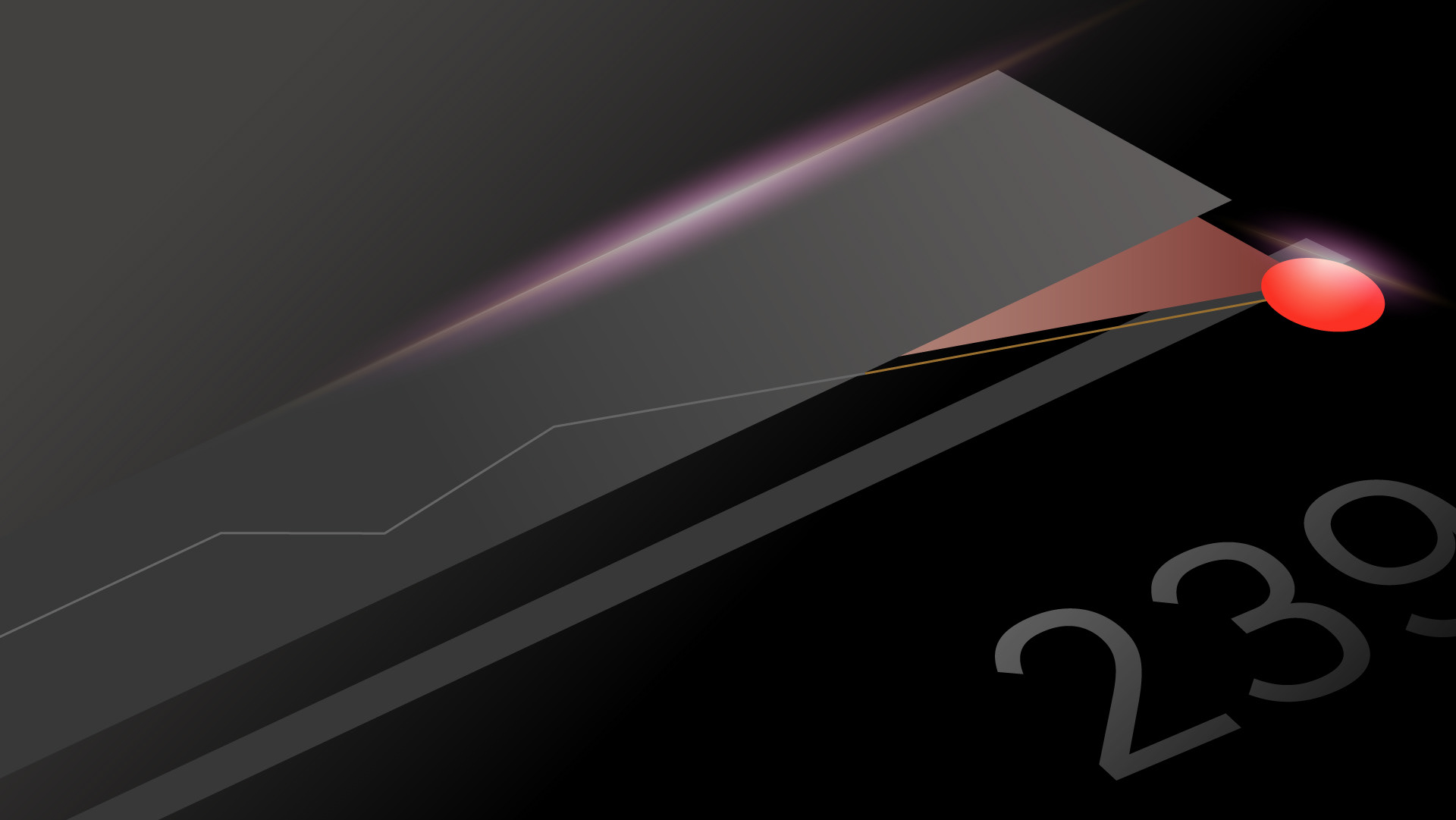
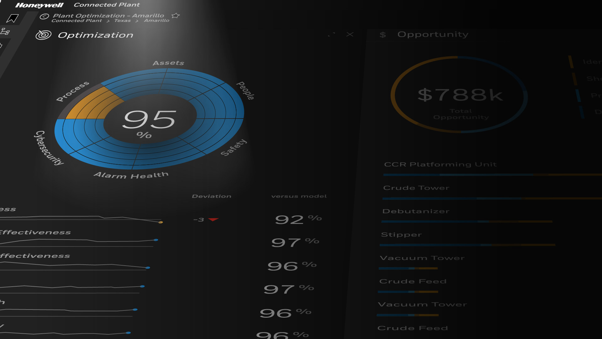
While admiring the UX design of the various screens, I was impressed by the elegant and attractive shapes of its elements. This inspired me to consider deconstructing these shapes and transforming them into visually compelling artwork. The opening statement of the video - "At the intersection of data and analytics", sparked an idea of these elements moving through space and combining in various ways. Having only raster images of the screens, I knew these would have to recreated in vector art for this idea to work in After Effects. We needed high-resolution screens and elements for use in the video. Therefore, we needed to meticulously recreate all essential screens in vector art using Adobe Illustrator.
At the intersection of data
and analytics...
and analytics...
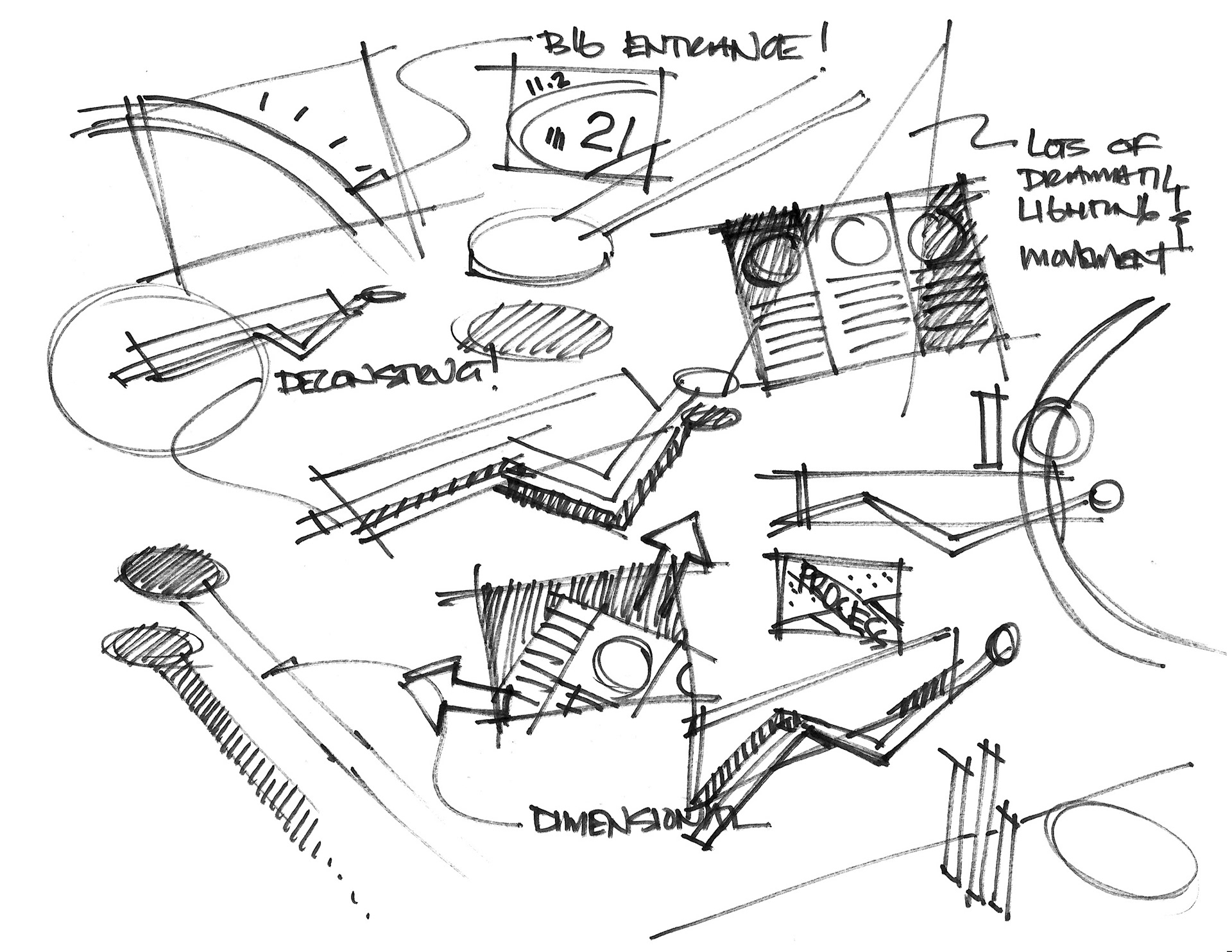
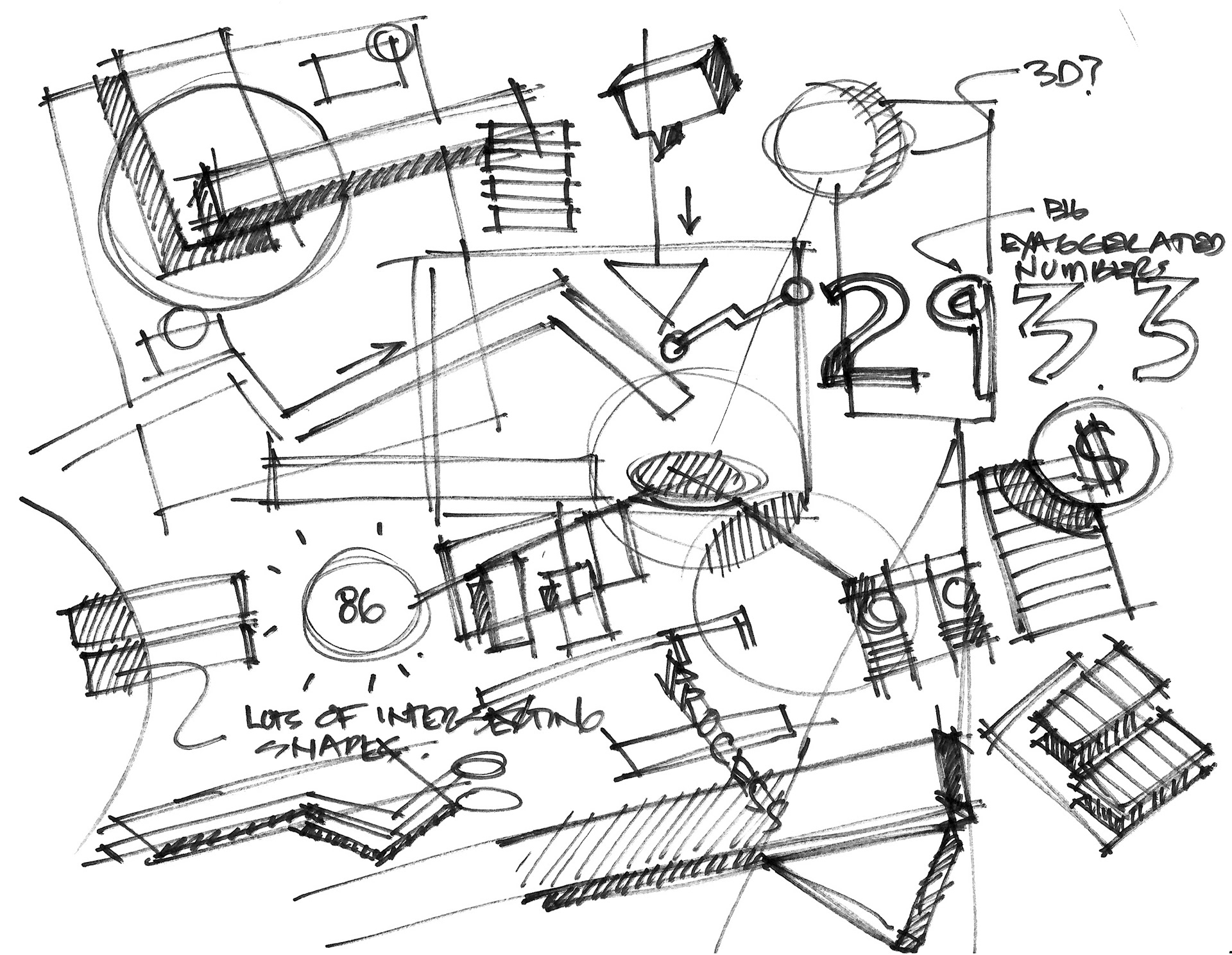
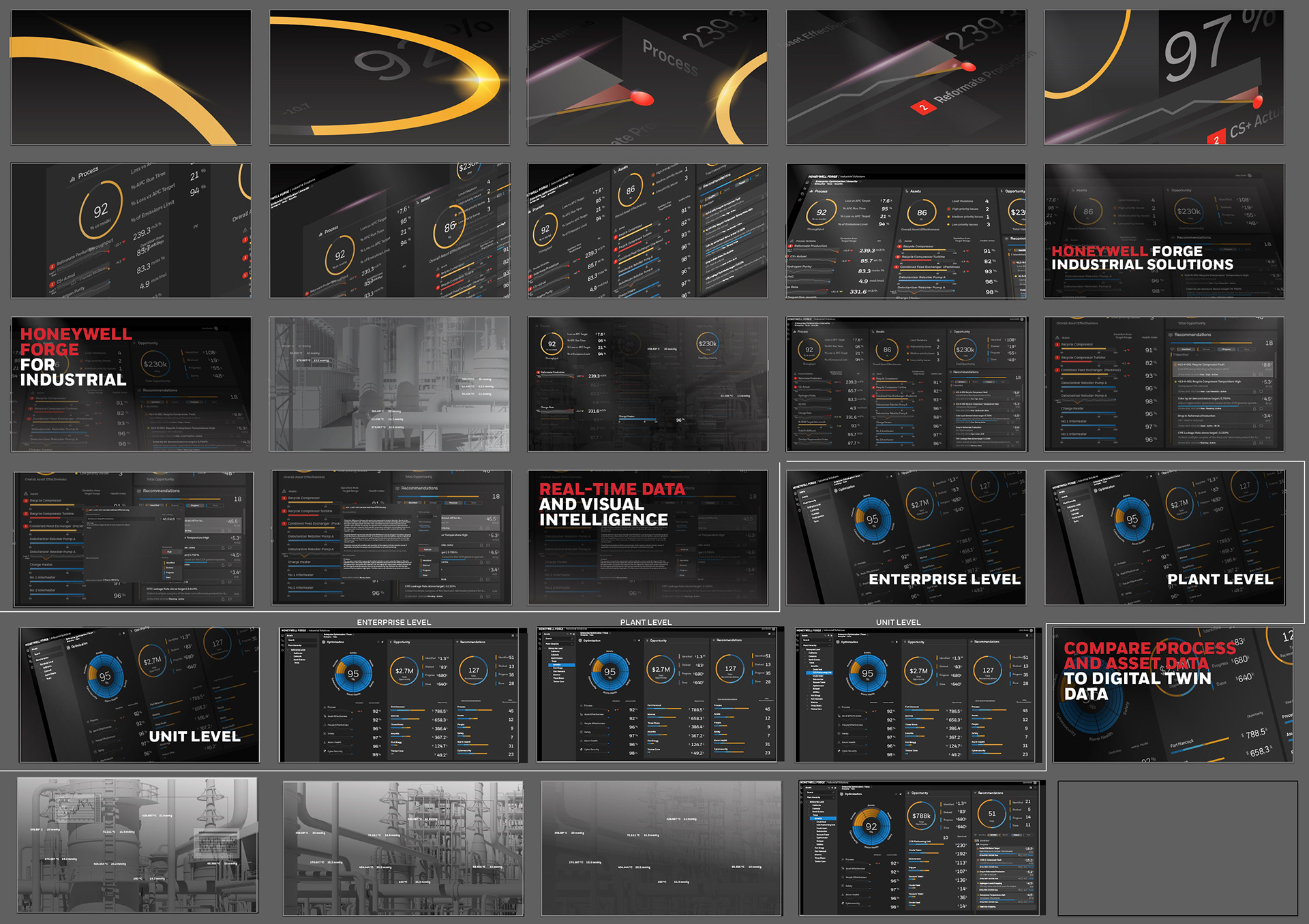
Brainstorming with the creative director I started to explore these ideas. Below are the visual
concepts presented to the Honeywell team. Visually I was trying to turn these software elements
into moving, artful objects to provide a compelling backdrop to the messaging.
concepts presented to the Honeywell team. Visually I was trying to turn these software elements
into moving, artful objects to provide a compelling backdrop to the messaging.


Storyboards
Time to make those screens!
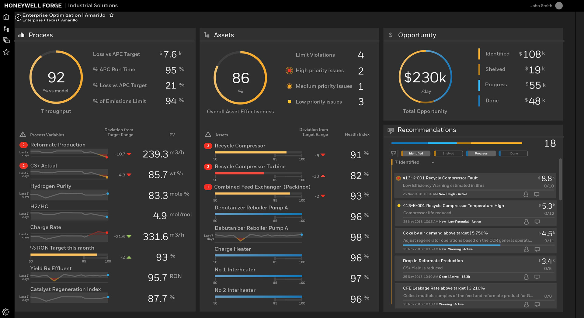
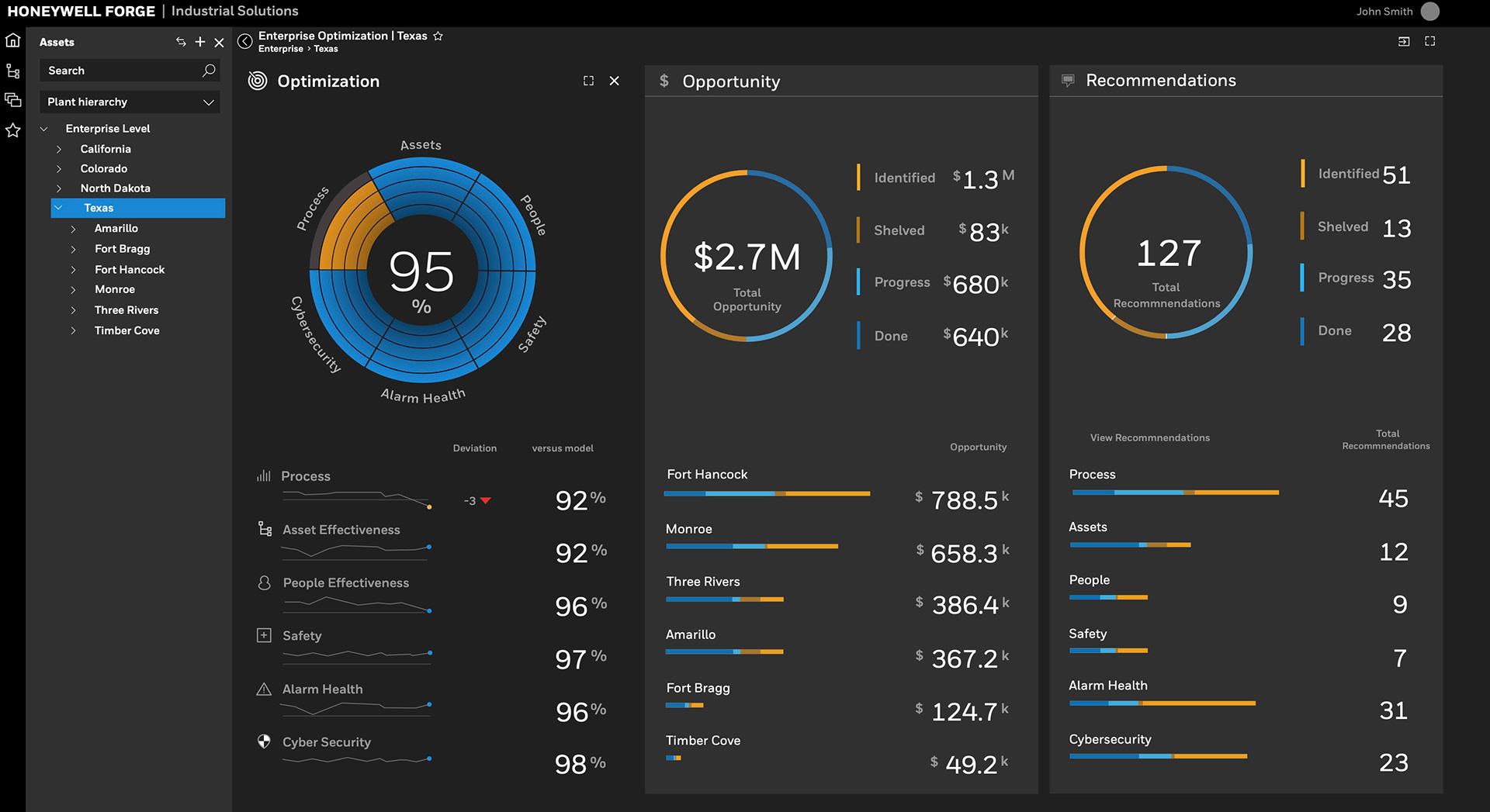
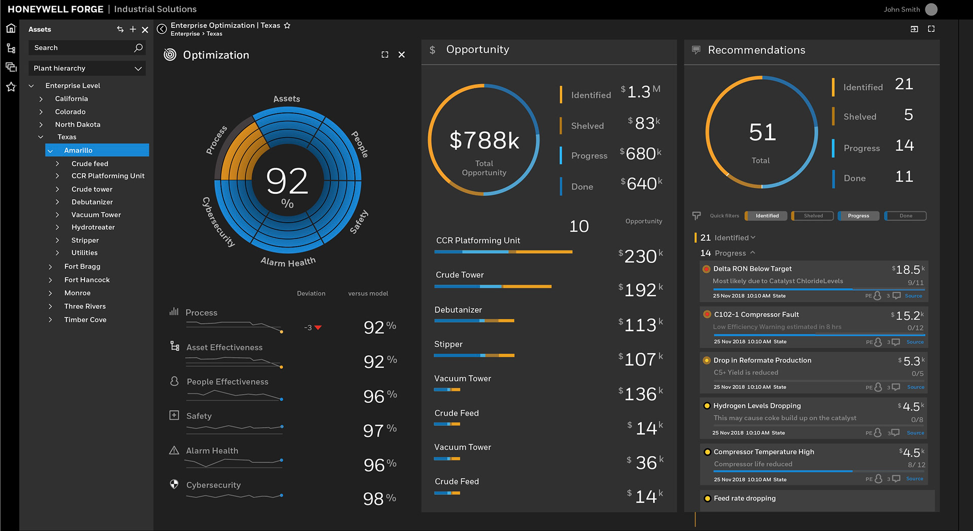
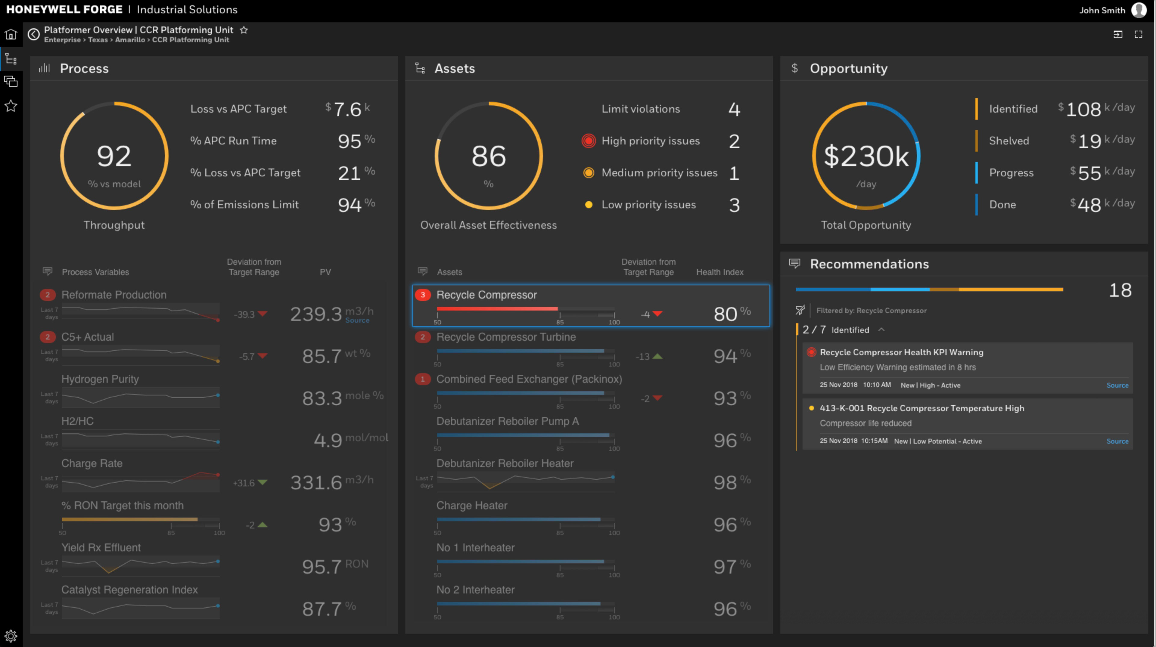
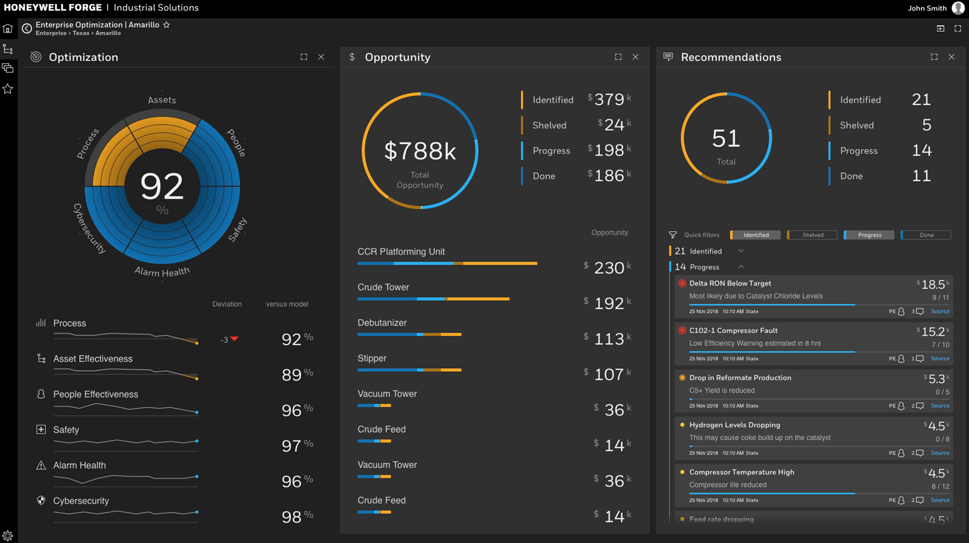
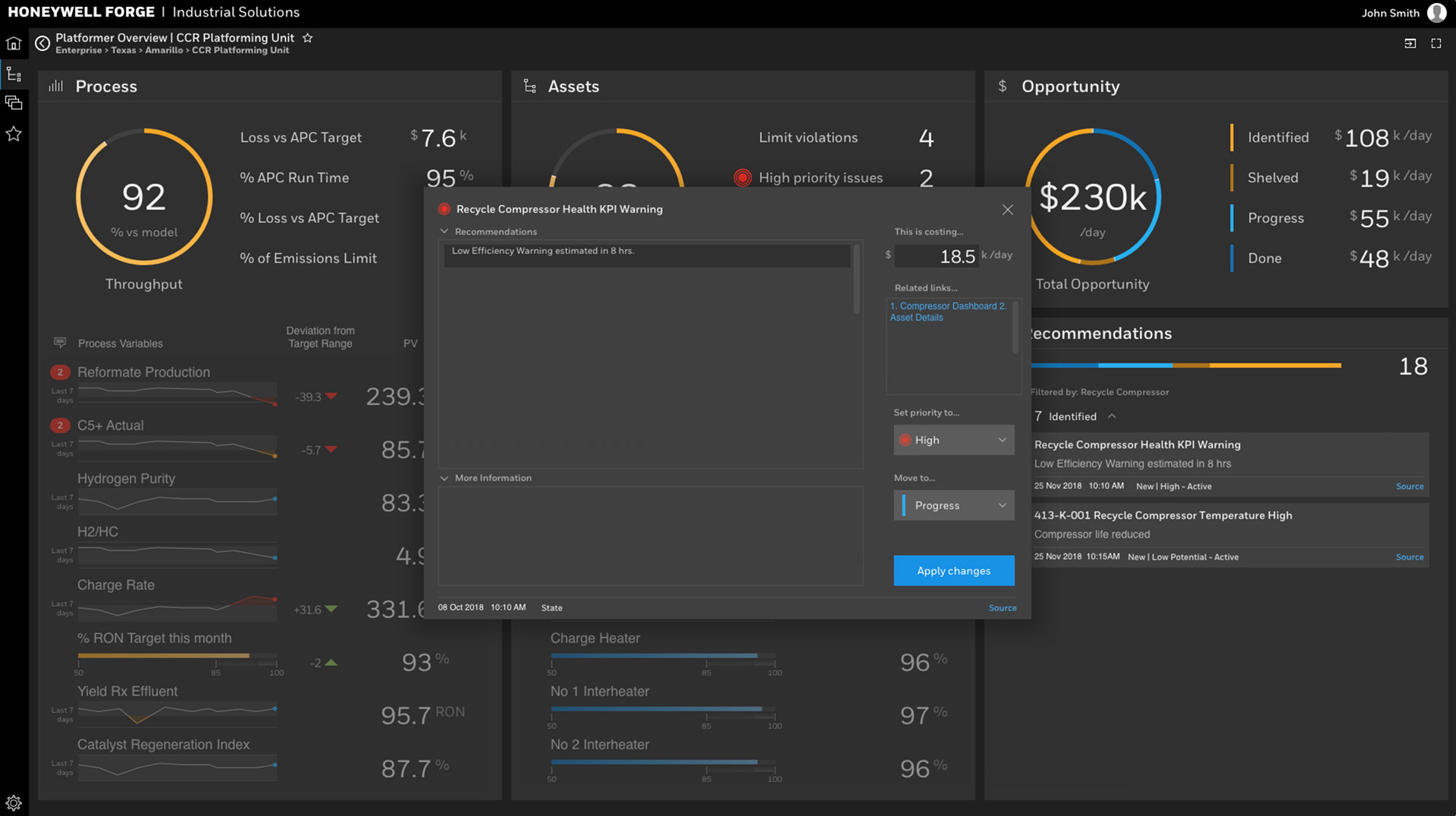
All of the above screens were recreated in vector art. Working closely with the motion graphics editor, all files were broken down into layered sequential files to isolate the elements for use.
In just four weeks, we successfully created an engaging and visually captivating video that effectively communicated our key messaging and introduced viewers to our software. The visual deconstruction approach provided an exciting backdrop for the messaging, resulting in positive customer feedback. Additionally, we took users through the various screens of the software, ensuring they had a general understanding of its functionality.